
Welcome to my website, I love to paint the sea and I have been painting seascapes for many years. For those of you who enjoy painting and are wanting to learn more about painting seascapes then you may be interested in this blog post which details my painting process. I will be adding more painting demonstrations on my blog that show you how to paint landscapes and seascapes so stay tuned.
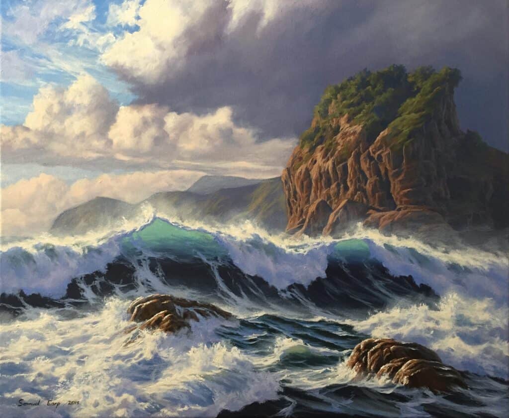
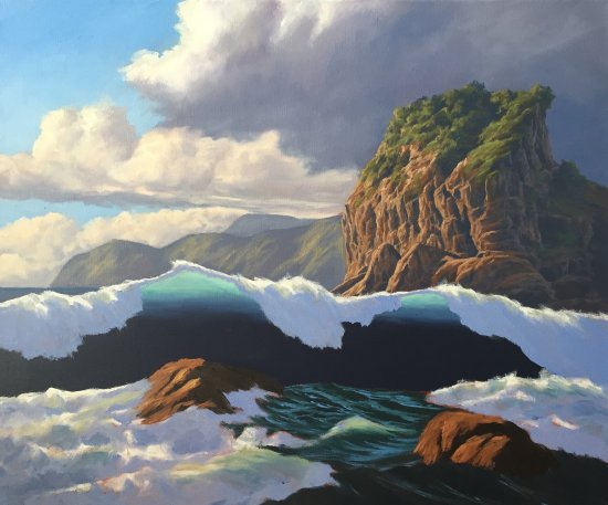
In this step by step painting demonstration I am going to show you how to paint this seascape of the wild sea as shown in the picture below. This seascape is based on the wild sea at Piha Beach located in West Auckland, New Zealand.
Planning the Painting
In order to create an engaging seascape first of all we need to plan our picture so we can determine what the painting is about. Depth within a painting can be achieved by having strategically placed focal points and effective use of colour to create atmosphere and space within the painting.
In order to create the story of this painting I decided what elements I wanted in the scene and where I wanted my main focal point to be. Before I even began painting this picture I compiled many pencil sketches in order to plan the composition so I could see what would work and what wasn’t going to work in the picture. This is essential so I don’t run into problems with composition issues later on when I am painting the picture.
The subject of composition is a tricky one and something I’m forever trying to get to grips with myself. There are however some basic guidelines I follow so I can reduce the risk of running into issues with composition when I am creating a painting. Elements that can upset the balance of the composition and therefore should be avoided include the following:
Centre Lines: This can be a major compositional issue and one where we can unconsciously run into trouble. For example, painting the horizon line of the sea in the middle of canvas so the distance of the sea and sky is the same, or having the focal point in the centre of the painting. These common problems make the composition predictable and therefore boring! I want to create tension in the painting so I have placed the focal point, the translucent breaking wave left of centre and painted a lower horizon line.
Aberrations: These are repetitive elements, forms and shapes which can upset the balance of the painting, for example painting rocks that are all of the same shape and size. Aberrations in your painting can be difficult to identify even once you have started your picture. Sometimes its a good idea to get a fresh pair of eyes to look at your painting.
Painting in the Corners: Painting solid symmetrical shapes in the corners again can upset the composition of the painting as our eye is suddenly drawn to the corner. Make sure whatever you paint in the corner of the painting blends in and works with the rest of the painting overall.
Over-Complicating the Painting: Sometimes you can have too much going on in the painting, elements, forms, shapes competing with each other making the painting look cluttered and confusing the eye as to where it is supposed to look. In order to reduce this risk of over complicating your painting it is best to decide on what your main focal point will be and work in elements around that.
Creating the Composition
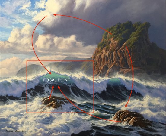
In this painting I have made the breaking wave the focal point and principle object of interest. The focus of the painting is the wild sea especially the breaking waves in the foreground, however I also wanted to include ‘Lion Rock’ which is an iconic landmark of Piha Beach. I have painted Lion Rock in the right side of the painting, however given the size of the landmark it had the potential to make the painting unbalanced. To solve this problem and make the painting more fluid I have placed the focal point more to the left of the painting and added the two rocks in the foreground to triangulate the composition and lead the eye towards the translucent breaking wave. I have also extended the clouds in the upper left side of the painting. You want your point of interest to say ‘look at me’ and have supporting elements that lead towards it.
My Palette
I painted this artwork using oil paint and the colours I used in this painting are as follows:
- Titanium white
- Cadmium yellow deep
- Yellow oxide
- Burnt sienna
- Burnt umber
- Cadmium red light
- Quinacridone magenta
- Ultramarine blue
- Cobalt blue
- Cobalt teal
- Pthalo green
I have also used the medium Liquin Original which improves the flow of the paint and speeds up the drying time.
Painting the Seascape – Step by Step
Step 1
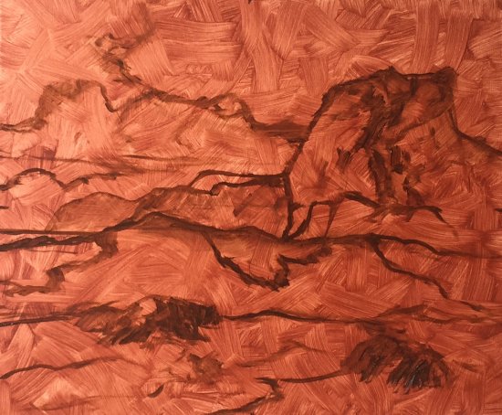
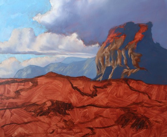
Prior to starting this painting I prepared the canvas by covering it in a layer of burnt sienna. Adding a layer of burnt sienna gives the painting vibrancy as it comes through the layers of paint, and warms up the whole painting. You can also use burnt umber.
To prepare the canvas with the burnt sienna layer I mixed burnt sienna with liquin and thinners. I then applied it to the canvas with a large hake brush making sure that the mixture is applied in a thin layer. I usually leave it to dry for at least a couple of days before starting a painting.
I have sketched the scene with burnt umber mixed with liquin.
Step 2
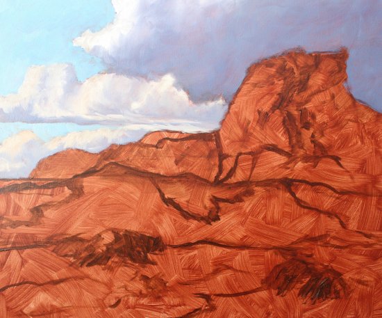
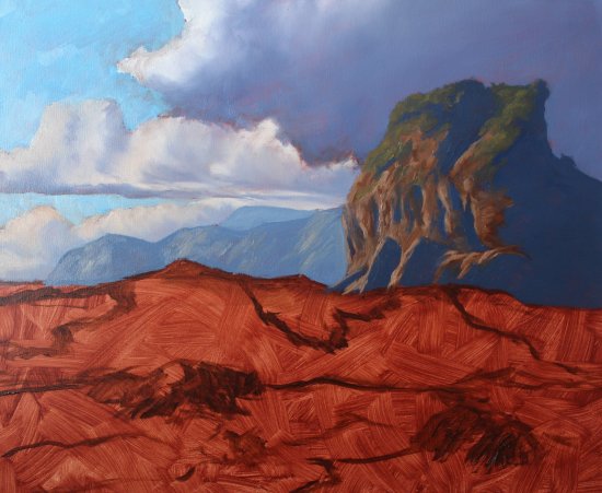
As I begin blocking in the painting I have started painting the sky which sets the overall scene for the painting. I will use the sky to gauge my tonal values in the rest of the painting. The blue of the open sky is mixed with a combination of cobalt blue, cobalt teal and titanium white. You can also use turquoise light as an alternative to cobalt teal. I have painted the highlights of the clouds using titanium white. I have also begun to paint the clouds in the distance above the horizon, I want them to appear far away so I have used de-saturated colours to drop the tone which I mixed using ultramarine blue, burnt umber, a very small amount of quinacridone magenta and titanium white.
The shadow areas of the clouds using a combination of ultramarine blue, burnt umber, quinacridone magenta and titanium white.
When using quinacridone magenta bare in mind that it is a powerful colour so you should only use this in very small amounts. If you find you have added too much quinacridone magenta to your mix you can neutralise it using cobalt teal or turquoise light. Since cobalt teal is a greenish blue, the green element in the pigment will have a neutralising effect to the quinacridone magenta due to it being its complimentary opposite (refer to the colour wheel).
Step 3
Next I have painted the cliffs in the background. To create depth I want to give the appearance of the cliffs being very distant so I have used de-saturated colours to create lighter tones. The shadow areas of the cliffs were mixed using a combination of ultramarine blue, burnt umber, quinacridone magenta and titanium white. The lighter areas of where there is green and yellow grass was mixed using a combination of yellow oxide, ultramarine blue, burnt umber and titanium white. These were all mixed in different quantities. Remember you want to keep your colours de-saturated when painting distant landforms such as hills and cliffs etc so it gives the appearance of it being far away. If the colour in the background cliffs in this painting was too saturated it would bring them forward and the depth would be lost. Quick tip: avoid using cadmium colours and pthalo green for painting distant landforms as they are too saturated.
Next I have started blocking in Lion Rock using a combination of ultramarine blue, burnt umber, quinacridone magenta and titanium white. For the highlighted areas I have used a combination of burnt umber, burnt sienna, titanium white and a little ultramarine blue. The shadow areas have been created using the same colours however much less titanium white and more ultramarine blue.
I want to create the illusion that Lion Rock is closer to me than the cliffs in the distance but still away from the breaking waves in the foreground. I have started to increase the saturation of the colours and therefore the variation in tone increases, dark colours become darker and light colours become lighter.
I have used less titanium white in my shadow areas so they appear much darker than the cliffs in the background. I have added a little ultramarine blue in my burnt umber and burnt sienna mixtures in order that these colours are not too saturated and thereby bringing them too far forward.
Step 4
Next I have begun to paint the foliage on Lion Rock. I have used a varying combination of yellow oxide, cadmium yellow deep, ultramarine blue, cobalt blue, burnt sienna and titanium white. When I was painting the foliage I needed to constantly keep in mind that Lion Rock is in the mid ground of the painting so I don’t want my greens to be too saturated otherwise it will bring it too far forward within the painting.
When mixing your combination of greens start by mixing yellow oxide (or yellow ochre) with ultramarine blue and titanium white, then if required increase the saturation by adding a little cadmium yellow deep and if needed a small amount of pthalo green. Be very careful when using pthalo green as it is very strong and can quickly overpower your mixture. When mixing shade greens yellow oxide combined with cobalt blue is a good starting point. If I discover my greens are too saturated I can knock it back with its complimentary opposite colour, either cadmium red or quinacridone magenta.
Step 5
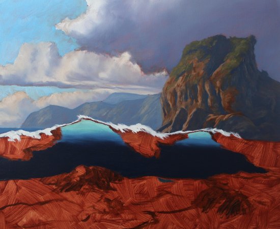
Here I have begun to paint the sea and the translucent wave which should be painted first. I have begun to use more saturated colours in the sea using a combination of ultramarine blue, pthalo green, burnt umber and titanium white. Remember pthalo green is very strong colours and can be overpowering if used in great quantities so be careful. You can reduce the saturation of the colours by mixing a little burnt umber to the mix which has a neutralising effect on the colour.
I have outlined the shape of the rocks on the shadow areas of Lion Rock using ultramarine blue and burnt umber with a tiny amount of titanium white.
To give the translucent effects of the breaking wave I have used cobalt teal with a very small amount of cadmium yellow and titanium white. You can also use turquiose light as an alternative to cobalt teal. Increase the intensity of the blue by adding a little ultramarine blue and if needed you can reduce the saturation by adding a little burnt umber. Adding a little pthalo green to your blue mix also gives it that green / blue sea colour. You may have to play around with the colours a little bit.
I have outlined the highlighted area at the lip of the breaking wave, at this stage I have used straight titanium white as this will need further layers once it’s dry.
Step 6
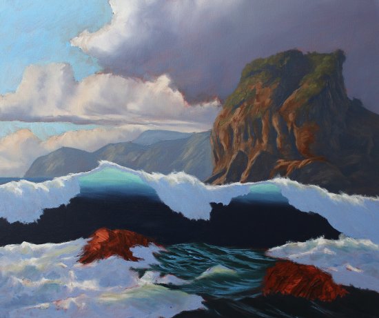
Next I have started to paint the white-water in the foreground and foam on the breaking waves. I have used varying combinations of ultramarine blue, burnt umber, quinacridone magenta and titanium white.
Step 7
I have blocked in the rocks in the foreground using a combination of burnt umber, burnt sienna and yellow oxide and a little titanium white for the highlighted areas. The shaded areas of the rocks are painted using burnt umber and ultramarine blue. When these colours are combined they pretty much make black, in this case I have have kept the mixture to a very dark brown.
With the blocking in process complete I let the painting dry before I make a start on building up the detail.
Now that I have established a base to work from I begin to start building up the detail in the cliffs and sky. I have started to refine the clouds and define their shape. For the highlighted areas of the clouds I have added a very tiny amount of yellow oxide with titanium white. I would always recommend this as titanium white straight from the tube is too cold so adding a little yellow oxide or yellow ochre with warm it up. You can also use yellow ochre as an alternative to yellow oxide although yellow oxide is slightly more vibrant than yellow ochre.
Next I have added much more detail to Lion Rock, modelling the paint and building up the finer detail of the jagged rocks. I have used a combination of burnt umber, burnt sienna, yellow oxide, titanium white and ultramarine blue. Given Lion Rock is in the mid ground of the painting I have dropped the tone and semi de-saturated the colour so it doesn’t sit too far forward in the painting and start conflicting with the breaking wave in the foreground.
I have increased that saturation of my greens on Lion Rock but again not too much. I have used a mix of ultramarine blue, yellow oxide, titanium white and earthed it with a little burnt sienna. I have added a few highlights in the foliage and increased the saturation by adding a little cadmium yellow deep and a very small amount of pthalo green. Go very easy with the pthalo green as it’s a very strong colour and will quickly overpower everything. If you find your green mix is too saturated you can knock the colour back by adding a complimentary opposite such as a cadmium red or quinacridone magenta.
Step 8
I have started to work on the main focal area of the painting, the translucent breaking wave in the foreground. With a round brush I have started refining the turbulent water in the breaking wave and worked on the detail of the highlighted areas of the breaking wave. Again I have added a little yellow oxide with titanium white for the highlighted areas of the break wave.
I have added the cirrus clouds in the sky.
Step 9
Continuing with building up the details of the breaking waves I have started painting the foam patterns in the wave. Remember the light source is emanating from behind the wave so this is in shade, therefore I have used a combination of ultramarine blue, a little quinacridone magenta, titanium white and I have knocked out the saturation with a little burnt umber. I have used liberal amounts of liquin to improve the flow and I have used a liner brush to achieve the spidery foam patterns.
I have painted some reflected light in shadow areas of the breaking wave by mixing ultramarine blue, quinacridone magenta, a little burnt umber and titanium white. I have used a little more quinacridone magenta to warm up the white-water. If it becomes too saturated with quinacridone magenta I can knock it back with cobalt teal.
Step 10
Working on the white-water in the foreground I have refined the detail using a combination of ultramarine blue, cobalt teal, quinacridone magenta, burnt umber and titanium white in varying amounts depending on whether I am painting the shadow areas of the white-water and the warm reflected light. Again I have used titanium white mixed with a yellow oxide for the highlighted areas of the white water.
I have added more highlights to the rocks using a combination of yellow oxide, burnt sienna, burnt umber and titanium white. I have also introduced the spills on the rocks.
Step 11 (Final Step)

To complete the painting, I have added the last of my highlights and effects to portray the drama of the wild sea in this painting. Using a large round bristle brush I have mixed titanium white with a little yellow ochre and a liberal amount of liquin I have brushed over the lip of the breaking waves and the white water to give the illusion of spray coming off the turbulent water. Using the same colour mix I have added a further highlights to the foreground rocks giving them the appearance of wet rocks that are reflecting the direct sun.
Finally I have added a glaze of titanium white mixed with a little ultramarine blue, quinacridone magenta and burnt umber to soften the clouds in the distance. This was applied using liberal amounts of liquin.
Thanks for reading 😊