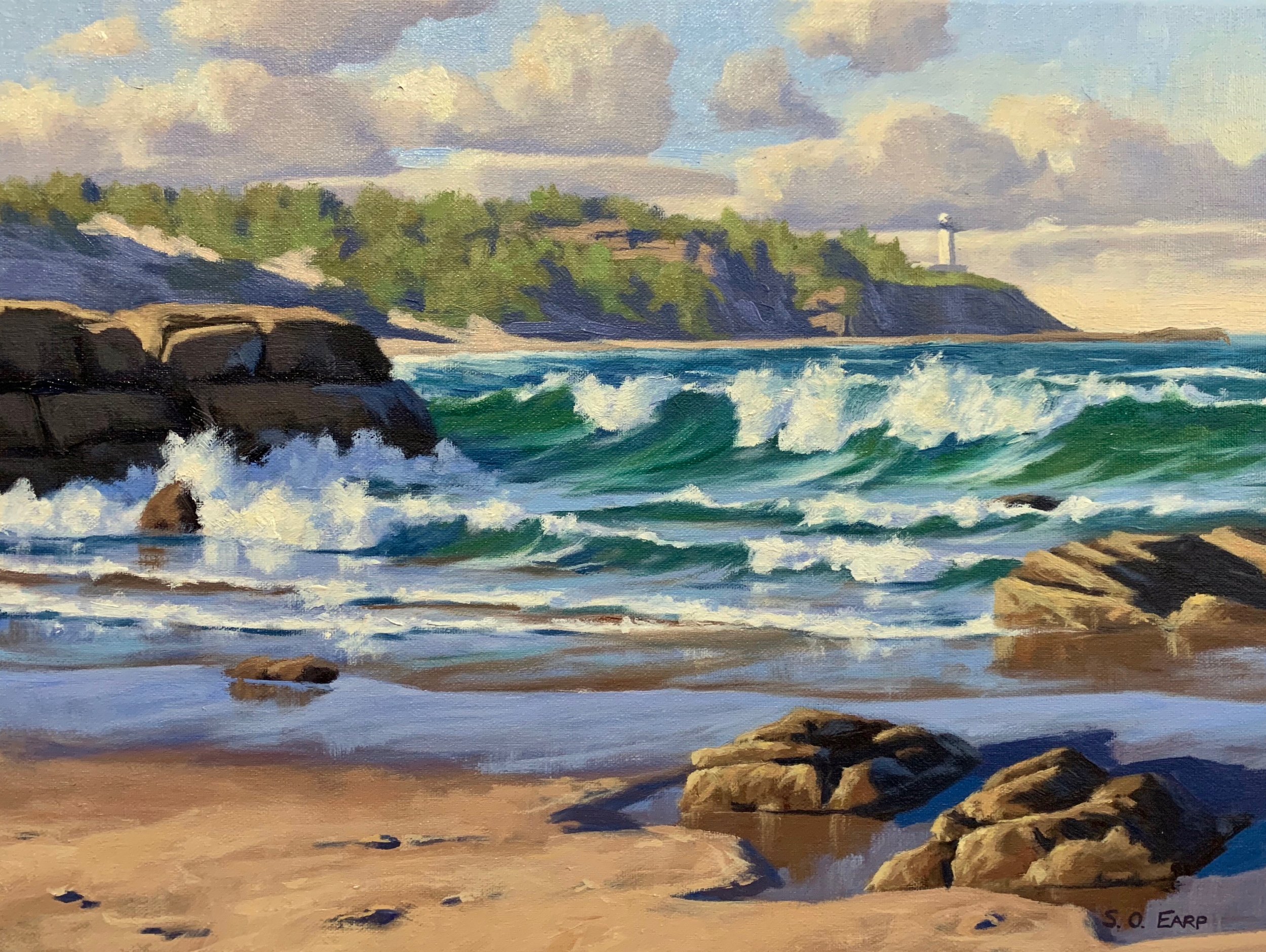
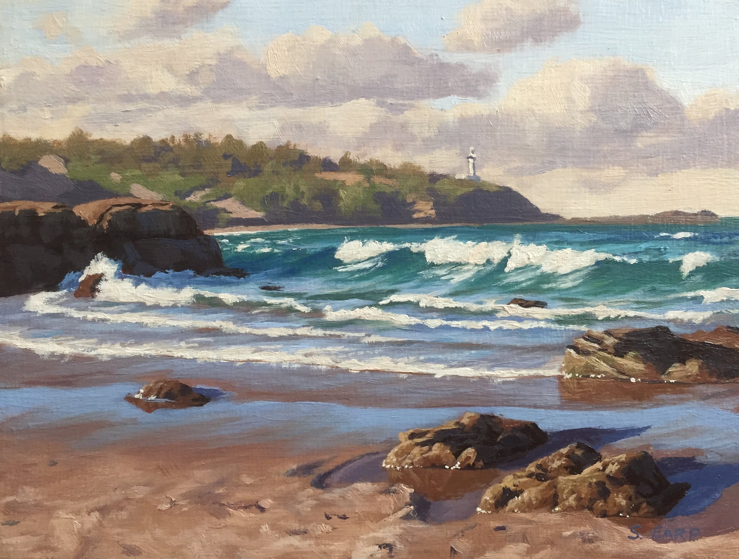
I love painting seascapes and in this art tutorial I will show you how to paint this coastal scene of Norah Head on the Central Coast in Australia.
Inspiration For This Painting
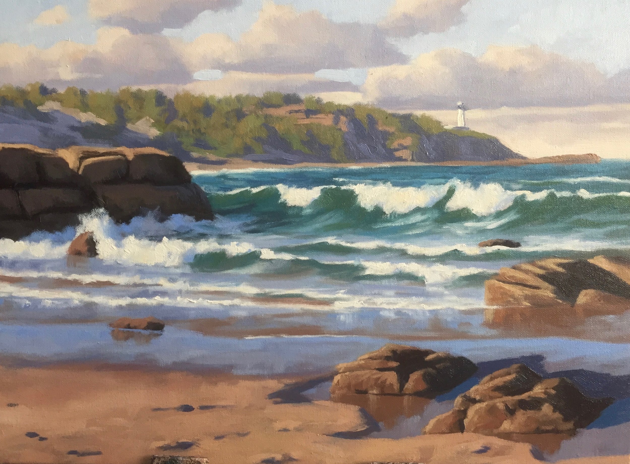
The location for this painting is Soldiers Beach with the headland of Norah Head that features the Norah Head lighthouse. This is one of my favourite beaches in the world, I love the unique colours of the cliffs and foliage and the turquoise bottle green of the sea.
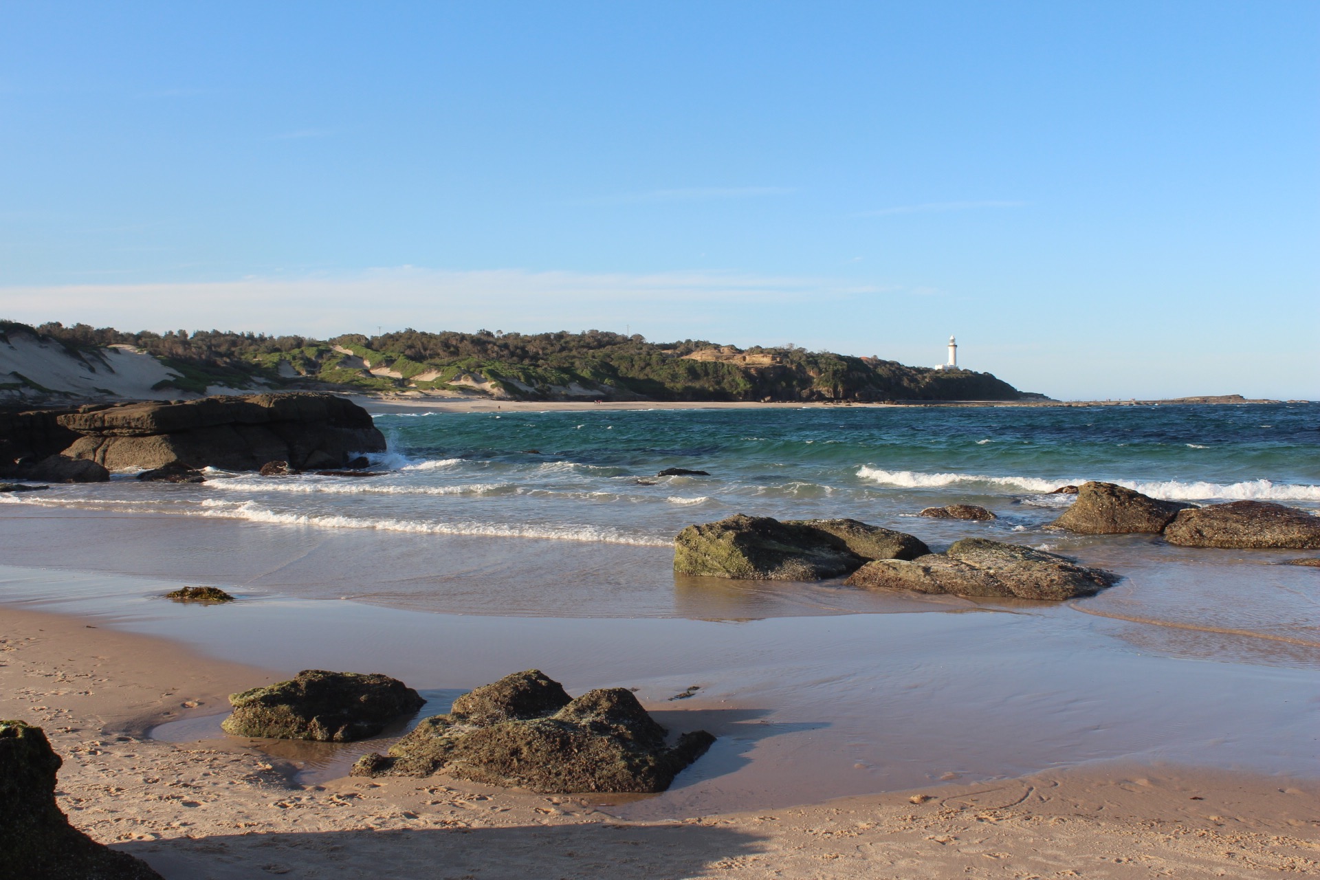
Reference Photo
This is the reference photo I used, please feel free to use or copy it if you would like to have a go at painting this art work.
In this tutorial I will cover the following:
- Colours
- Brushes
- Composition
- Blocking in the painting
- Adding detail
- Final details
Colours
I painted this artwork using oil paint and the colours I used in this painting are as follows:
- Titanium white
- Burnt sienna
- Yellow oxide
- Cadmium yellow
- Cadmium red
- Quinacridone magenta
- Ultramarine blue
- Phthalo green
Brushes
Here is a list of the brushes I used in this painting:
- No.6 flat
- No.2 flat
- No.2 filbert
- No.1 round
Composition
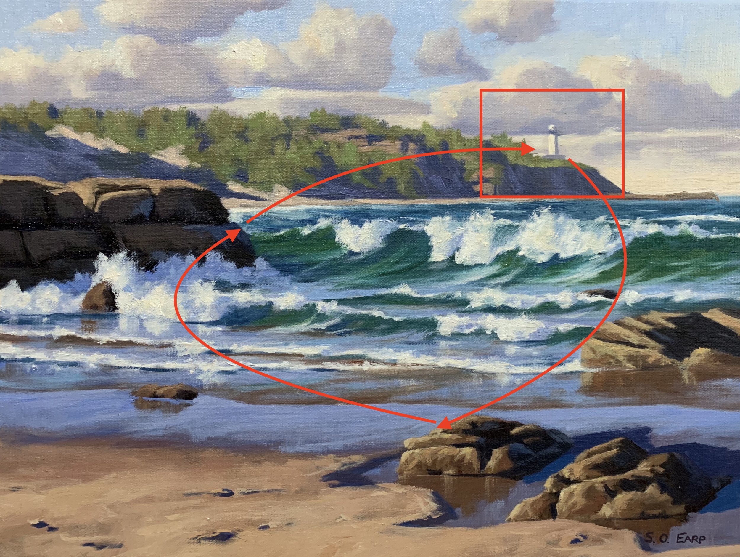
The design of this painting is based off a composition known as a circular or ‘O’ composition and this is a useful composition as it often produces unity and a solid design. The ‘O’ composition is characterised by a dominant opening or space that is formed by masses, lines or edges.
In this case the Norah Head lighthouse is a subtle focal point and the foreground rocks and headland form the ‘O’ shape.
Before I began the painting I sketched out the composition and then a final sketch. I’d always recommend sketching before you begin a painting so you can create a good composition before you start.
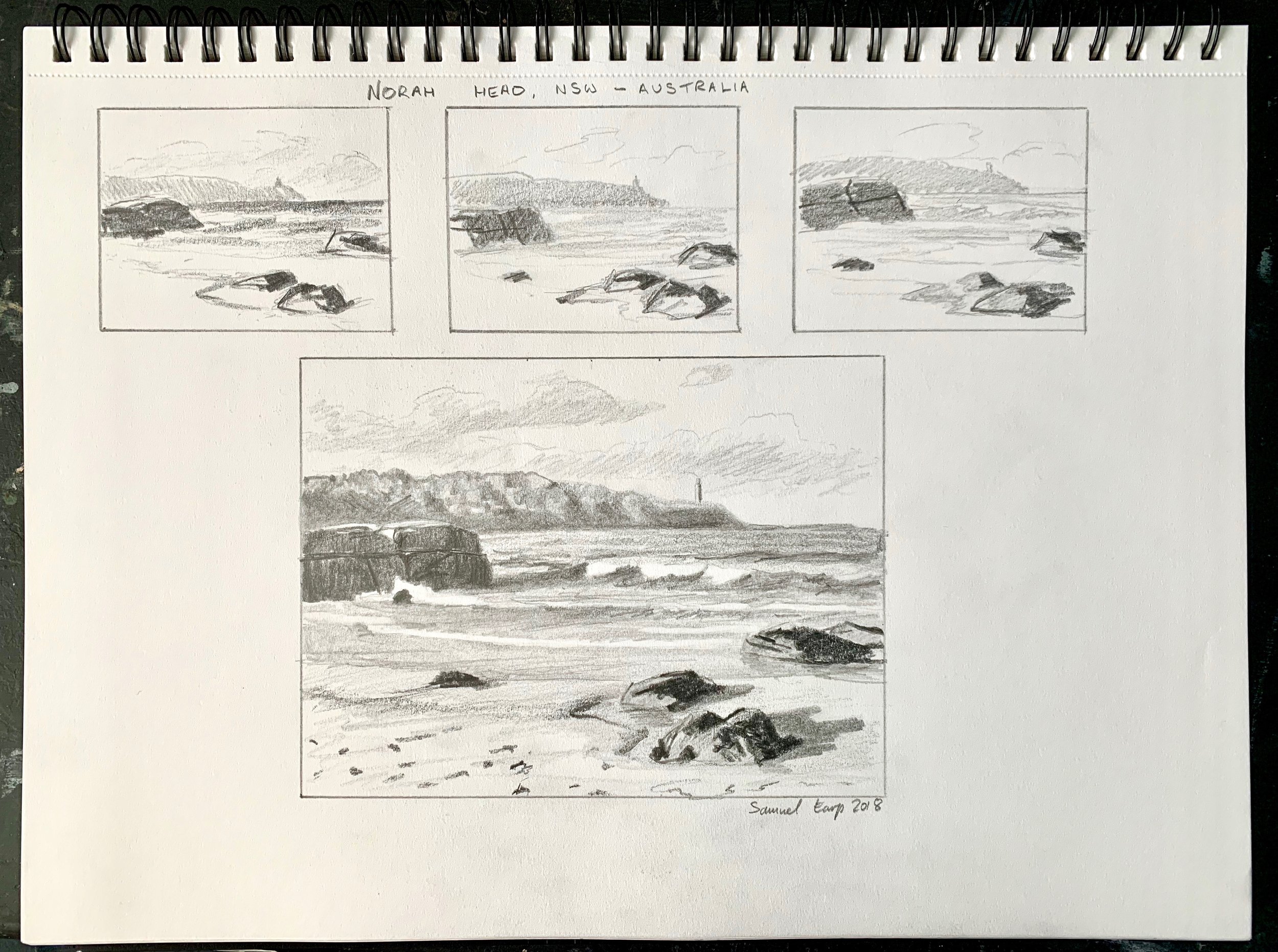
Following the sketch, I then did a small colour study to make sure the painting would work before starting the final painting.
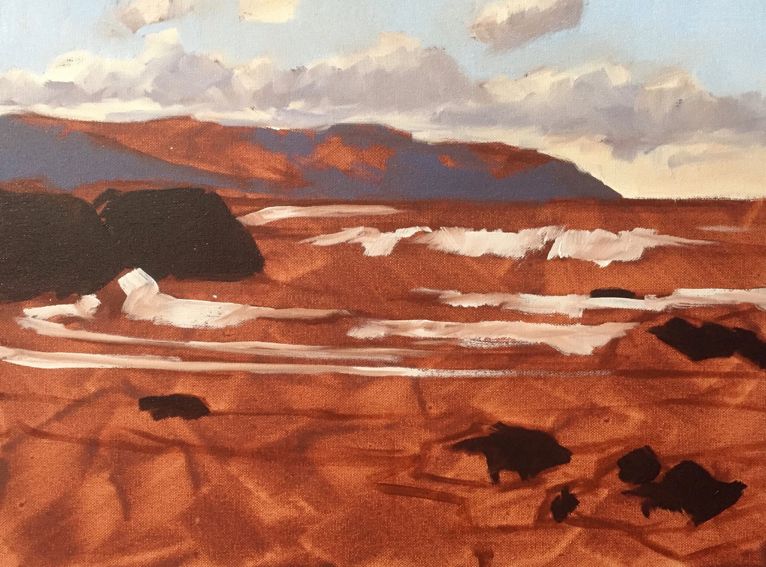
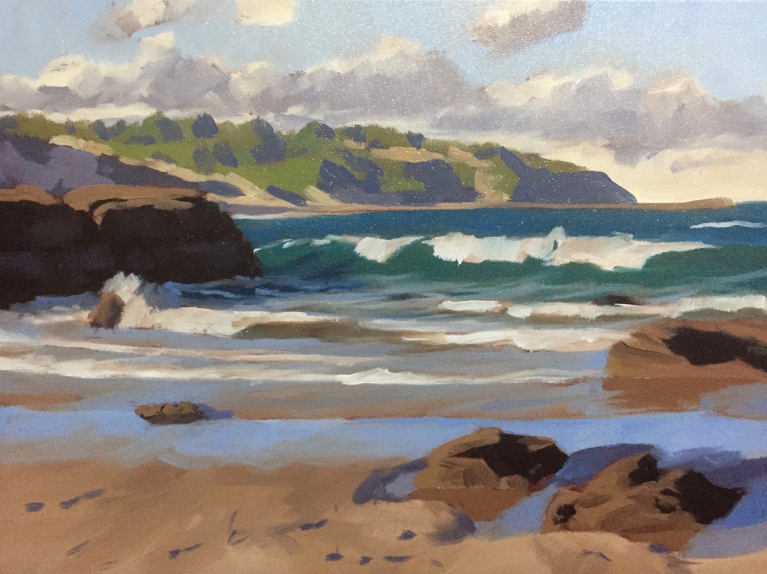
Blocking in the Painting
I’m using a 40cm x 50cm canvas. I prepared it with a layer of burnt sienna which helps with tone and colour.
I sketch out the composition with a No.1 round brush using burnt sienna.
In order create a looser feel with the painting I carried out the entire blocking in process with a No.6 flat brush. I prefer using bigger brushes as I can cover more ground quickly and have a more vibrant feel to the painting.
First and foremost, I am not at all worried about detail when blocking in a painting which is why I use larger brushes for this process. I just want to get my colours and values correct to start with so I have something to work with when I’m adding the detail later on.
Using large brushes also helps to achieve a more ‘painterly’ effect.
The first thing I establish in this painting is where my darkest values are. In this case the rock shadows in the foreground are the darkest followed by the shadows in the cliffs of Norah Head which is a mid tone.
In order to the Norah Head to recede into the distance we must pay attention to the values. What are values? …it’s basically how light or dark a colour is. The dark values in Norah Head will not be as dark as the values in the rock shadows so we must account for this.
I mix the rock shadows using a combination of ultramarine blue, burnt sienna and quinacridone magenta. I then use the same colours for the cliffs in Norah Head (the headland) but this time adding titanium white to lighten the value.
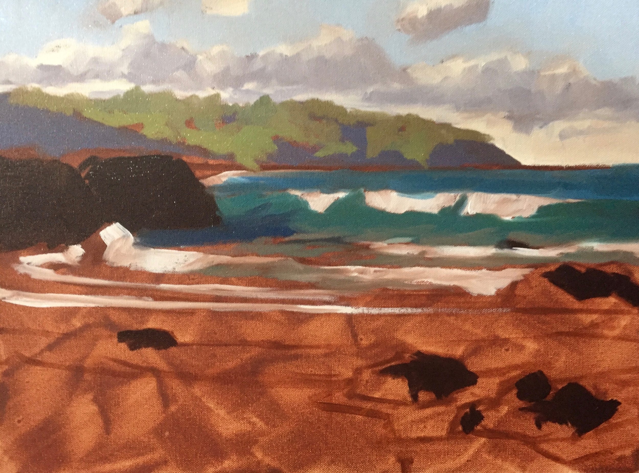
I paint the shadows of the clouds using the same colour combinations as I did with the rock and cliff shadows but adding more titanium white. I paint the cloud and white water highlights with titanium white mixed with a little burnt sienna.
The sky is a combination of ultramarine blue, a tiny amount of phthalo green and titanium white.
By using the same colours in the rocks, cliffs and sky I am helping to achieve more cohesive and harmonious colours which will make the painting read better, as the elements in the painting contain common colours.
Next I block in the general mass of the sea and the breaking wave using a combination of ultramarine blue, phthalo green, yellow oxide and titanium white. I vary the mixtures to achieve different colours that adds texture to the water. If the colour is too saturated I can knock it back with a little burnt sienna.
I paint the greens of the foliage in the headland starting with a combination of ultramarine blue, yellow oxide, burnt sienna and titanium white. I can then vary the colour and increase the saturation by mixing in a little cadmium yellow, cadmium red and phthalo green.
If my greens become too saturated I can knock it back with cadmium red, quinacridone magenta or burnt sienna…but why these colours? The answer is because they all contain red which is the opposite to green on the colour wheel so the cancel each other out.
Green can be a tricky colour and they can get away on you if you are not careful. If they are too saturated they’ll jump forward in the painting and the depth dynamic will be lost.
I complete the blocking in stage of the painting by adding in the sand and the rock highlights in the foreground.
The sand was painted using a combination of burnt sienna, yellow oxide, quinacridone magenta, ultramarine blue and titanium white. I must keep in mind that the sand is lighter in value and I need to keep it lighter than the rocks so the rocks stand out more in the painting.
I paint the rock highlights with burnt sienna, yellow oxide, quinacridone magenta, ultramarine blue and titanium white but I also add in a little cadmium yellow and cadmium red to vary the texture.
All up, for me the blocking in stage is one of the most important parts of the painting because here you can establish your colours and values for the whole painting. Its also always best to have the overall tone of the painting a little darker as it then allows the space to add lighter values to create three dimensional depth as you add the details.
Adding Details
Once the painting is dry I can start adding detail, I revisit the clouds and refine the forms. I am still using a No.6 flat brush and the same colours as I used in the blocking in stage. I lighten the value a little of the cloud highlights by mixing a combination of burnt sienna, yellow oxide and titanium white.
I start using a smaller No.2 flat brush to add more detail to the foliage in the headland of Norah Head, I’m still using the same colours that I used in the blocking-in stage but I’m lightening the value to emphasise there tree forms.
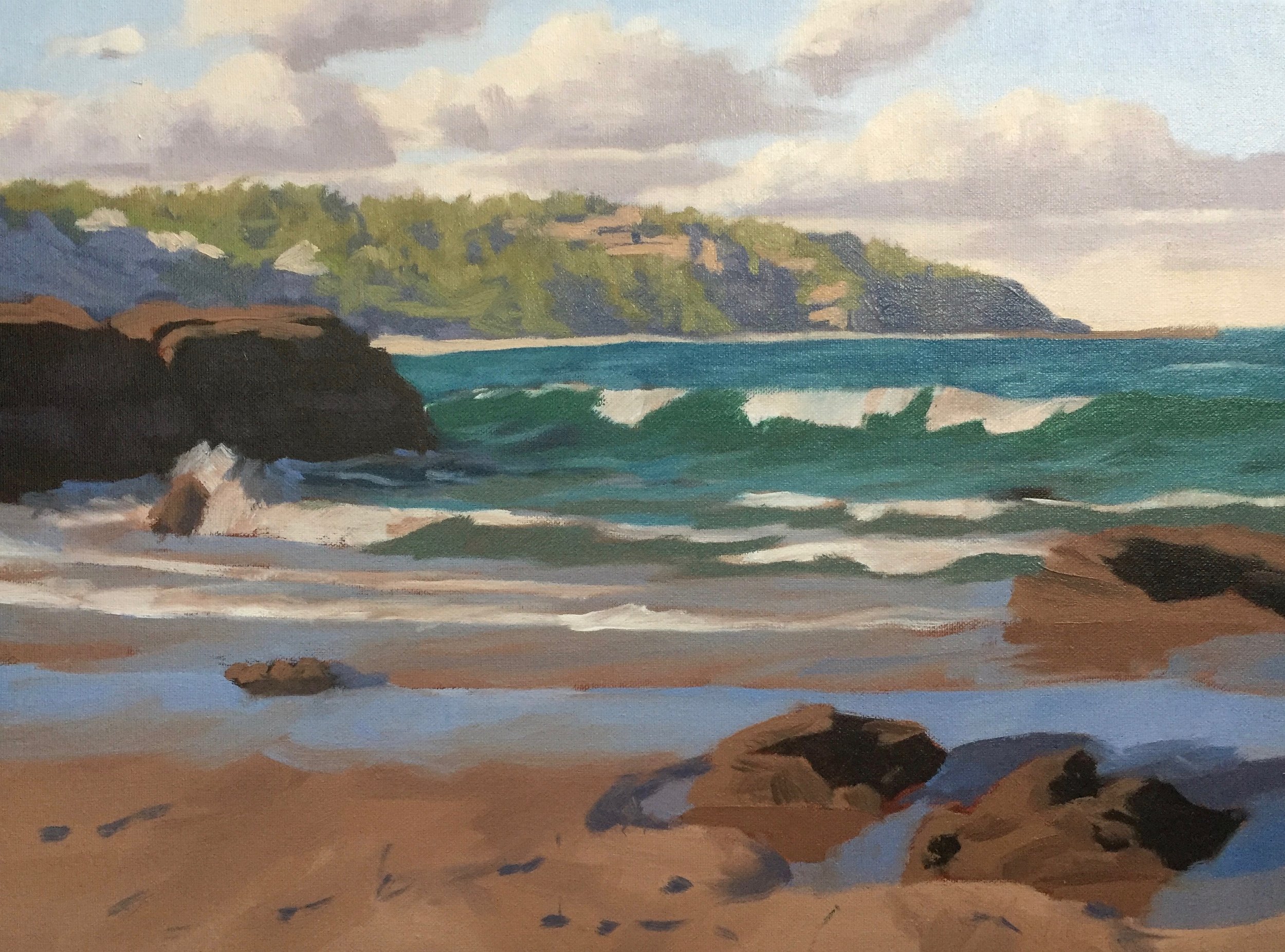
I add reflected light to form ripples and small waves in the main body of the ocean by mixing a combination of ultramarine blue and titanium white. The troughs of the small waves and ripples are reflecting the sky so it must be communicated in the painting. I use a No.2 filbert brush to paint the ripples.
I need to keep the white water / foam in the breaking waves tonally a little darker so I can make them look more three dimensional later on in the painting, if the are painted with just pure white they will look flat. With this in mind I add a little ultramarine blue, quinacridone magenta and burnt sienna to my pile of titanium white. It then means I can add lighter tone later on in the painting.
The foam / white water areas that are in shadow are created with a mixture of ultramarine blue, quinacridone magenta and titanium white.
Now that the sea and background is underway I turn my attention back to the foreground rocks and sand. I paint some reflected light in the rocks on the left using a combination of ultramarine blue, yellow oxide, quinacridone magenta and cadmium red, paying careful attention not to make the value of the colour mixture too light.
I add more colour and lighter tone to the rocks on the right using the same colours that I used in the blocking in stage but adding a little more cadmium yellow and cadmium red to increase the saturation. I’m now using smaller No.2 flat and filbert brushes to add finer details to the rocks.
I add the Norah Head lighthouse to the headland.
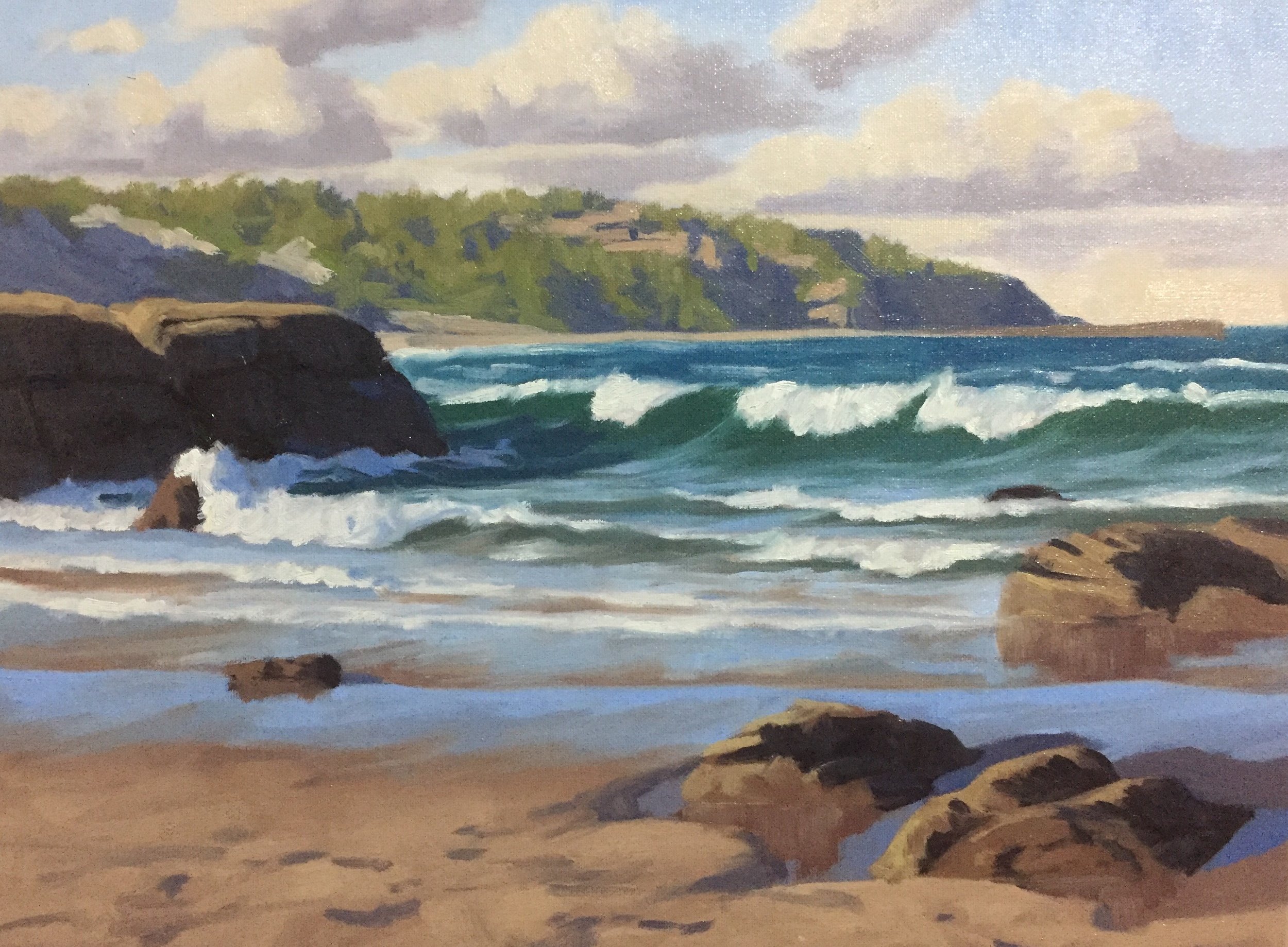
Final Details
I finish the painting by adding the lightest tone to the white water in the breaking waves by using pure titanium white mixed with a little yellow oxide, I also use this same colour to paint some reflections in the water.
I wasn’t happy with the shape of the breaking wave as it was creating a vector that was conflicting with the Norah Head lighthouse so I changed it.
I add my final lightest tones to the rocks in the foreground and sharpen up their reflections in the standing water.
I emphasise the forms or the breaking waves more by adding shadow to the areas where the meet the water.
I have purposely chosen to keep my painting a little looser and not so detailed but you can certainly go as detailed as you want with it.
Thanks for reading 😊
