In this blog post I will show you my design process I use for creating a painting. I have a 12″ x 36″ blank canvas ready and waiting and I want to paint a seascape of the coast of Wellington in New Zealand. But before I get into the painting I need to plan it.
I never just start a painting, I’ve had too many disasters with paintings where I didn’t do any prior planning so I always at least do some pencil sketches but very often a colour study too. Colour studies are small paintings in their own right and in this post I will show you my sketching process and a step by step tutorial on painting the small seascape colour study.
Photo Reference
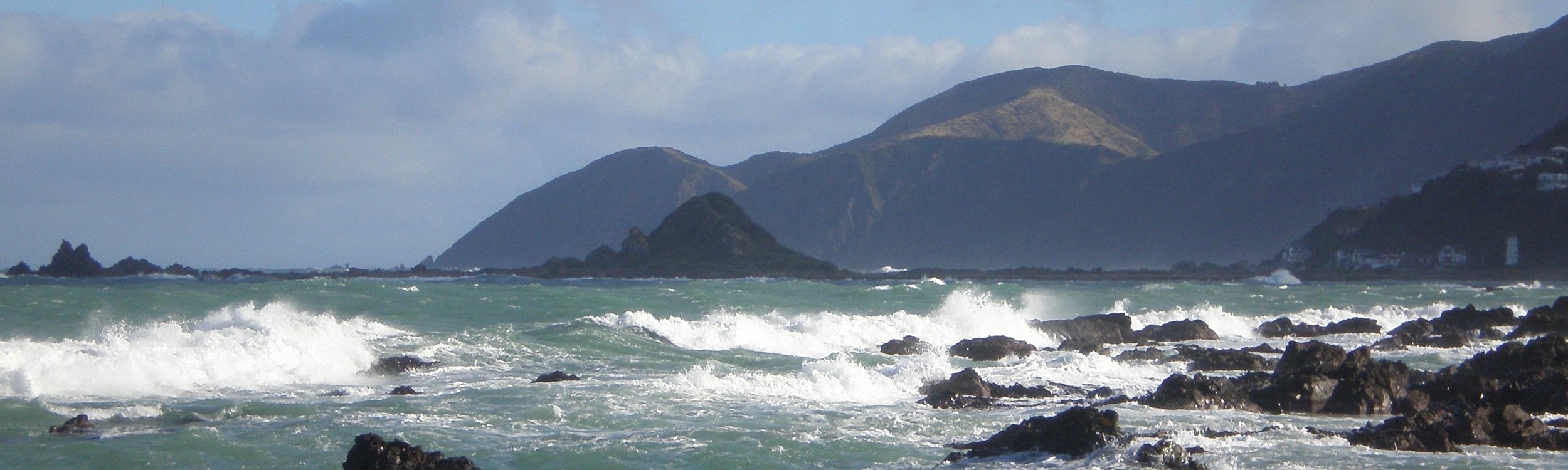
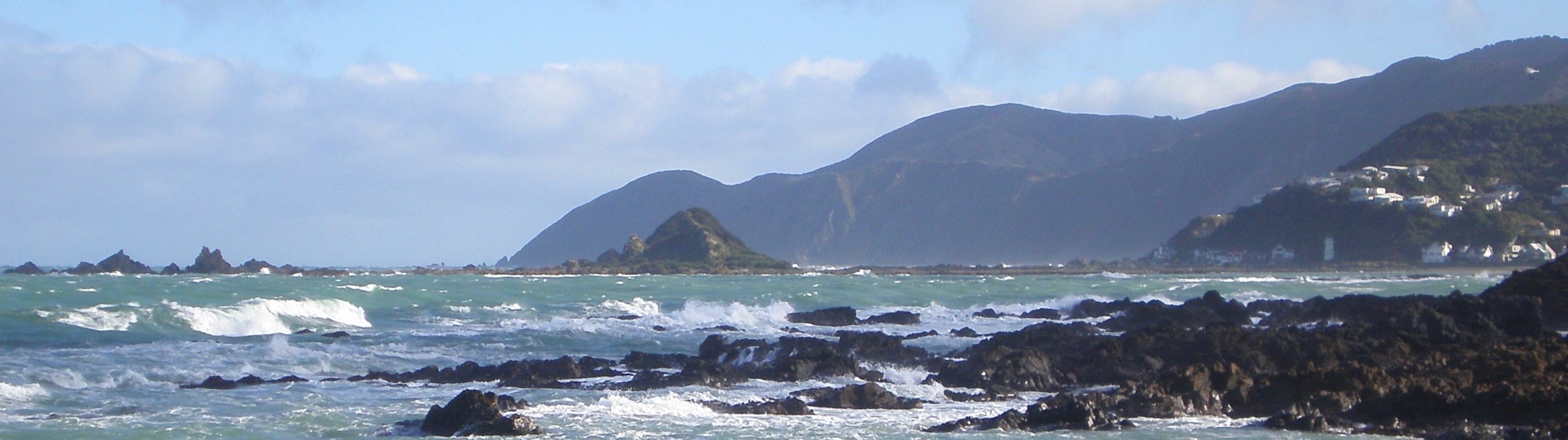
I was scrolling through my photo reference of the coast of Wellington in New Zealand and I was especially drawn to these photos. They have all the elements for a successful seascape painting including rocks, the wild sea, cliffs and a headland, a good lighting dynamic and great cloud reference.
These are some of the photos I used, please feel free to use them if you would like to have a go at painting this.
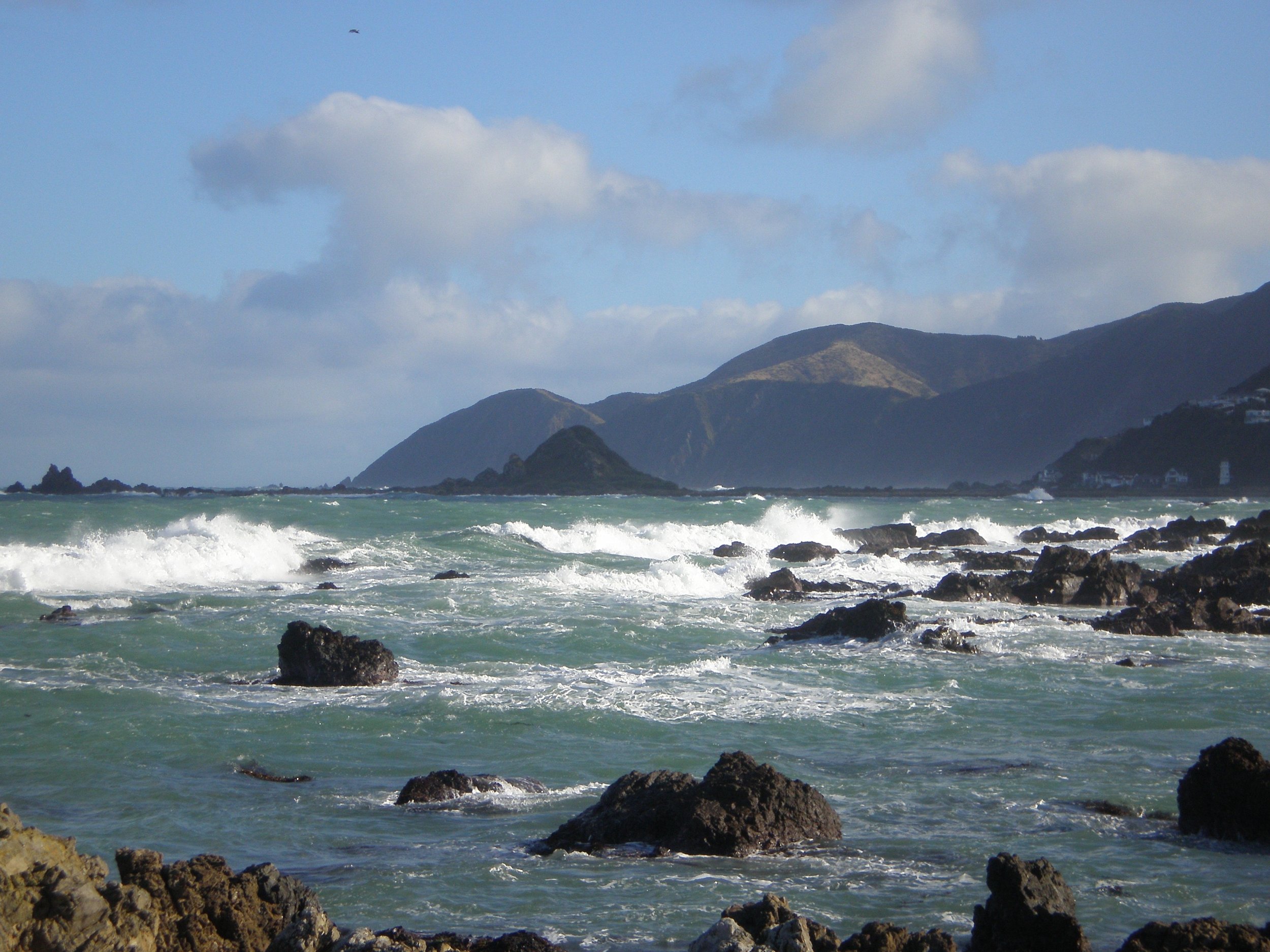
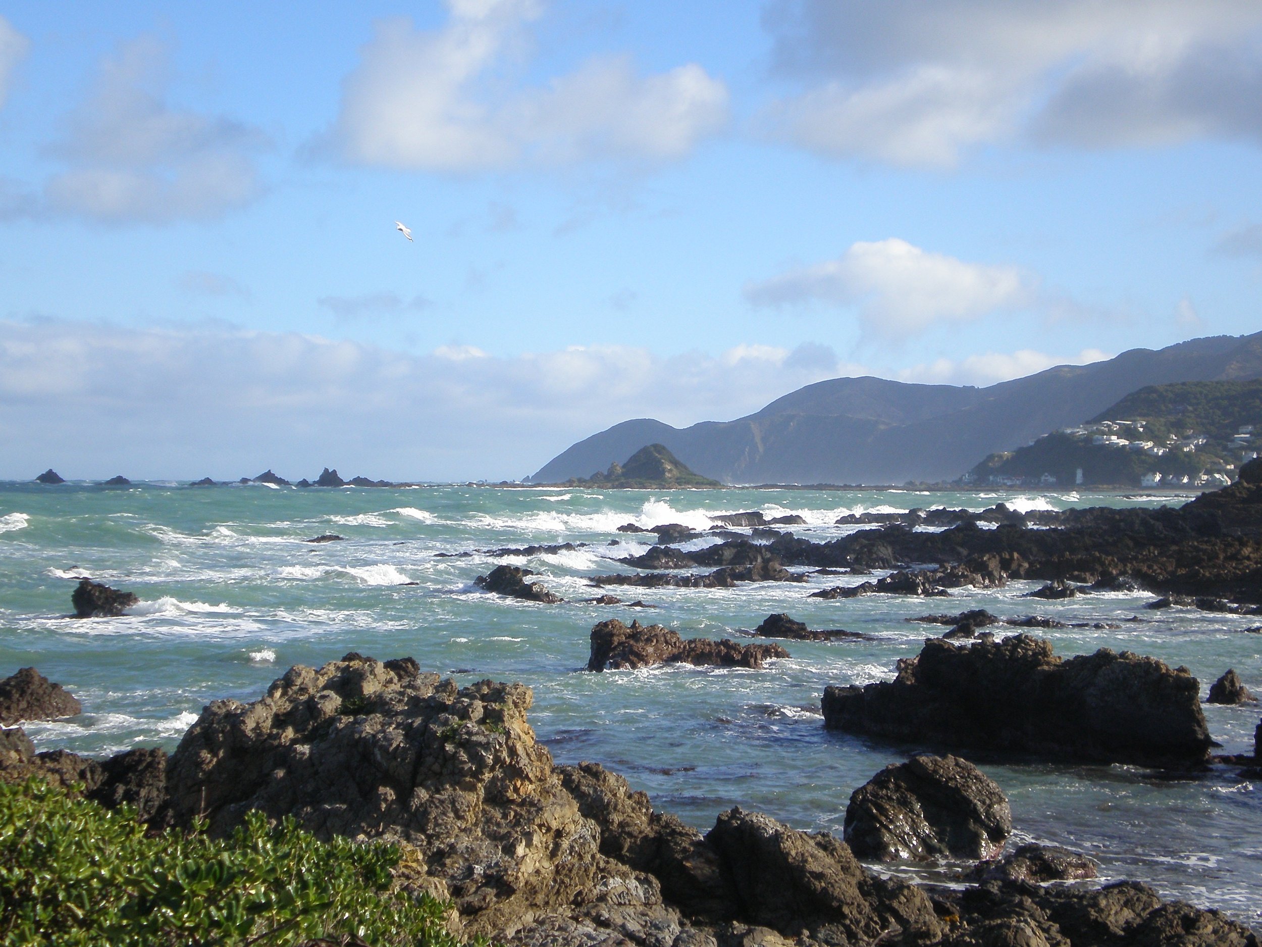
I found some photos I particularly liked and I cropped them to see what they might look like on a 12″ x 36″ canvas.
Sketching
Now that I have selected my reference photos I sit down with my sketch book and begin sketching some small thumbnail sketches, these are just quick two minute sketches. Once I have a good idea for a composition I complete a final sketch.
The main purpose of my sketch is to plan a composition and establish a value arrangement for the subject I will paint.
These are my thumbnail and final sketch for my proposed Wellington seascape.
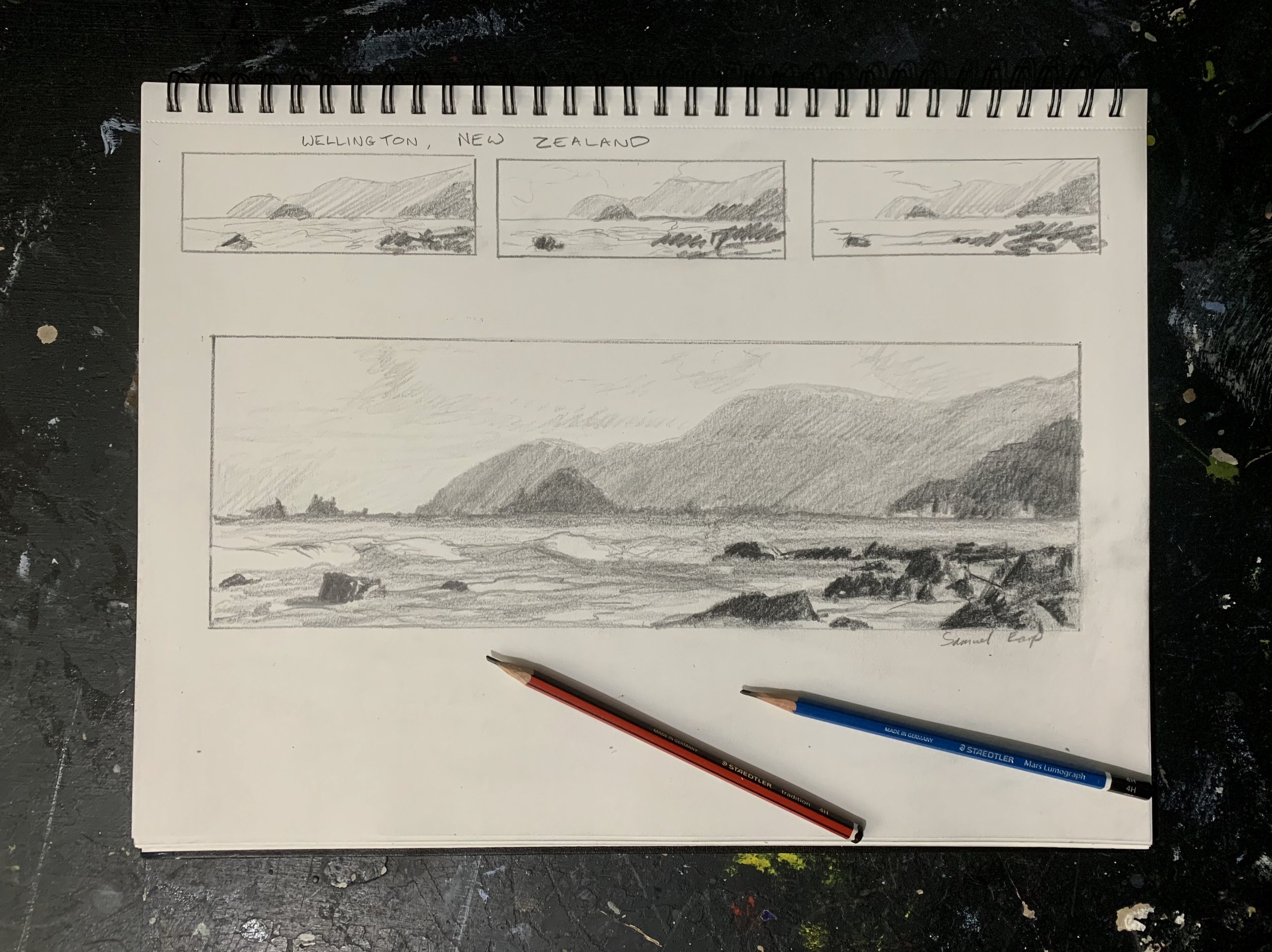
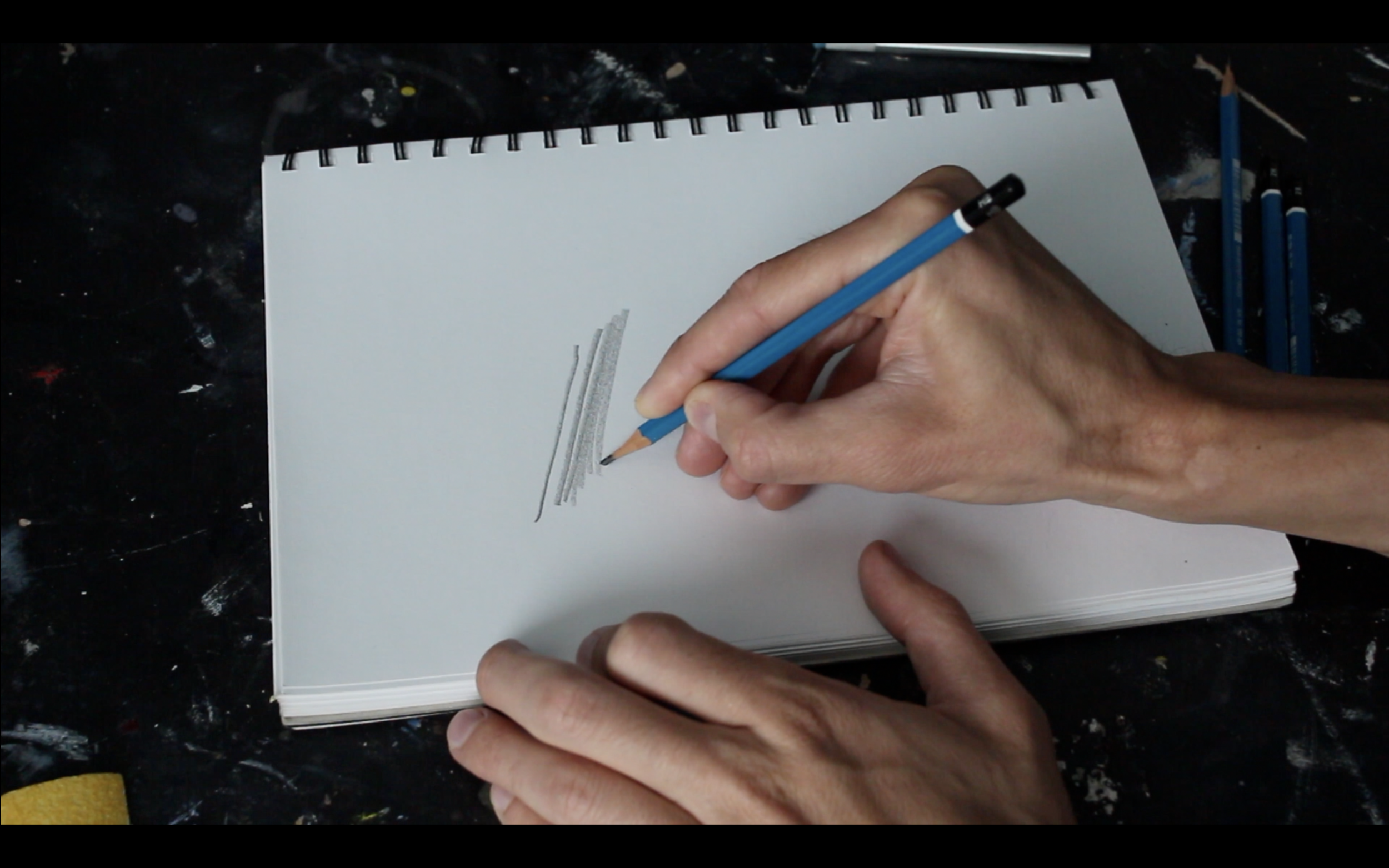
When sketching a composition I used five pencils including a 4H, 2H, HB, 2B and 4B. I use the 4H and 2H pencils for lighter values and 2B and 4B for dark values.
I sharpen my pencils with a craft knife and file the tip with sandpaper so its on an angle.
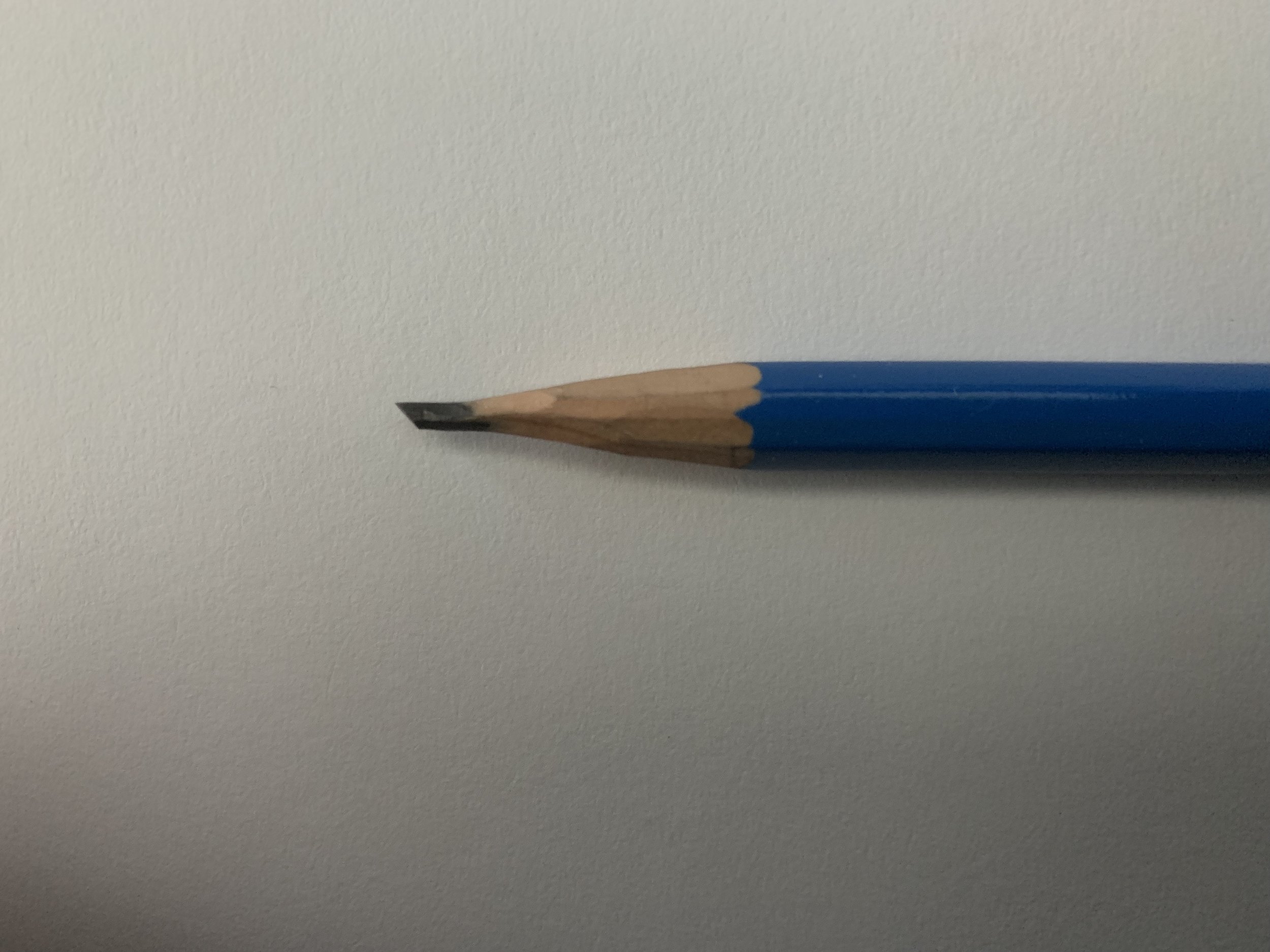
When I sketch, I use a method similar to the artist Ted Kautzky known as the broad stroke pencil method. This is where you can use the filed end of your pencil to produce broad pencil marks which is great for shading in large areas in your drawing. I can use the opposite edge of the pencil tip for finer marks.
Composition
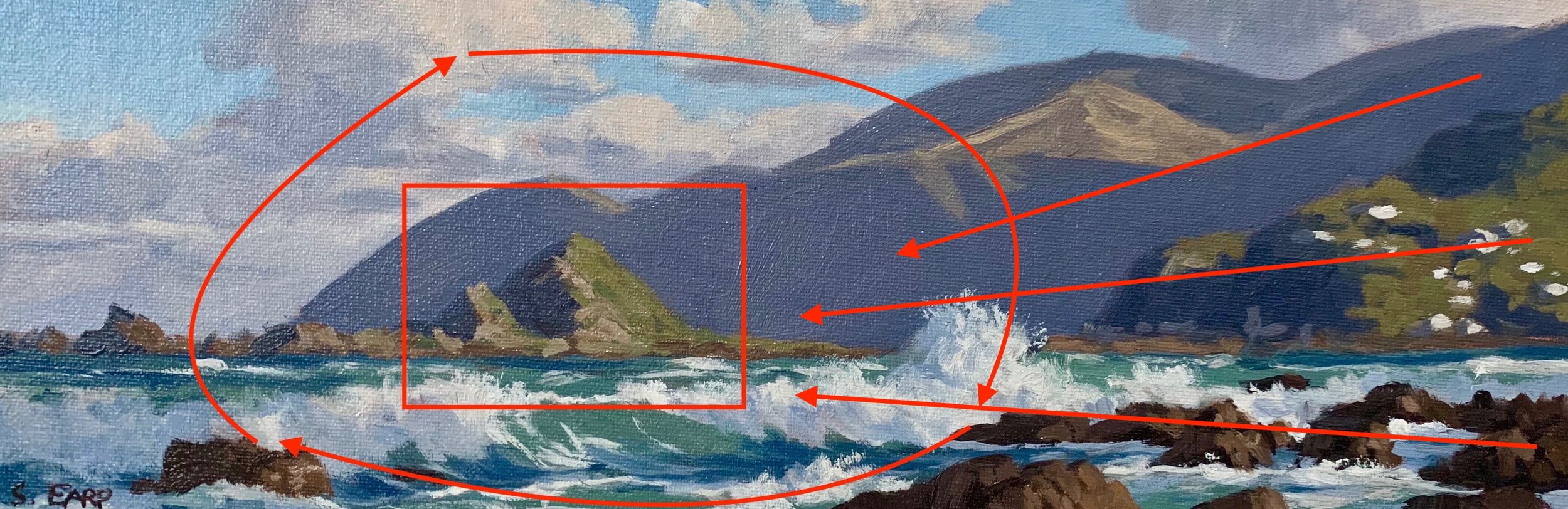
Whilst this is a long painting I have made the mid ground rock the general focal area of the painting with a general circular composition. I have left and opening and placed the foreground rocks in a manner that leads the eye up towards the sky and then back down to the sea and the foreground rocks. The general direction of the headland and cliffs also leads the eye back towards the mid ground rock.
A circular composition is a good solid composition for keeping the viewers eye on the canvas.
Colours and Brushes
Below are the colours I am using for this painting and I am using a No.6 and No.2 flat brushes, a No.1 round brush and a 3/8″ dagger brush.
- Titanium white
- Burnt sienna
- Yellow oxide
- Cadmium yellow
- Cadmium red
- Perylene crimson
- Ultramarine blue
- Phthalo green
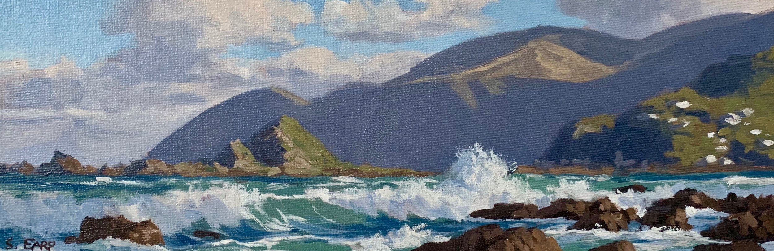
Colour Study
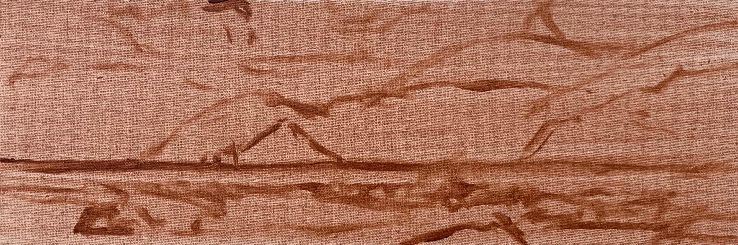
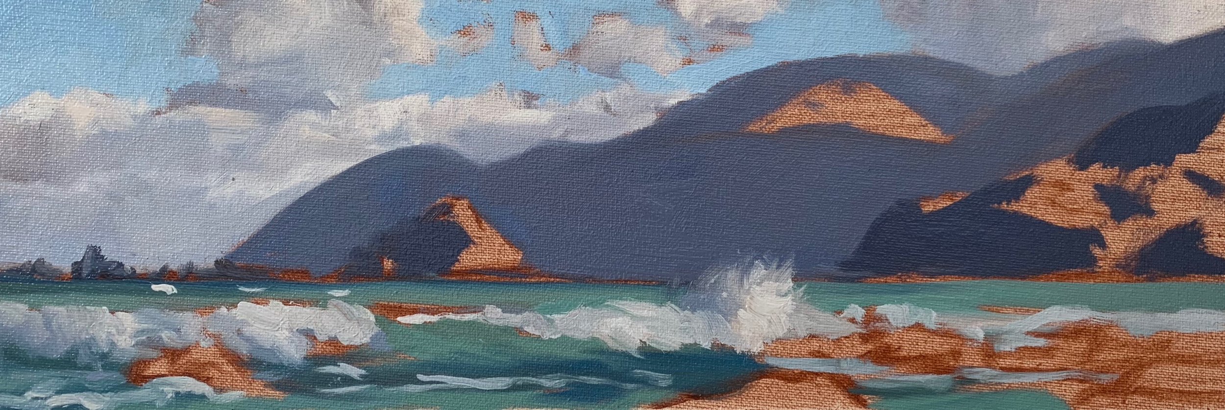
I’m using a 12cm x 36cm canvas, which I’ve tape to a board with masking tape. It’s pretty much a scaled down version of the larger canvas I will paint later on if I am happy with the colour study.
I prepared it with a layer of burnt sienna which helps with tone and colour as well as warming up the painting. I sketch out the composition with a No.1 round brush using burnt sienna.
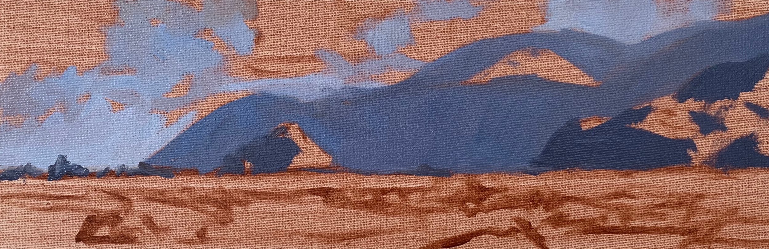
Now that I have sketched out my composition I focus on painting my shadows and getting my dark values established.
I start by painting the cloud shadows using a combination of ultramarine blue, burnt sienna, perylene crimson and a lot of titanium white and I apply this with a No.6 flat brush.
Next I paint the headland and I use the same colours but with less titanium white to darken the value. I darken the value further and use even less titanium white for the mid ground rocks and cliffs, but what is value? It’s basically how light or dark a colour is.
You may have notice I am using similar colours for the shadows, this is because I am trying to create colour harmony by using similar colours throughout the painting. By using similar colours throughout the painting will read better to the viewer.
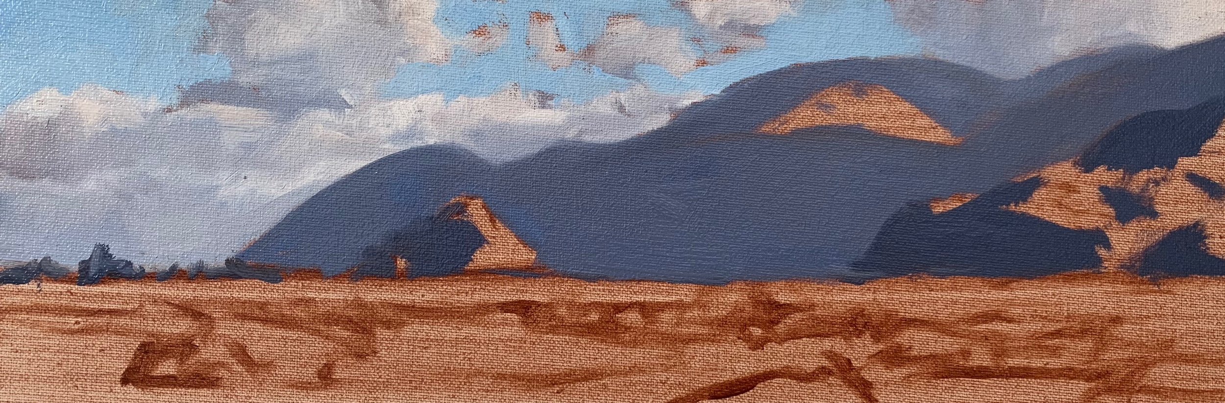
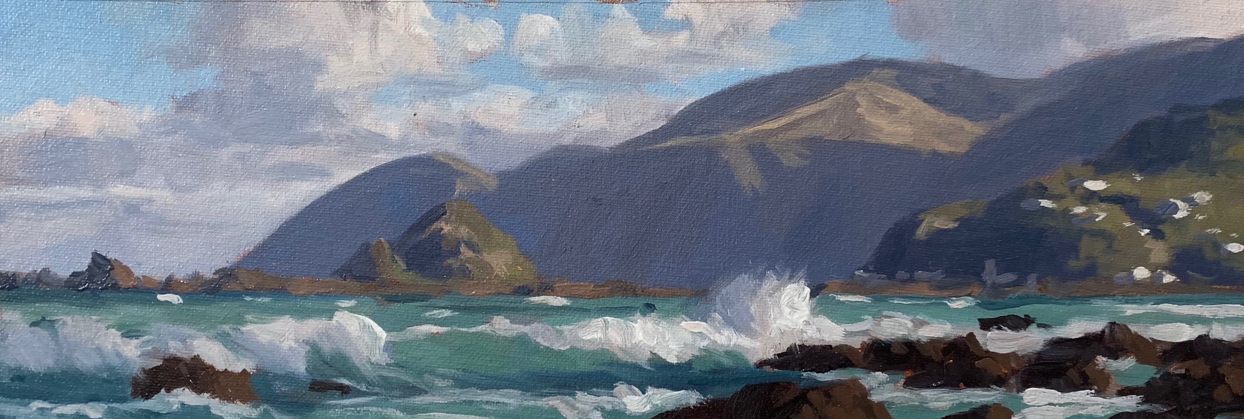
I paint the highlights on the clouds using a No.6 flat brush and a mixture of titanium white and burnt sienna. I don’t want the cloud highlights to jump too far forward so I allow it to blend in with my shadow mix.
I paint the sky with a combination of ultramarine blue, phthalo green and titanium white.
I use my existing sky mix to paint the sea but I add more phthalo green and yellow oxide ands if required some more ultramarine blue. The areas of the sea that are in shadow are darker in value so I use the same colours but less titanium white and more ultramarine blue.
I paint the shadows in the breaking wave with a combination of ultramarine blue, perylene crimson and titanium white. I use titanium white mixed with burnt sienna for the wave highlights however I leave them tonally a little darker so I can selectively add lighter tone later on in the painting to give the wave a more three dimensional form.
In order to paint the grass on the distant headland I need to desaturate my colour. The grass is golden and low in chroma (saturation) so I mix a combination of ultramarine blue, perylene crimson to create a violet colour and then add yellow oxide and titanium white. Violet is opposite to yellow on the colour wheel so the two colours cancel each other out.
The foliage in the mid ground is more saturated and vibrant in colour so I mix a combination of ultramarine blue, yellow oxide and cadmium yellow, but with these colours alone it will be too green. In order to make them look more natural I mix in a little burnt sienna, perylene crimson and cadmium red. All these colours contain red, the opposite to green on the colour wheel and so they not only desaturate the colour but it also makes the green look more organic.
I paint the rock shadows, which contain the darkest values in the painting using a combination of ultramarine blue, burnt sienna and perylene crimson, the same colours I used in my other shadows in the painting.
The rock highlights are painted using the same colours I used in the shadows but with additional cadmium yellow, cadmium red and titanium white to lighten the value and increase the saturation.
At this point in the painting I waited for it to dry so I could add a few final details to it without it mixing in with the existing paint.
I painted the foam patterns on the wave with a No.2 flat and a No.1 round brush and I used my shadow and highlight mix that I used earlier.
I paint the suggestion of houses in the mid ground and overall I am reworking some of the areas of the painting, adding lighter tone to the clouds, mid ground cliffs and rocks and the breaking waves.
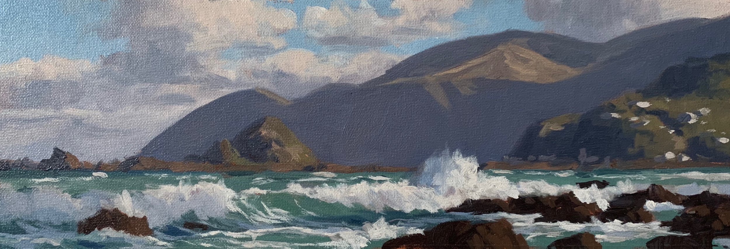
I complete the painting by adding a few highlights with pure titanium white and a very tiny amount of yellow oxide in the breaking waves and I use a 3/8″ dagger brush to create the illusion of water droplets.
I add further highlights to the sunlit faces of the rocks with the same colour combination I used earlier but with more cadmium yellow, cadmium red and titanium white added.
I was happy with this colour study and I will now use it as reference for a larger 12″ x 36″ canvas painting.
Thanks for reading 😊
