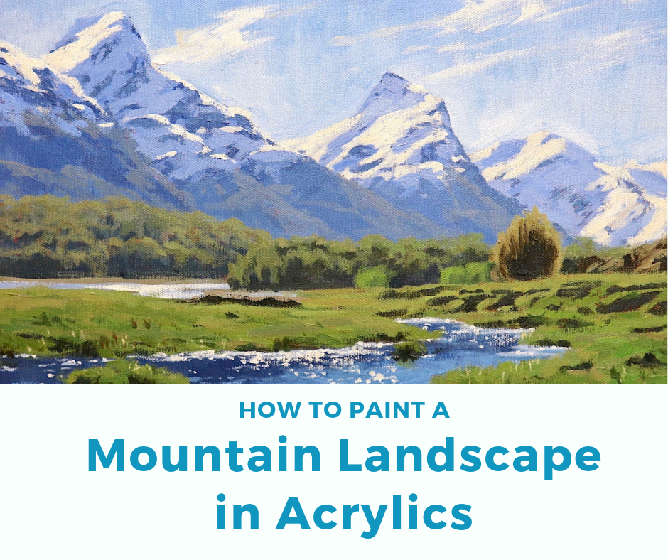
Mountains are one of my favourite subjects to paint. It’s also a good subject to paint if you are learning to paint landscapes as it’s much easier to see the different tones and values in the scene you are painting.
I normally paint art works in oils but I’ve had a few requests for me to do a painting tutorial using acrylics, so this is for the acrylic painters. However if you are an oil painter you still may find this painting tutorial useful as the principles of colour and tone are the same.
For some people painting in oils is not practical, so I wanted to show you that you can still get some good results with acrylics. Also the fact that they dry very quickly can be an advantage.
Inspiration For This Painting
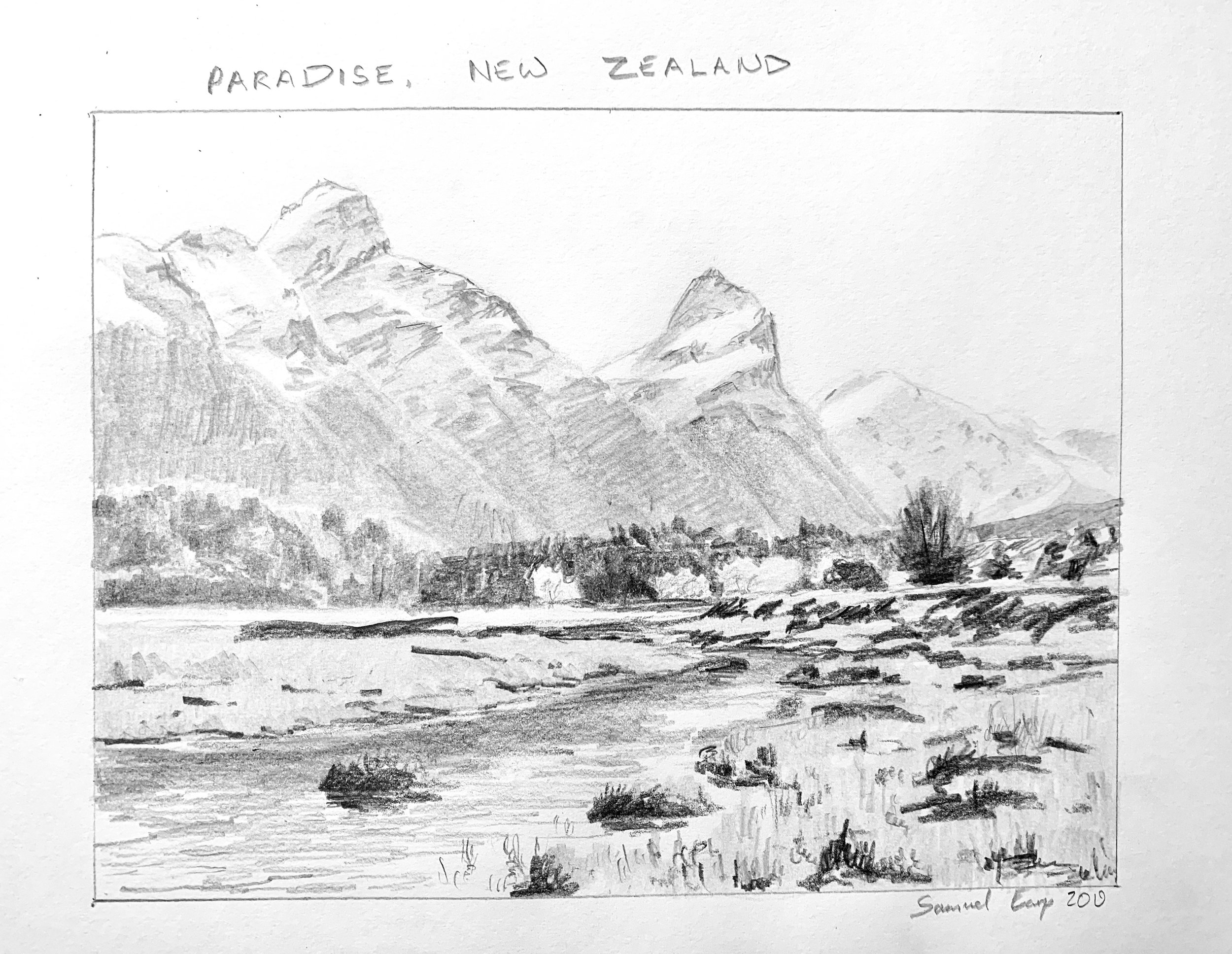
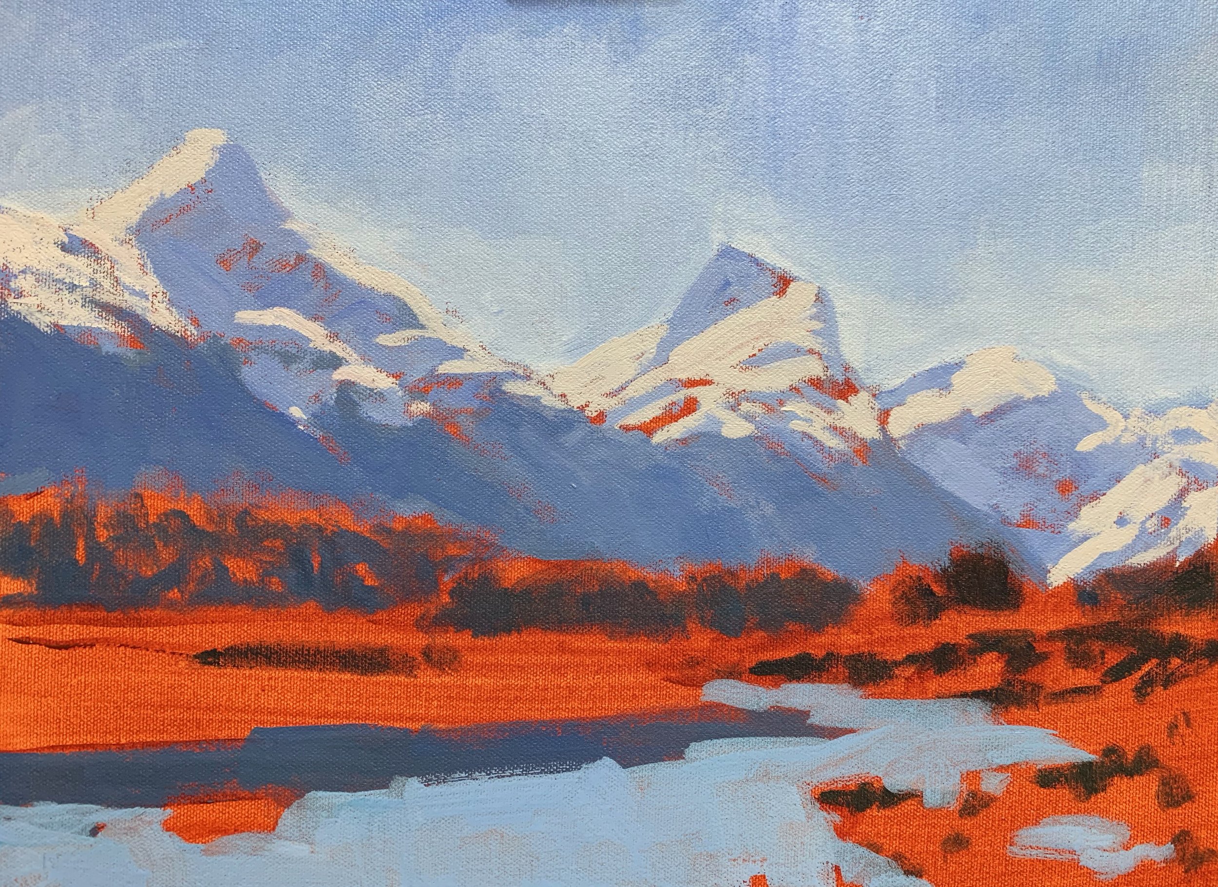
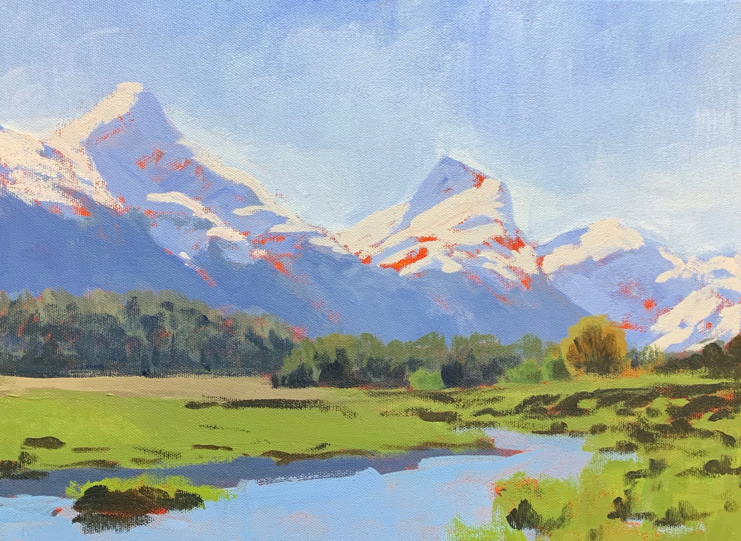
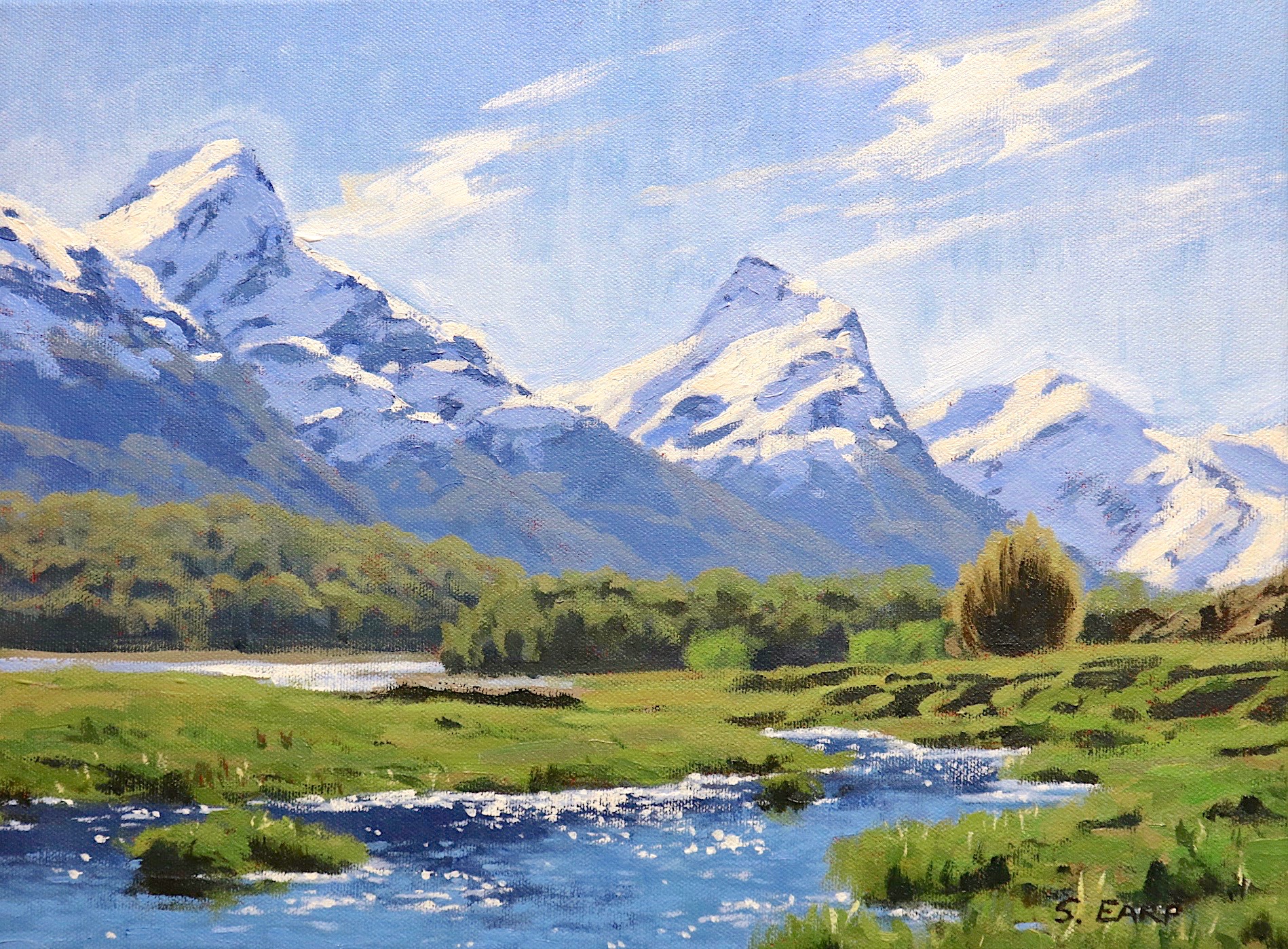
This mountain landscape is inspired by a place called Paradise in southern New Zealand. The area is surrounded by high mountains, native beech trees and a pristine landscape and it’s a place I often visit to go and paint outdoors en plein air.
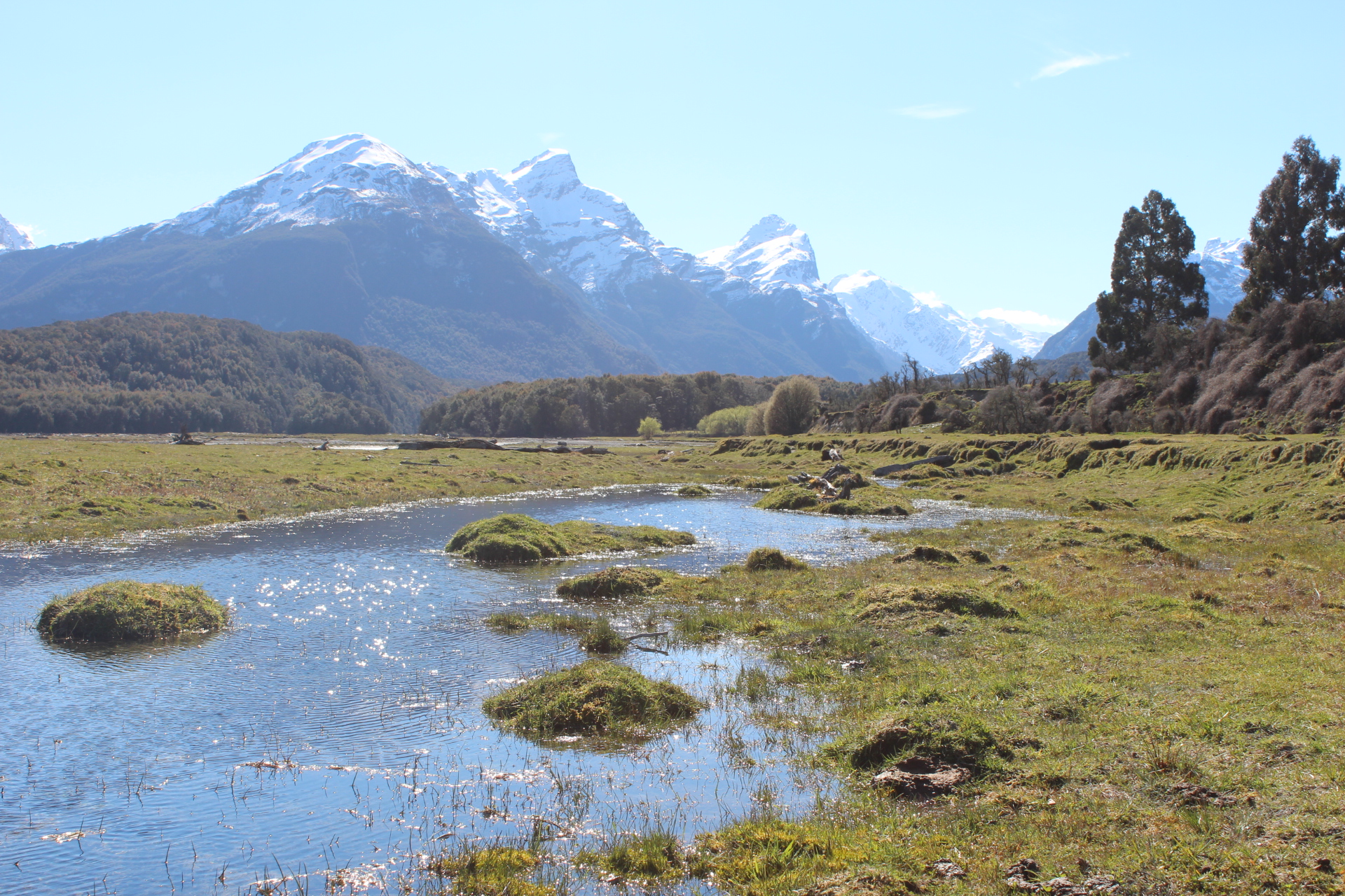
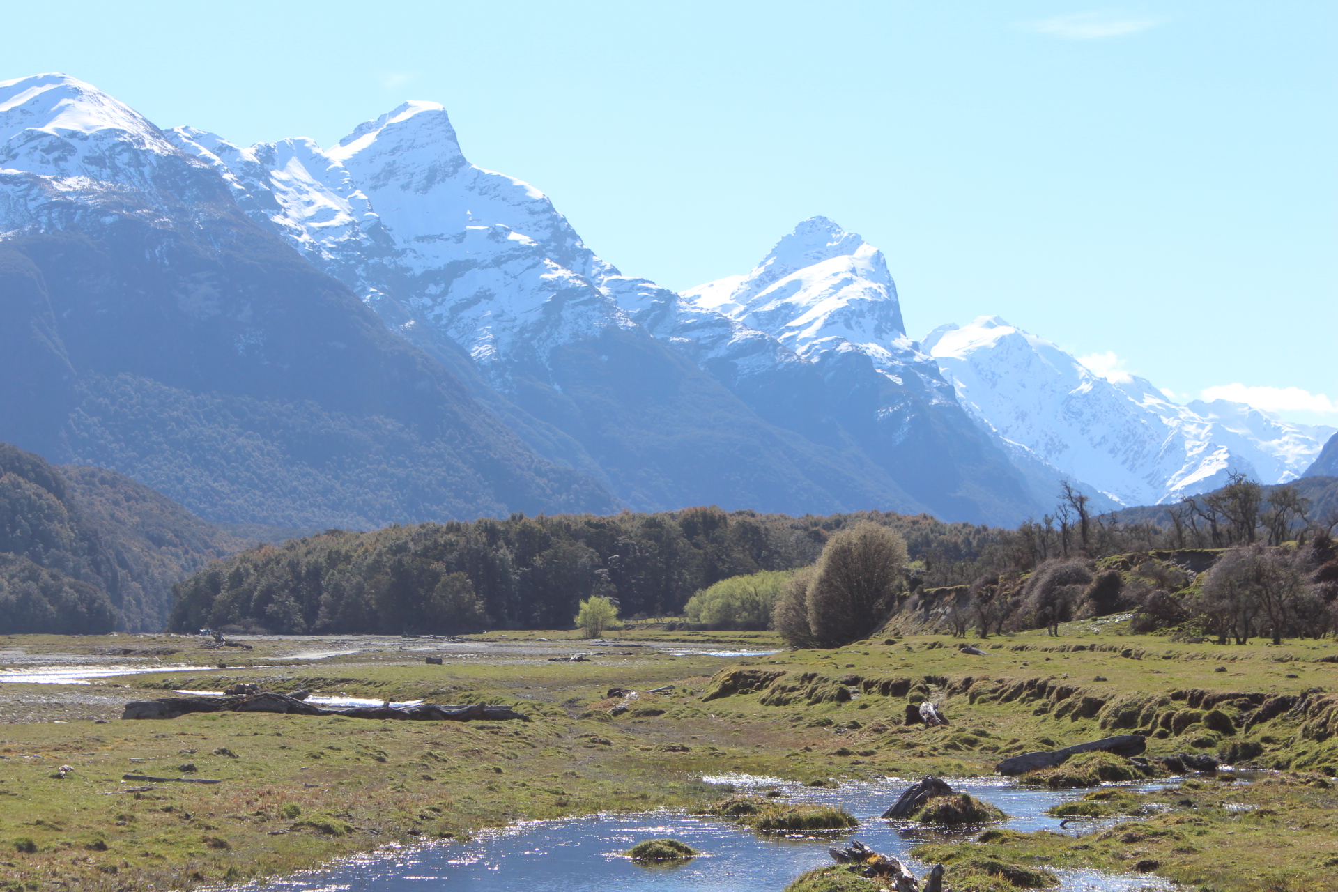
Reference Photos
Here are some of the reference photos I took. Please feel free to use them or copy them if you would like to have a go at painting this art work.
Colours and Brushes
The colours I used in this painting are as follows:
- Titanium white
- Burnt sienna
- Yellow ochre
- Azo yellow medium
- Perinone orange
- Alizarin crimson
- Ultramarine blue
- Phthalo green
I used a range of flat brushes and round brushes.
Composition
I loosely used a diagonal composition in this painting as this is a good one to use in mountain paintings especially if you want to add a sense of drama to your art work.
In general the diagonal line composition incorporates a main line or series of lines than runs form the upper left corner to the lower right or vice versa.
I have made Mt Chaos the main focal area and the water in the foreground leads the eye towards the mountain adding some rhythm to the painting.
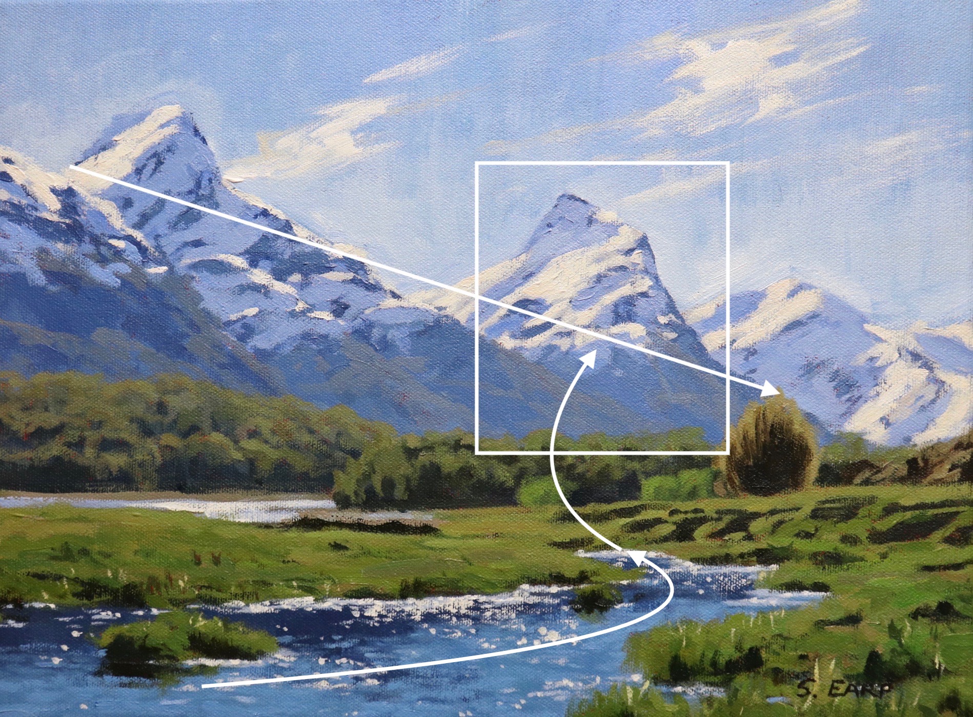
Before I began the painting I sketched out the composition and then a final sketch. I’d always recommend sketching before you begin a painting so you can create a good composition before you start.
Things to be Mindful of When Using Acrylics
The main thing with acrylics is that they dry quickly, which can be an advantage. The other thing to keep in mind is that the colours dry darker once they are dry.
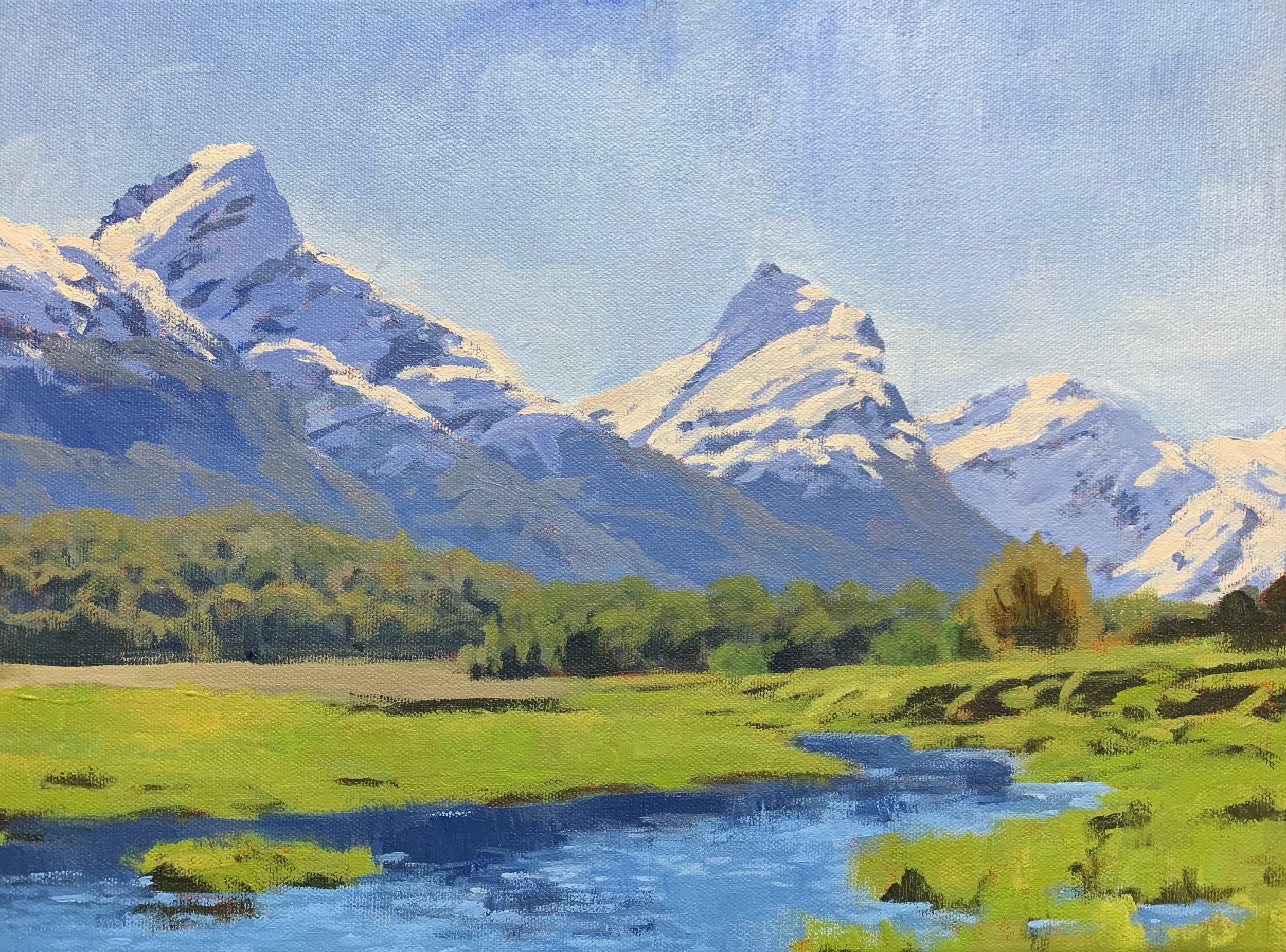
Blocking in the Painting
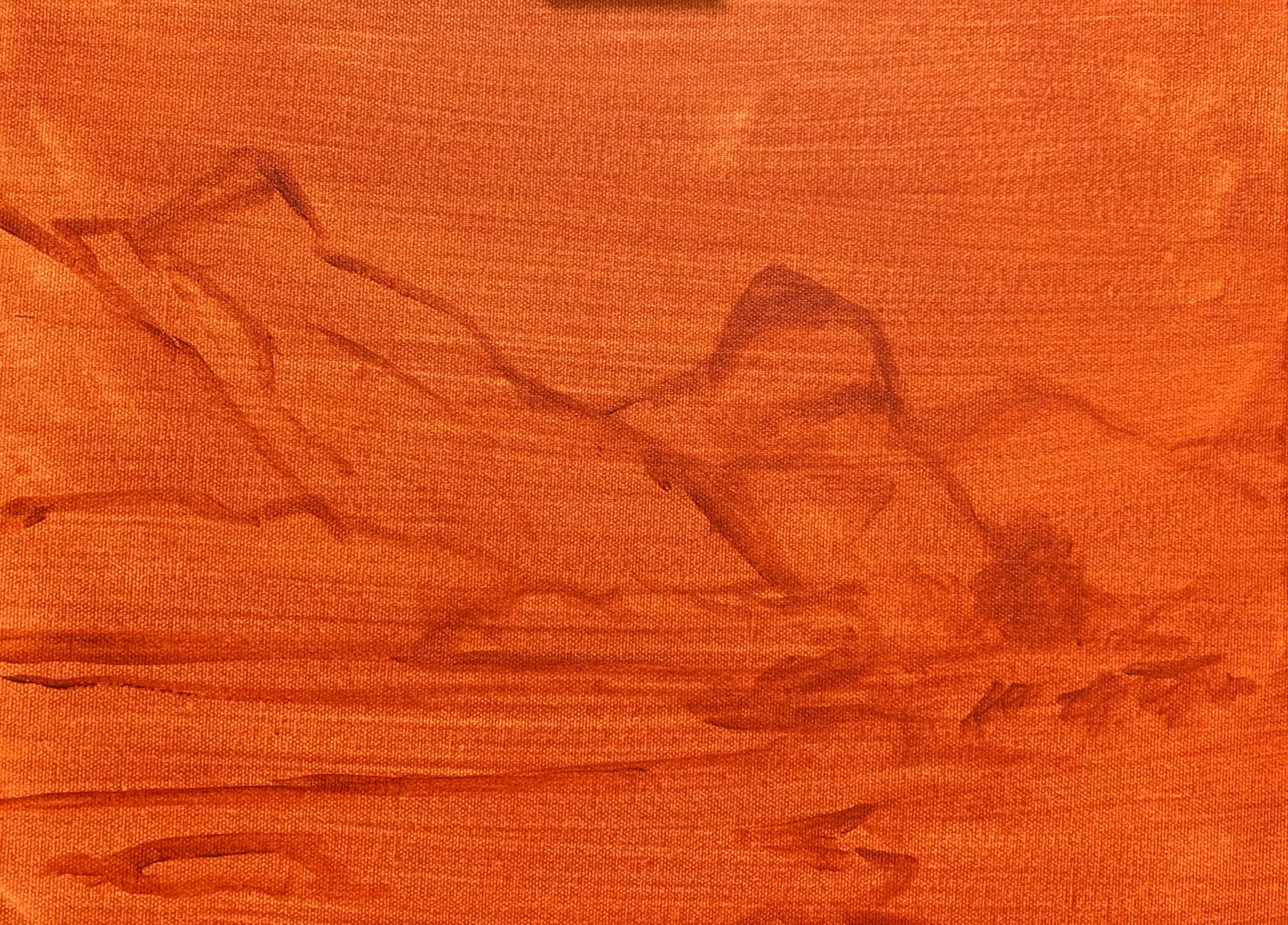
I’m painting on a 30cm x 40cm canvas. I prepared it with a layer of burnt sienna which helps warm up the painting as well as adding vibrancy to the colours.
I sketch out the composition with burnt sienna using a No.2 round brush.
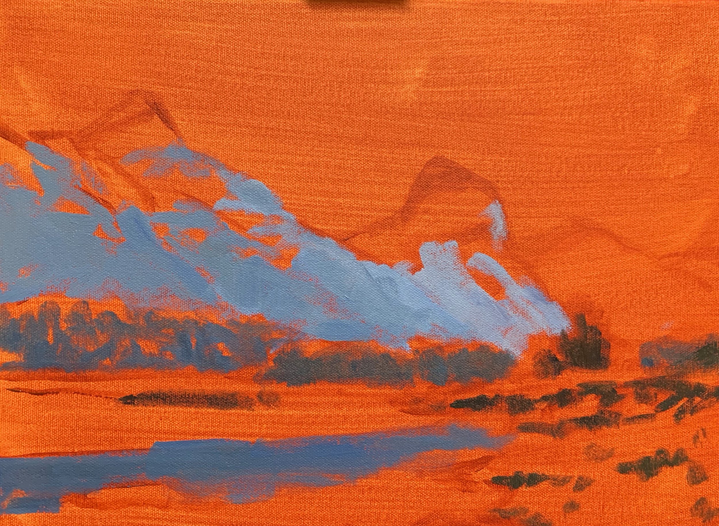
Whether I am painting with oils or acrylics I always use the same approach and that is to establish my dark values and shadows first. Value refers to how light or dark a colour is. In my opinion if you establish your dark values first you’ll find it easier to achieve the correct colour saturation and value when you come to paint the areas in light.
I start by painting the mountain shadows which are a mid-tone. I mix a combination of ultramarine blue and burnt sienna which desaturates the blue as burnt sienna is a dark orange. Orange is opposite to blue on the colour wheel and so the two colours cancel each other out when combined. I then add in a very small amount of alizarin crimson and the I lighten the colour by mixing in titanium white.
I use the same colour combination for the trees in the mid ground but I use less titanium white which darkens the value.
I use the mid ground shadow mix to paint the reflection in the water.
The shadows in the trees and the mounds of dirt are the darkest values in the painting. You’ll find your darkest darks and lightest lights in the foreground as the full extent of the tonal scale is applicable. Whereas in the distance darks are not quite dark and lights are not quite light as the tonal scale narrows.
I paint the shadows with a combination of ultramarine blue, yellow ochre and burnt sienna. I’ve used yellow ochre to add in a green element to my shadows.
ARE YOU STRUGGLING WITH YOUR PAINTING?
JOIN MY ONLINE ART SCHOOL AND UNLEASH YOUR INNER ARTIST.
- Step-by-Step Painting Tutorials
- Helpful Tips and Techniques
- In-depth lesson notes
- Inspiring reference photos
- Instant access to all content, including videos, lesson notes, reference photos and more.
- A vibrant and friendly community, meet other members, ask questions, and share your art.
- Zoom meetings for Q&A’s, painting critiques and painting livestreams.
- Ideal for beginners and experienced painters.
- Lots of inspiration, help and support to take your painting skills to the next level.
I’m using the biggest brush that I can get away with, a No.6 flat. This way I can cover ground quickly and achieve a more painterly effect.
I paint the snow shadows on the side of the mountains using a combination of ultramarine blue, titanium white and a very small amount of alizarin crimson to give the mixture a violet tint.
I need to make the value of the snow that is in full light a little darker so I can add lighter layers later on in the painting that will help to make it look more realistic. I mix a combination of titanium white, ultramarine blue, burnt sienna and alizarin crimson.
I paint the sky with a combination of ultramarine blue, titanium white and then a tiny amount of phthalo green which adds a richness to the blue. I use the same sky mix to paint the water which is mostly reflecting the sky.
The colour in the mid ground trees is not overly saturated but not massively high in chroma either, so I mix a combination of ultramarine blue, yellow ochre and burnt sienna to start with. I’m going to come back to these later on in the painting.
The green of the grass is lighter in value compared with the mid ground trees. It’s also quite saturated and so for this I mix ultramarine blue, azo yellow and then I round off the colour with perinone orange and alizarin crimson. If I want to soften the green and warm it up a little I can add yellow ochre. I can lighten the value by adding in titanium white but beware that it will also desaturate the colour as well.
The willow tree foliage is a very similar colour to the grass so I mix in a little phthalo green to my existing green mix.
The tree closest in the foreground is a combination of a little of my green mix, azo yellow, perinone orange and titanium white. If the colour is too saturated I can mix in a little burnt sienna or ultramarine blue.
Adding Detail
Once the blocking in stage is complete I start adding detail. I start by painting in more snow shadows on the mountain but using some slightly lighter colour to indicate reflected light. It’s still the same colour combination as I used in the blocking in stage but with a little more titanium white to make the value lighter.
I add lighter snow to the area that are in full sunlight but I still make the value a little darker by mixing in ultramarine blue, burnt sienna and alizarin crimson to the titanium white. However this layer is lighter than the previous layer.
I paint in areas of exposed rocks within the mountains.
I add more layers to the mid ground trees but I increase the saturation a little. I still start of with a mixture of ultramarine blue, yellow ochre and burnt sienna but I also add some azo yellow and a little perinone orange. I then mix in some titanium white.
I tidy up the shadows in the trees by mixing a combination of ultramarine blue, yellow ochre and burnt sienna which adds a new dimension to the previous layer.
I start painting in reflections and ripples in the water using the same colours as I used in the sky but with more titanium white added.
I add more texture to the grass by varying my combination of colours that I am using to mix the greens. I am still using ultramarine blue, azo yellow, perinone orange, alizarine crimson and titanium white. Here and there I also mix in phthalo green and / or yellow ochre.
I start painting in the sparkles in the water but I keep the value of the white a little darker by mixing in ultramarine blue, burnt sienna and alizarin crimson.
I add more detail to the mountains including the distant trees that are in light. Because they are so far away the green doesn’t travel well over long distances and so the colour is desaturated. For this I mix a combination of ultramarine blue, yellow ochre, alizarin crimson, burnt sienna and titanium white. You will only need a small amount of yellow ochre and alizarin crimson and burnt sienna. Use the titanium white until you get the right value.
I sharpen up the shadows in the foreground.
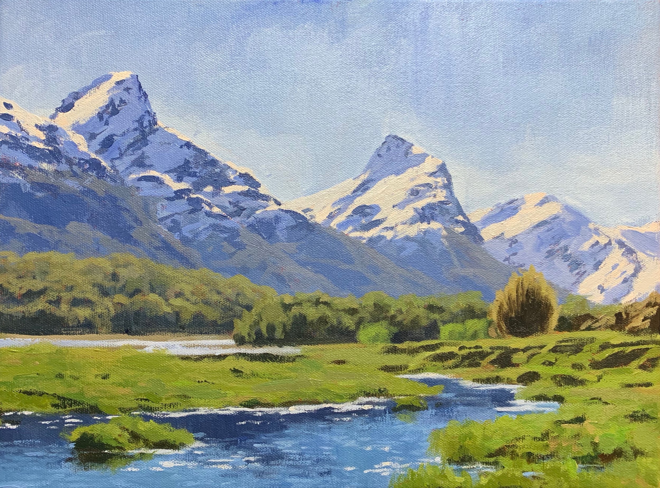
Final Details
I add my final lightest layers of snow and for this I use a combination of titanium white with a tiny amount of azo yellow to warm up the white. I apply it selectively to the mountain snow as final highlights to indicate areas of snow that is reflecting the direct sunlight.
I use the same colour mix to paint the sparkles in the water which I apply with a No.1 round brush.
I use a No.12 filbert brush to paint the wispy clouds in the sky.
I add the suggestion of blades of grass in the foreground.
Thanks for reading 😊
