
Have you ever attempted to paint grass in oils, only to end up with an unrealistic mess? Do you have difficulty mixing greens to paint grass? Or you’re just starting and need help figuring out where to begin. Fear not, fellow artist!
This comprehensive oil painting tutorial guide reveals tips and techniques to create breathtaking landscapes with realistic grass. This blog post will provide strategies, great tips and unique ideas to add creativity and interest to your grass oil paintings based on my experience in painting grass landscapes.
Suitable for oils and acrylics.
Choosing the Right Oil Paints
When painting landscapes, choosing suitable oil paints is essential for capturing nature’s vibrant colors and textures, including the grass. There are some factors to consider when selecting oil paints, especially for painting subjects such as landscapes and grass.
The quality and brand of oil paints you use are one of the most critical factors in the success of your oil paintings. Choosing high-quality oil paints from reputable brands ensures consistency, durability, and better color retention.
Artists Quality vs Student Quality Oil Paint
Always use professional-grade artist-quality oil paint, and never use student-grade paint, even if you are a complete beginner. Artists’ quality oils typically have a higher pigment concentration, producing more vibrant colors and better coverage.
While professional-grade oil paint may be pricier, quality paints can significantly enhance your artwork’s overall appearance and longevity. Although there is an initial cost upfront when buying artists’ quality oils, I have found that the more expensive colors last much longer.
Get Your Free eBook
Color Mixing
The green grass itself is not uniform but consists of various shades and tones. When I mix greens, I prefer to combine them with blue and yellow rather than using pre-mixed greens, as this helps with the overall color harmony in your painting.
The one pre-mixed green I use for painting landscapes, especially with grasses, is thalo green which I use to boost the saturation of an existing green I have mixed. Thalo green creates lovely emerald tones, especially for painting rich grasses and greens.
Check out this article if you want more information on selecting oil paints.
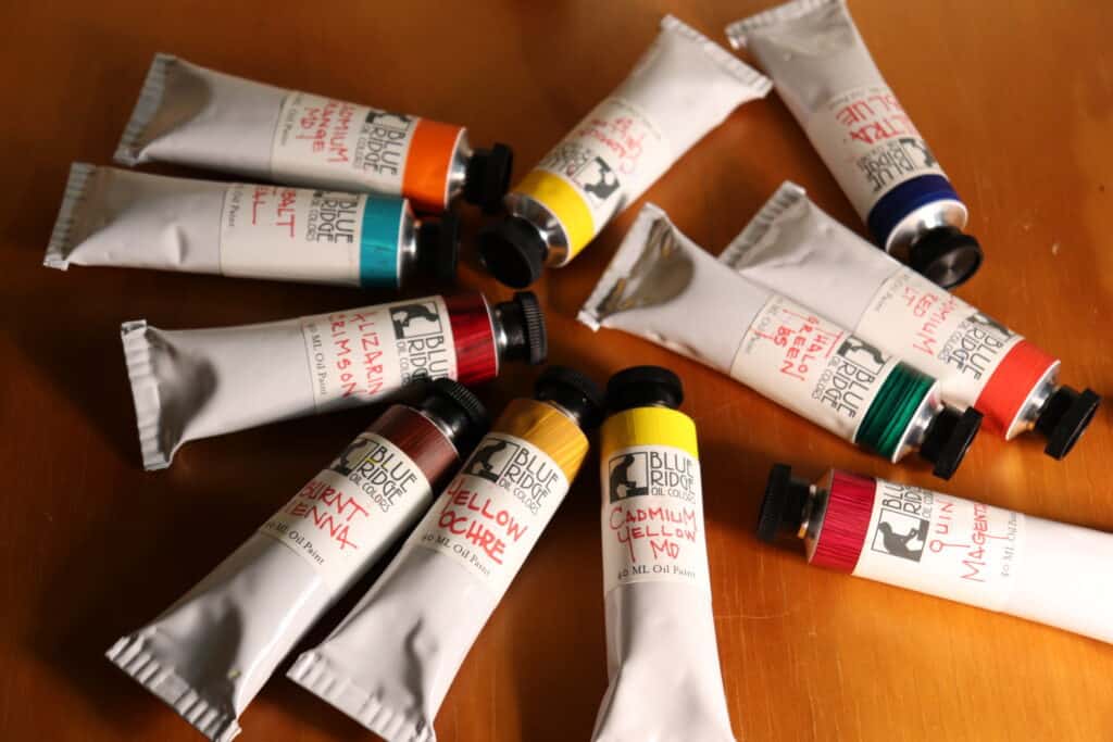
Recommended Color Palette for Painting Landscapes and Grass
The following list of oil paints is the ones of paint I use for my own landscape paintings. It is a simple palette, but you can paint any landscape with these colors, including grass.
Titanium white
Burnt sienna
Yellow ochre
Cadmium yellow
Cadmium red light
Alizarin crimson
Ultramarine blue
Thalo green
How to Mix Green Color for Grass
Green is one of those tricky colors, and mixing the right shades of green is essential when painting grass in oils; otherwise, your colors can look awful.
First, it’s important to remember that greens are rarely just one color. Instead, they’re often made up of a combination of yellow, blue, and sometimes even a touch of red or brown.
Tonal Values
An important factor when painting grass is to consider the tonal values. Value is how light or dark your subjects are, and grass tends to be one of the lighter values in the landscape.
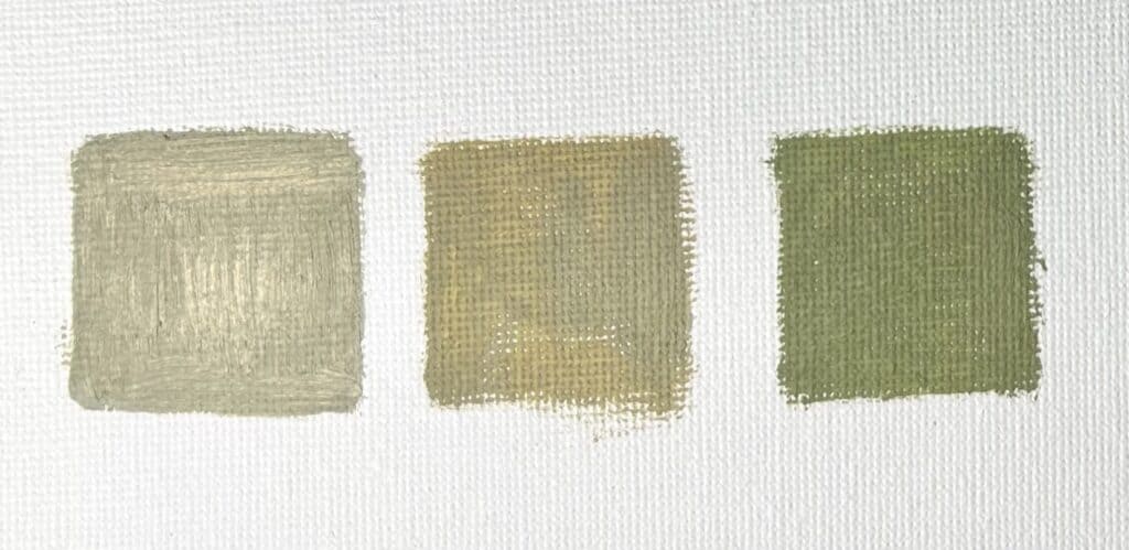
Basic Grass Green Mix
Here is a recipe for mixing a color scheme of essential grass green that you will find in the foreground of a landscape painting.
You can mix a vibrant natural grass green using ultramarine blue, cadmium yellow, a little cadmium red light, and titanium white.
Adding a little red will help to desaturate and balance out your green. Mixing in yellow ochre will warm your green, and mixing in some Thalo green will increase the saturation of your color.
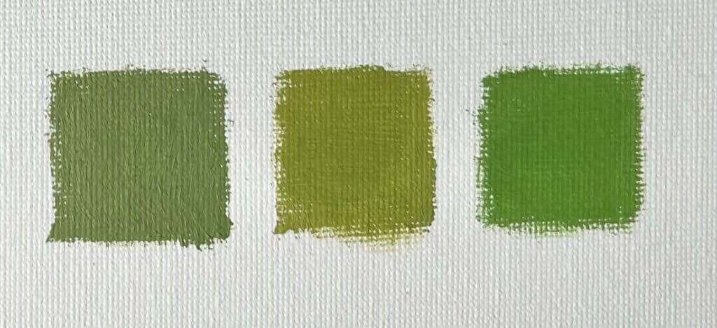
Finally, feel free to add other colors to your greens. A touch of red or brown can create a more earthy, natural-looking green, while a white touch can help create a softer, more pastel shade.
ARE YOU STRUGGLING WITH YOUR PAINTING?
JOIN MY ONLINE ART SCHOOL AND UNLEASH YOUR INNER ARTIST.
- Step-by-Step Painting Tutorials
- Helpful Tips and Techniques
- In-depth lesson notes
- Inspiring reference photos
- Instant access to all content, including videos, lesson notes, reference photos and more.
- A vibrant and friendly community, meet other members, ask questions, and share your art.
- Zoom meetings for Q&A’s, painting critiques and painting livestreams.
- Ideal for beginners and experienced painters.
- Lots of inspiration, help and support to take your painting skills to the next level.
Selecting the Right Brush for Realistic Texture
Selecting the right brush is crucial to achieving a realistic texture when painting grass in oils. A natural bristle brush, such as a flat with long, flexible bristles, is recommended, as it allows for loose strokes and the ability to create varied textures.
When painting grass in a landscape or oil painting tutorial, I find bristle flat brushes to be the most effective. I also use the biggest brushes I can get away with in the beginning stages of my painting. This will help to create a lovely textural base layer for your grass.
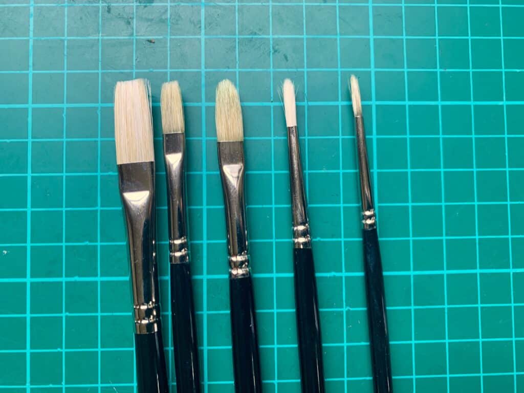
Try using a fan brush or an old flat brush with some bristles chopped away with scissors for a more detailed approach. Even the tip of an old brush where the bristles have splayed outwards, can create some exciting marks and suggestions of blades of grass.
Mastering Brushwork for Different Types of Grass
To truly capture the essence of grass in your oil paintings, you must understand brushwork, which comes with experience and ‘brush mileage’.
Different types of grass require different strokes and techniques to portray their unique textures and movements. For example, long blades of grass may be best depicted with more extended, sweeping strokes, while shorter, stubbly grass may require more choppy and rough strokes.
In my experience of painting landscapes, I have found flat brushes produce the best results when creating texture. When detail is required using an old flat brush, a fan brush, or even a dagger brush can help suggest dense grass.
Don’t Paint Every Blade of Grass
When painting grass, very often, less is more, and it is usually better to go sparingly on the details. When I show how to paint grass well, I don’t try to paint every grass blade as this will make your painting look labored. Instead, the suggestion of a few blades of grass can go a long way in creating dense-looking grass.
Also, could you consider the direction of the grass? If you are painting grass being blown by the wind, your brushstrokes and lines should reflect the direction of the wind. This can be achieved by using a light, feathery stroke in the same direction as the wind.
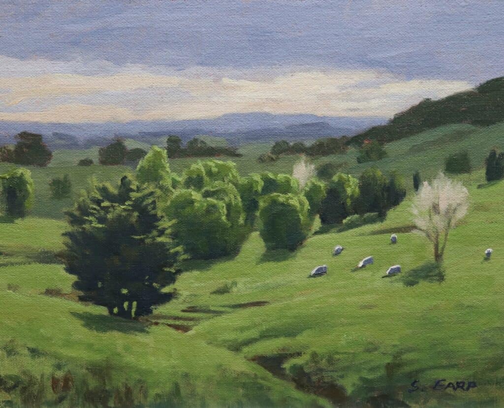
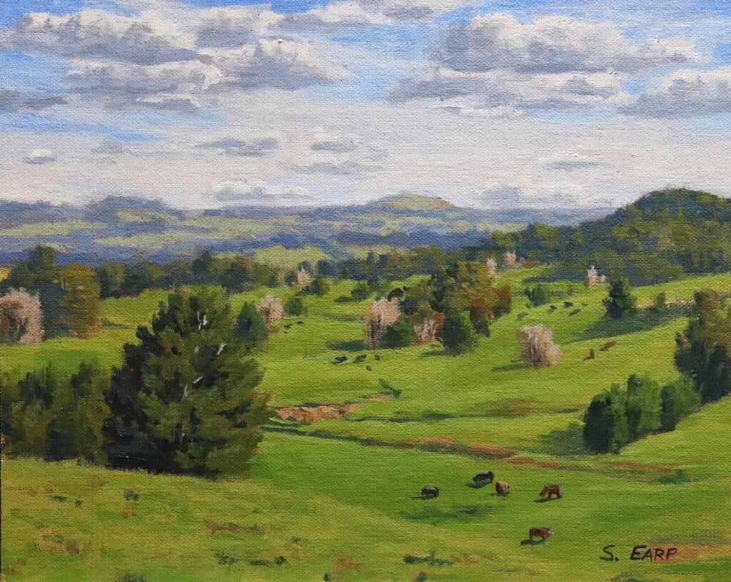
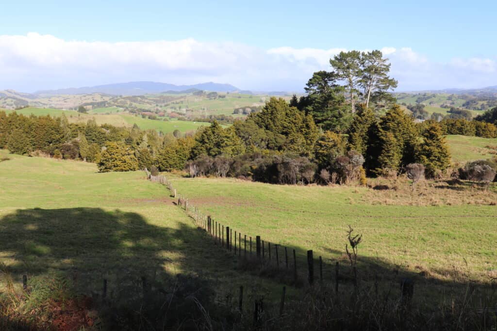
Creating Atmospheric Depth with Distant Grass and Hills
To truly capture the essence of a landscape, it’s essential to create atmospheric depth. This is where distant hills and landforms look like they are receding into the distance.
By painting these elements in different directions to reflect their distance from the foreground, you can create a three-dimensional effect that draws the viewer into the scene.
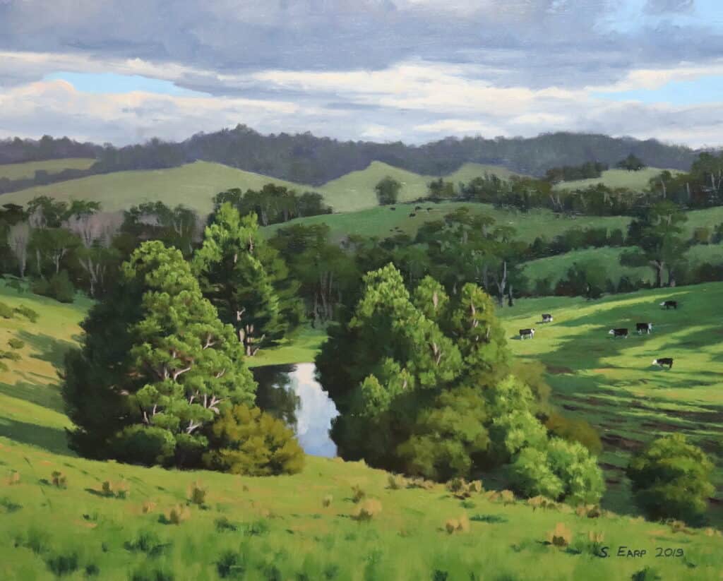
One way to do this is to use lighter tones and less detail in the distant grass and hills. This helps to create the illusion of distance, as things that are further away are naturally less distinct.
Additionally, using cooler colors in the distance can help to create the impression of more depth, as objects that are farther away often appear cooler in color.
Use Low Chroma Colors
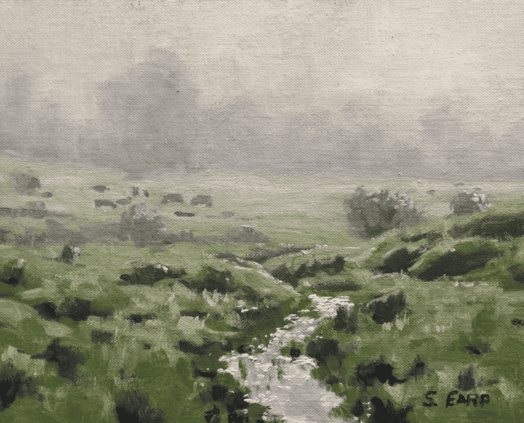
It is crucial to desaturate your colors when painting distant landforms. Green as a color tends to drop out quite quickly as it recedes into the distance. You can see this with distant grass, as the green is nowhere near as vibrant.
Another technique for creating atmospheric depth is to use a hazy or misty effect in the distance. This can be achieved using a dry or semi-dry brush, creating a slightly blurred or softened effect. By using subtle shifts in hue and value, you can make the impression of a hazy or misty distance, further enhancing the sense of depth.
Painting and Mixing Colors for Distant Greens
To truly bring the colors of a landscape to life, it’s essential to master the art of painting distant greens. This can seem daunting, but it is relatively easy.
As greens recede into the distance, they become less saturated, which means color mixing is easier as fewer colors will be required in your mix.
In many cases, the colors for distance will be slightly lighter, cooler, and less saturated than the greens in the foreground.
Our Eyes Play Tricks on Us
When observing tall grass in distant hills, it can often appear green when it might not be because the color has dropped out due to the distance. This can be observed when you isolate the color of tall grass on a distant hill when looking at the same way across the landscape.
When mixing colors for distant greens, you must use lower chroma colors.
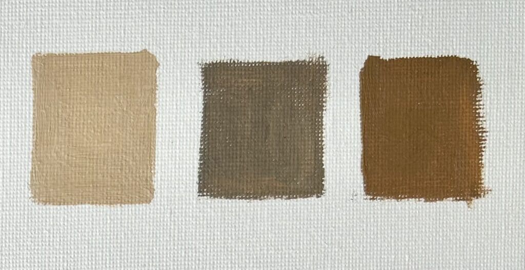
Basic Color Mix for Distant Greens
Whenever I mix a green for a distant hill, I use yellow ochre as this is a lower chroma yellow, and I mix ultramarine blue and titanium white. This will be my base green for distant grass and hills.
I can always increase the saturation of the color scheme of my greens by mixing in colors such as cadmium yellow and Thalo green.
Painting Hills
Capturing the beauty of hills in oil painting can be an exciting challenge for artists of all levels. One important consideration when painting hills is to pay attention to the perspective.
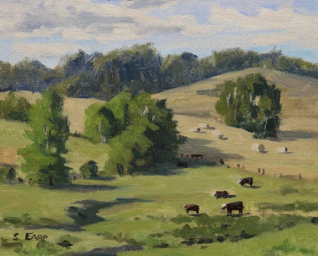
In general, hills closer to the viewer will have more visible details and sharper edges and the more saturated the green on the grass will be. In contrast, hills will appear softer and hazier farther away, and the colors will be more desaturated.
Another critical factor to consider when painting hills is the light source. The sun’s position can dramatically affect the appearance of hills, casting shadows and creating highlights that add dimension and realism to your painting. Take note of the direction of the light, and make sure to adjust the colors and shading accordingly.
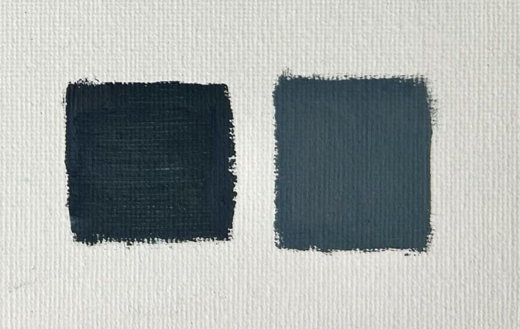
Essential Color Mix for Grass in Shadow on Hills
Using a mix of yellow ochre, dark ultramarine blue, and a little titanium white makes an excellent foundation for a grass shadow mix. Remember that grass is painted as one of the lighter values in the landscape when painting shadows.
Painting Mountain Grass
When it comes to painting mountain grass, there are a few key differences to keep in mind. First, the blades of grass tend to be thicker and sturdier due to the harsher environment of the mountains. This means that the brushstrokes used to create the grass should be thicker and more deliberate, allowing for a sense of texture and structure.
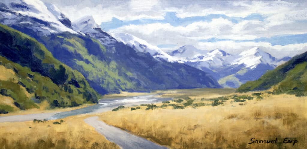
In addition, the angle of the blades may be different due to the terrain. Look closely at reference photos and observe the grass’s flow with the background mountain’s slope. This will help you to create a realistic and cohesive look.
Mountain grass tends to be straw-colored and low in chroma, so keep your color mixes simple.
Suggested Color mix for Mountain Grass
A mix of yellow ochre, burnt sienna, ultramarine blue and titanium white is ideal for creating a mountain grass color. Use more ultramarine blue and titanium white to desaturate your colors.
Painting Long Grass
When painting long grass in oils, there are a few subtle differences to remember. The blades paint grass are typically longer and more slender than regular grass, so they catch the light differently. It’s important to paint each blade with care and attention to detail to capture this effect.
One strategy is to start by painting the suggestion of lines of blades in thin, vertical strokes. This same technique will help to create the illusion of individual blades of grass rather than a single, flat shape.
Dry Brushing
Another essential technique is to use a dry brush to create the effect of wispy, delicate grass.
Dip the very tip of your brush in paint and then blot it on a paper towel until most of the color has been removed. Then, use the tip of the brush to lightly skim over the tops of the grass, creating a subtle, smooth, almost ghostly effect.
Painting Frost-Covered Grass
Painting frost-covered grass can be a captivating subject matter in a winter landscape. Here are a few tips to help you capture frost’s delicate and sparkling nature in your artwork.
You can start by watching natural frost-covered grass or reference photographs to understand how the grass grows after the frost forms on the blades. You will often find that frost-covered grass has a subtle blue cast, especially in shadow.
Choose a color palette that reflects the cool and icy nature of frost.
Suggested Color mix for Frosty Covered Grass
Whenever I mix colors for frosty grass, I keep it simple. A mix of yellow ochre, ultramarine blue and titanium white creates a great icy greenish-blue color.
Pay attention to lighting and shadows. Frost-covered grass often sparkles and catches the light, so consider how the light source shapes and interacts with the frost on the surface and the grass blades. Highlight areas that see the light and create shadows where the ice might cast a subtle shade.
Want to Learn More About How to Paint Grass?
Unleash Your Inner Artist: Master the Art of Landscape Painting!
Welcome to a special painting tutorial video bundle, where the captivating world of landscape art comes to life before your eyes. Embark on a breathtaking journey as I guide you through the creation of not just one but four magnificent landscape paintings.

Immerse yourself in these enlightening painting tutorial videos, where the secrets of crafting realistic landscapes are unveiled. Majestic mountains, serene fields, rolling hills, vibrant trees, glistening water, ethereal clouds, mesmerizing skies – discover how to capture the essence of these natural wonders and more.
But it doesn’t stop there. I’m not just revealing the final masterpiece; I’m unveiling the entire artistic process. Witness the birth of a painting as I divulge the intricate designs behind the compositions. Learn the art of color selection and value establishment, and witness the magic unfold as harmonious paintings take shape before your very eyes. Delve into the realm of color mixing as I demonstrate the alchemy on my palette, igniting your creativity.
No matter your level of expertise, these video tutorials offer a holistic approach. As I guide you from start to finish, I also unveil the principles of color theory, allowing you to grasp art fundamentals while breathing life into your creations.
Prepare to be captivated! These videos are an invaluable treasure trove of knowledge overflowing with essential information to elevate your landscape painting skills. Unlock the secrets to creating awe-inspiring artworks that command attention and stir the soul.
Once you’ve embarked on this artistic journey, the rewards are just a few clicks away. Upon purchasing this awe-inspiring video bundle, a PDF file will land in your inbox, revealing the key to unlocking a world of artistic wonder. Inside, you’ll find a link and password granting you access to these mesmerizing videos.
Choose to watch them online or savor them offline by downloading them to your personal computer. Additionally, you’ll discover invaluable lesson notes and reference photos that complement each tutorial, transforming your artistic process into pure magic.
This extraordinary opportunity is open to artists working with oils and acrylics. So, seize the moment and let your artistic dreams flourish. Unleash the power of your brush, and join me on this remarkable artistic odyssey.
The landscapes you’ve always envisioned are waiting to come alive under your skillful hand. Are you ready to create masterpieces that will leave a lasting impression?
Unlock your potential and embark on this incredible journey today!