Painting Workshop 3
Piha Beach Seascape
Lesson Notes
These lesson notes are intended to compliment the ‘Piha Beach Seascape’ painting tutorial video. I hope they help you to gain a better understanding of seascape painting techniques, composition, colour mixing, painting tonality and how to create atmospheric depth.
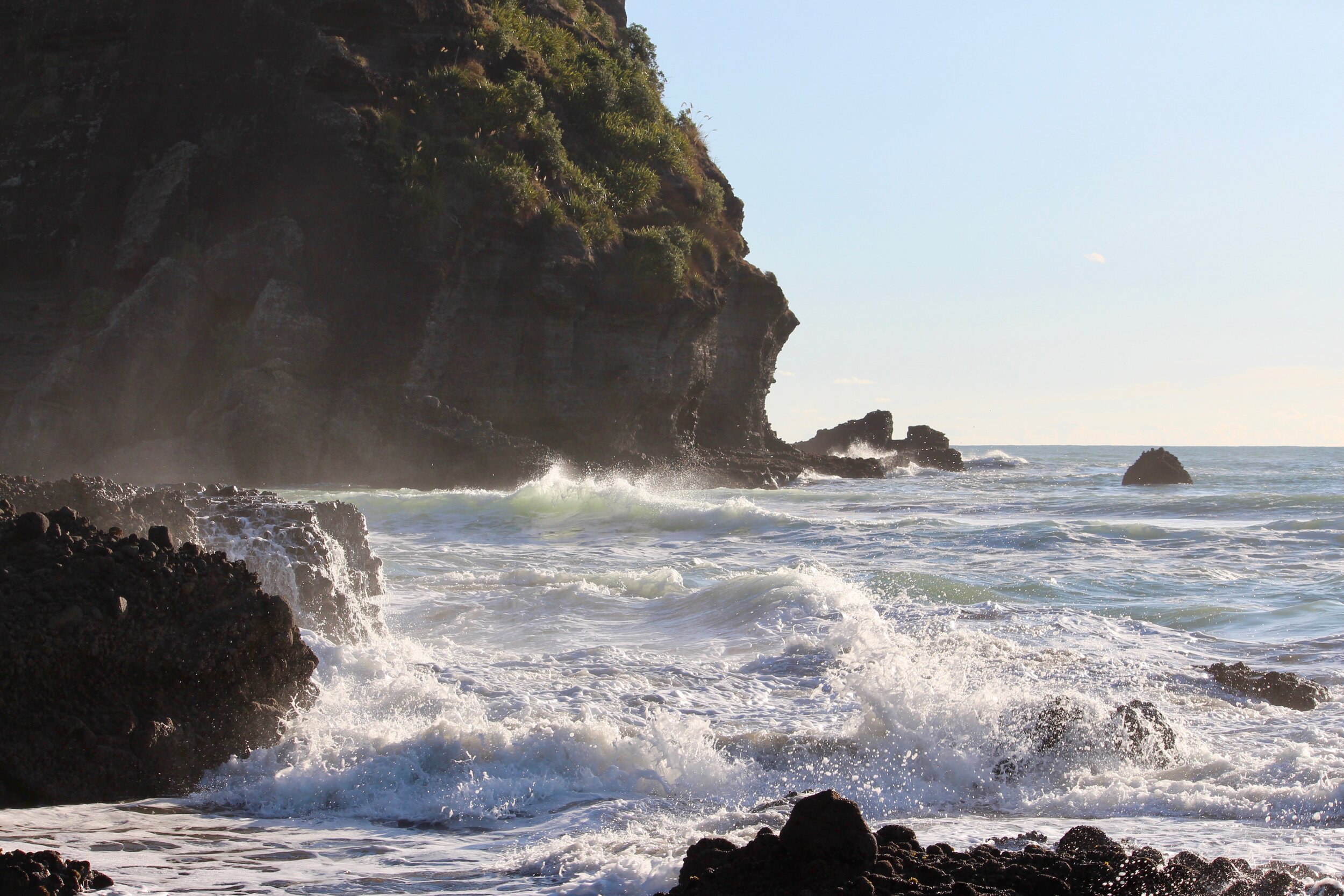
Reference Photos
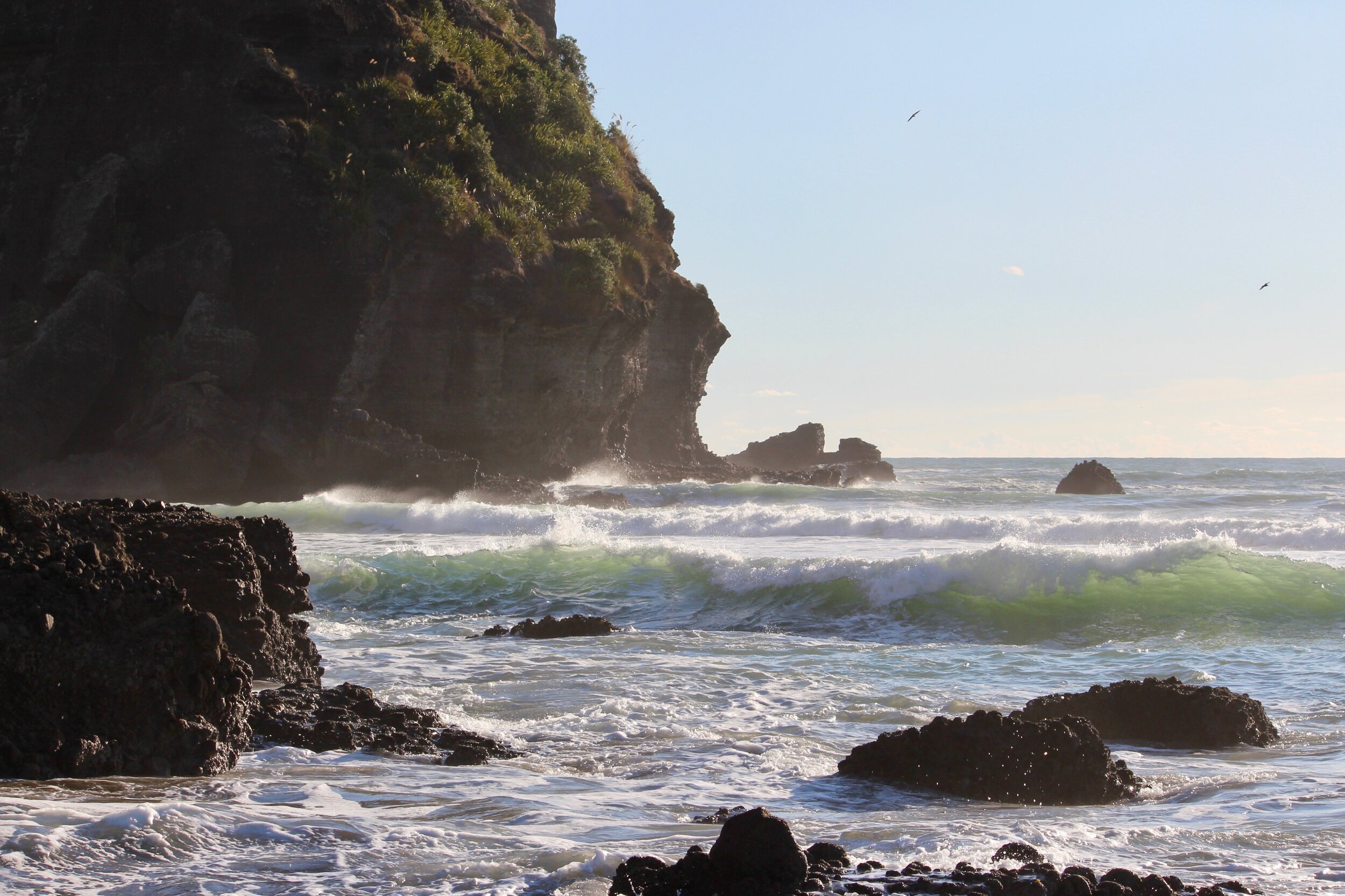
Here are the reference photos I used for this painting. Feel free to copy and use them.
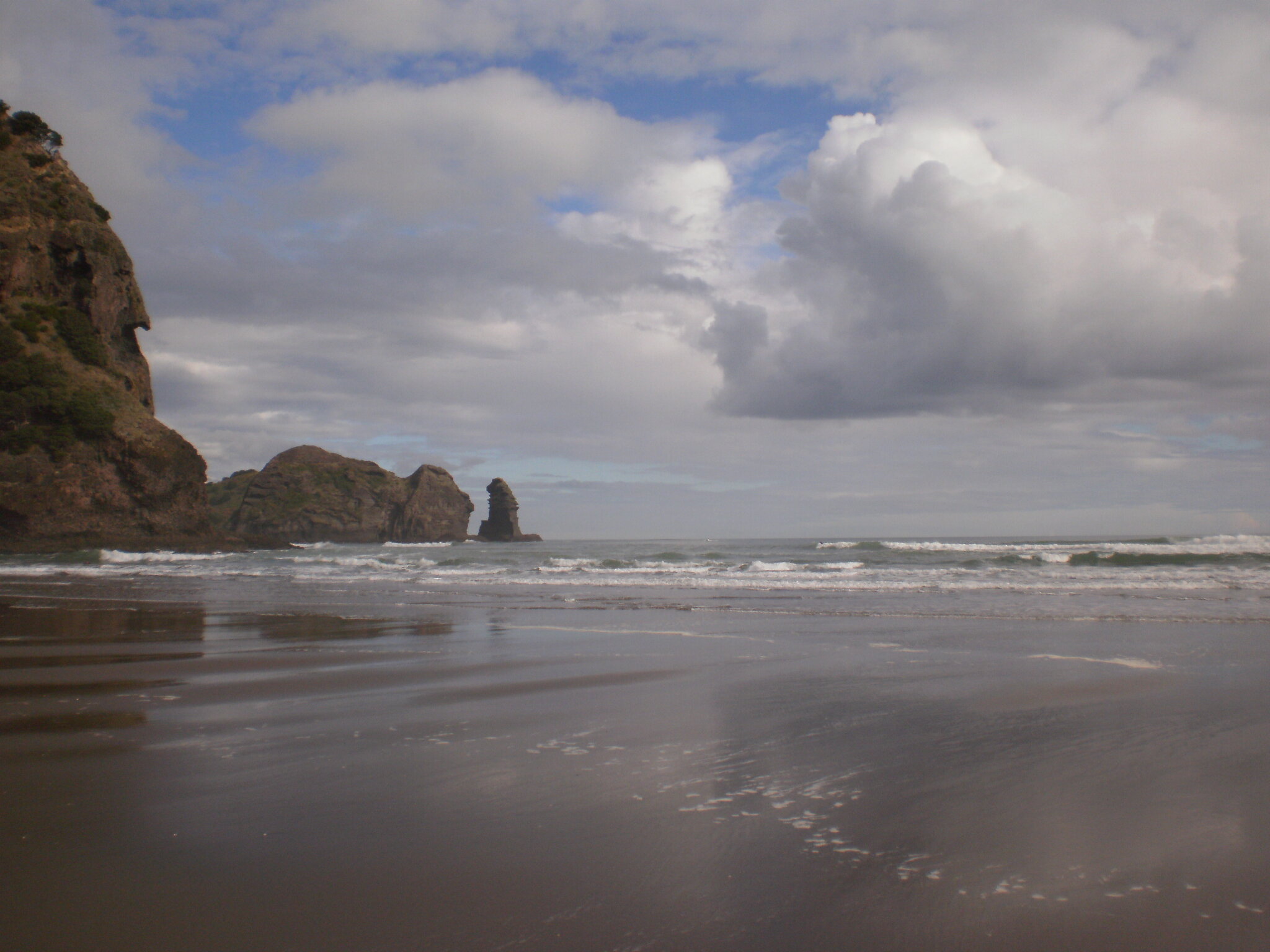
Cloud reference

Composition
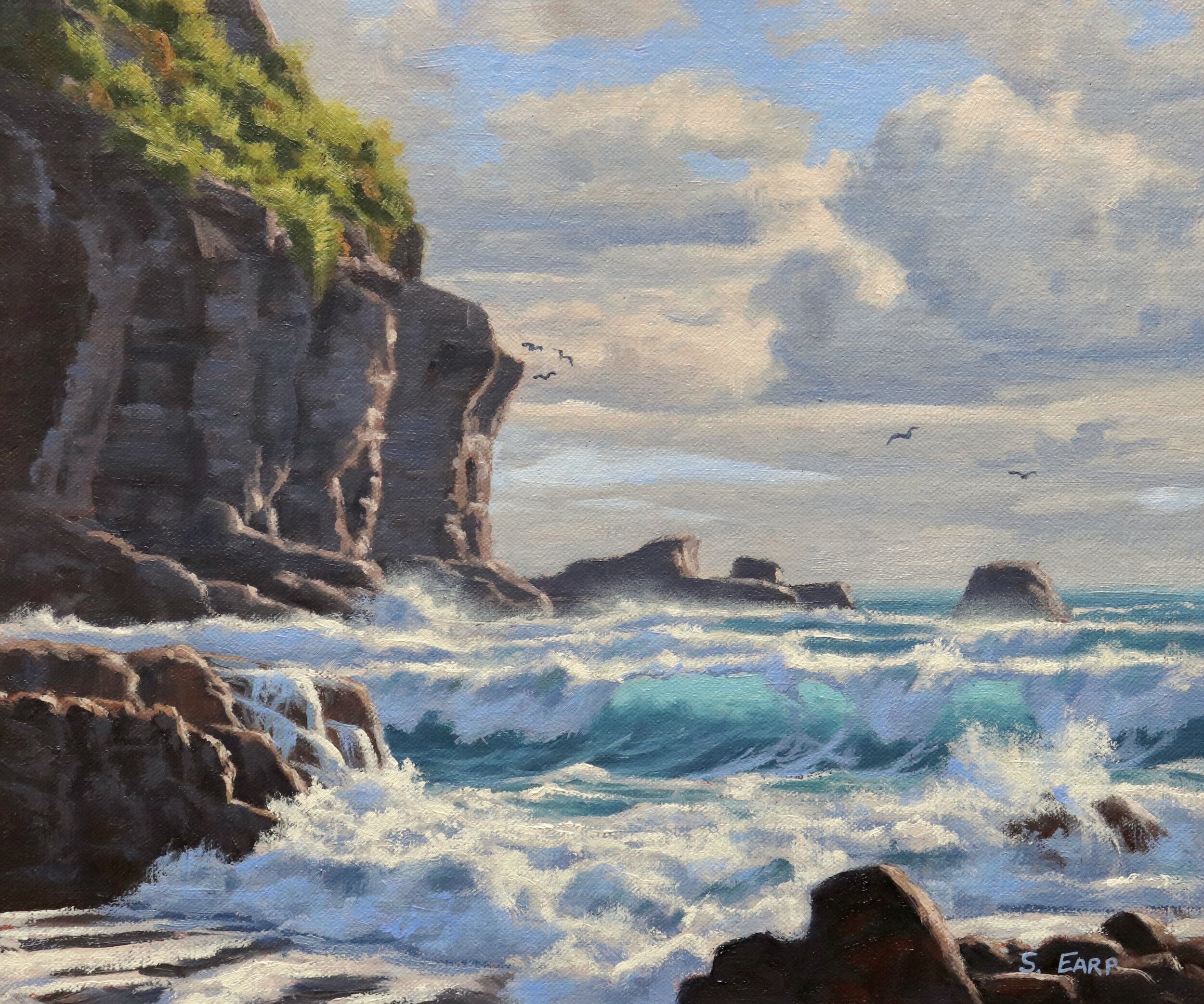
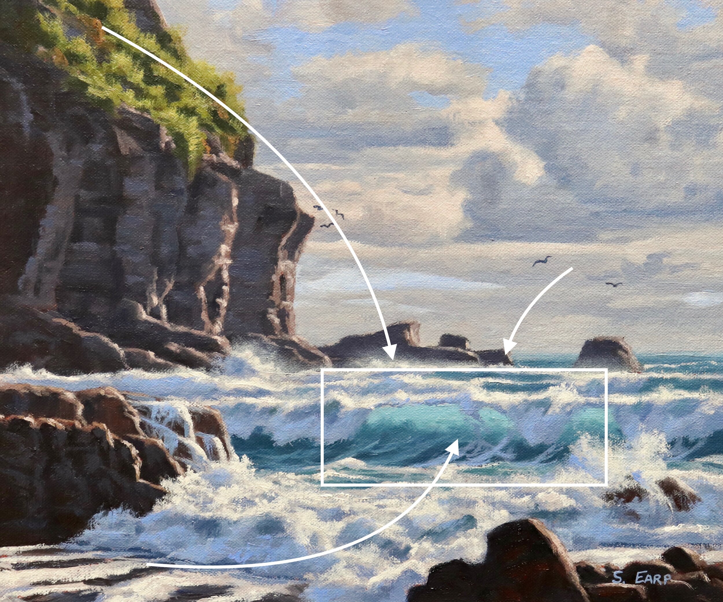
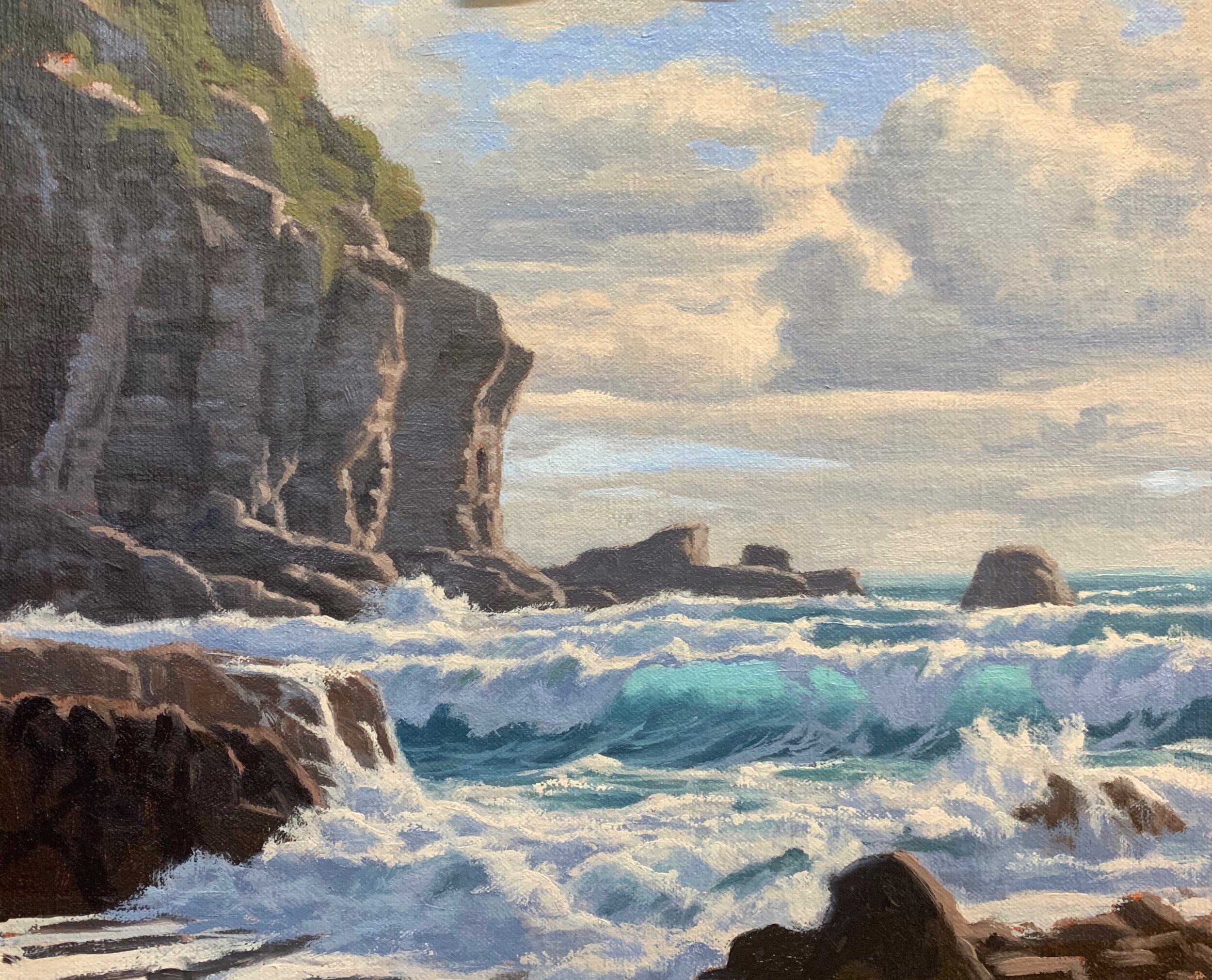
The main area of interest in this seascape is the translucent breaking wave. I have loosely incorporated an ‘S’ composition into the design where the channel in the foreground leads the eye towards the breaking wave. The positioning and form of the cliffs and the mid ground rocks help lead the eye towards the breaking wave.
It’s perfectly ok to move objects, elements, forms in your painting in order to create a good composition and it’s nearly always required. Remember we are artists and we are creating a painting, not a photograph.
Things to Be Avoided in Composition
-
Centred Horizon: This is bad composition as it results in the painting being halved for example half sky and half land and as a result forms a displeasing static within a painting. Either choose a lower horizon or a higher horizon.
-
Centred Objects: Areas of interest in the centre of your painting is a massive no no, it destroys any kind of rhythm and harmony within the composition.
-
Equal Masses and Repetitive Shapes: This is a problem in composition as often you can create repetitive shapes and forms in your painting without realising it. It again leads to disharmony within the composition.
Planning Your Painting
Once you have gathered the photo reference you are going to use for your painting, I would always recommend spending a bit of time doing some pencil sketches to design your painting. It is not often that there are perfect compositions in nature, so it is likely you’ll have to change some of the things that are in your photos.
Thumbnail Sketches
Once you have an idea for a painting, start designing the composition by doing a few quick thumbnail sketches in your sketch book. Spend around two to three minutes on each sketch.
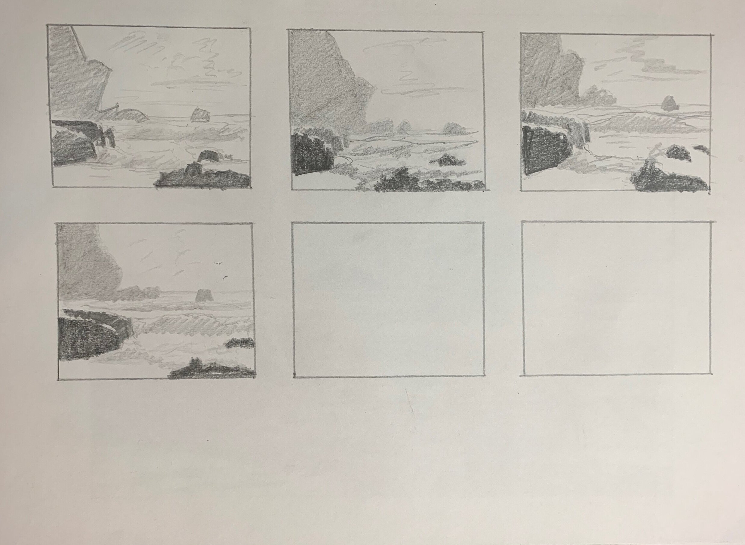
Final Sketch
Once you have done a few thumbnail sketches and have a good idea of your painting design you can then complete a final pencil sketch. The pencil sketch will help you finalise the composition and give you a good idea of the tonality of the subject you are painting.

I used a range of pencils for this sketch including a 4H, 2H, HB, 2B, 4B and 6B. The pencil sketch will be the foundation for your painting, they don’t have to be perfect but they should help you in creating a pleasing composition.
Colours and Values
Throughout the video you will hear me talk about colours and values. It is important to have a basic understanding of colour theory and values when painting as it will actually make colour mixing easier for you and you will be able to better create atmospheric depth in your paintings. Luckily it’s easy to learn the basics and the rest is just brush mileage.
Colour Theory Terms
Below are some terms I use throughout the video and their meanings.
-
Hue: This refers to the main attributes of a colour and is dependent on its dominant wavelength, irrespective of how light or dark the colour is. For example, the colour is discernible as blue or a red etc.
-
Saturation or Chroma: This refers to the purity or intensity of a colour. You can reduce the saturation of a colour by adding a neutral grey or an opposite colour on the colour wheel.
-
Value: This is how light or dark a subject is. Getting your values correct is one of the keys in the success of a painting.
-
Tone: This is a broad term for describing a colour that is not a pure hue or black or white. It is a widely misunderstood term.
The Colour Wheel
For the benefit of people who are new to painting that are watching this video I will briefly go over the basics of the colour wheel as remembering how this works can really help you with colour mixing.

Above is a simplified colour wheel. The colour wheel contains three primary colour blue, red and yellow and three secondary colours orange, green and violet. When any two primary colours are mixed together they make a secondary colour, so red and yellow make orange, yellow and blue make green and blue and red make violet.
When these colours are arranged on the colour wheel a primary colour is always opposite a secondary colour and are known as compliments or complimentary opposites. So, blue is opposite to orange, red is opposite to green and yellow is opposite to violet.
So why is this important?
If you want to desaturate a colour you can do this by mixing its complimentary opposite as the two colours will cancel each other out. In this manner you can create some neutral greys and browns especially when combined with white.
Complimentary colours also look good next to each other in a painting, for example greens often look more harmonious in a landscape if there are some reds amongst the mix or colours that contain red. If you look closely in nature, you’ll see naturally occurring complimentary opposites everywhere.
The Value Scale
Value is how light or dark a colour is and is perhaps one of the most important concepts in painting. The success of a painting rests on the relationship between the values in the painting. If they are not working and not in harmony, then the whole painting can lack any kind of depth.
Values in art work are represented on a scale with the highest value being white and the lowest value being black. The greys in between are known as mid or half tones.

In general, you will find your darkest darks and lightest lights in the foreground of a landscape. However, as landforms recede into the distance darks are not quite dark and lights are not quite light as the tonal scale narrows.
If you are unsure of where your light and dark values are in the scene you are painting, switch your reference photo to black and white and you’ll be able to clearly see where your light and dark values are.
In general, you’ll find that the sky is often one of the lightest values in the landscape. Grass is also generally lighter in value. Rocks and mountain faces are darker in value and often occupy the mid-tone range of the value scale. Trees are generally some of the darkest values in the landscape.
Colours Used
I am painting in oils but you can also use acrylics. The colours I used for this seascape painting are as follows:
-
Titanium white
-
Burnt sienna
-
Yellow oxide (you can use yellow ochre instead)
-
Cadmium yellow
-
Cadmium orange
-
Quinacridone crimson (you can use alizarin crimson instead)
-
Ultramarine blue
-
Phthalo green
Brushes
Here is a list of the brushes I generally use for plein air painting:
-
No.6 flat (these are the brushes I use the most)
-
No.4 short flat
-
No.2 flat
-
No.1 round
-
No.0 round
-
1/4 dagger
Tips for Painting Seascapes
Paint Your Darks First
Whenever I begin blocking in a painting I normally start by establishing my dark values and shadows first, that way I can quickly establish the tonal range in the painting. It also then makes it much easier when you come to add the areas in light as well as getting the saturation of your colour correct.
In this seascape painting I started by painting the cloud shadows first, then I painted the shadows in the cliffs which are a much darker value. The darkest values are found in the rock shadows in the foreground.
Once I have all my dark values / shadows established, it will make it much easier for me to paint the areas that are in full sunlight. It will also make it easier for me to get the values and colour saturation right.

Painting Translucent Ocean Waves
Painting the translucent ocean waves starts at the blocking in stage and it is not as complicated as it may appear. Start by getting the basic colours down on the canvas first starting with the upper section of the wave. The barrelling wave is thinner in this section which allows more sunlight to pass through it.
Keep the value of your breaking wave lighter in the upper section and add darker colour when you paint the lower section. Backlit waves often look more dramatic in seascapes and are generally easier to paint especially if you are a beginner.
Good colours to use for painting sea tones include the Following:
-
Ultramarine blue
-
Yellow oxide (or yellow ochre)
-
Phthalo green
-
Titanium white
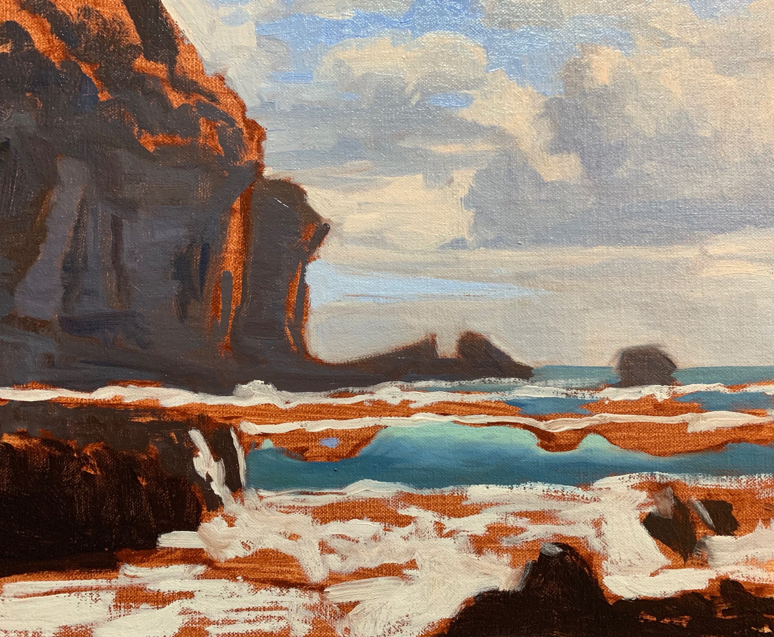
Blocking-in the Painting
If you can, try and block-in the whole painting in one sitting and don’t worry about painting details, that will come later on in the painting. The aim of the blocking-in stage is to provide a good solid foundation and a base to work from, where you can start building up detail.
Keep your brush work loose and gestural as this will add vibrancy, movement and life to your painting. You can add detail once the painting is dry, after the blocking-in stage is complete.
When you have finished blocking-in your painting, make sure your colours and values are working and aim to keep the overall tonality of the painting a little darker so you have room to add lighter values when you paint the details. Save your lightest values until the end of the painting.

Adding Detail
Building up the detail in the painting will be the most time consuming part so take your time and have fun with it. At this stage of the painting you’ll likely have to restate some areas of the painting with fresh paint, especially some of those darker tones.
Try to use bigger brushes if you can as this will help you to cover ground more quickly and maintain a vibrant and painterly feel to your painting. However, use the best brush for the job, for example if you feel using a dagger brush is best for painting a rock then use that brush.
In general, you’ll be adding lighter layers of colour compared with your previous layers.
Final Details
This is the stage of the painting where we’ll be adding those last final tones that are going to complete the painting and make the whole this come to life. We’ve saved our lightest values until the end of the painting which in this case are the crests of the waves, foam, sea spray and white water. Here I have selectively added my lightest values with titanium white and a small amount of cadmium yellow.
Adding a couple of seagulls to a seascape painting can really add that extra something that will add to the story of your art work as well as create an additional area of interest within the painting.