Painting Workshop – Lesson Notes
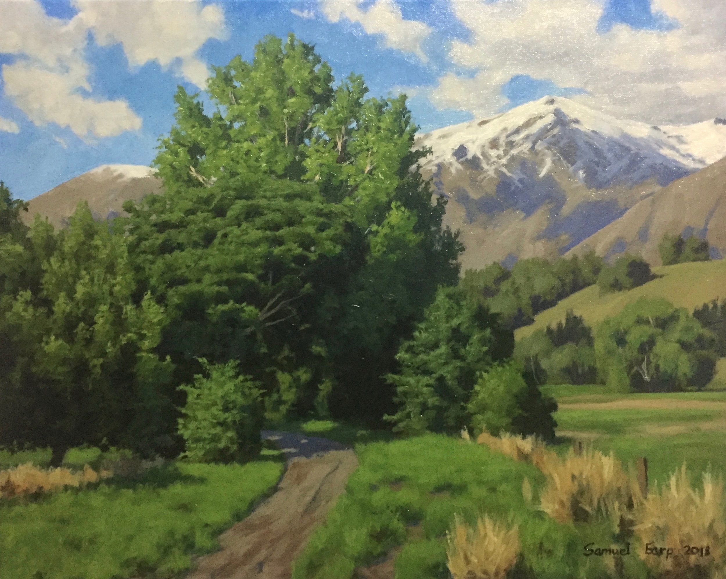
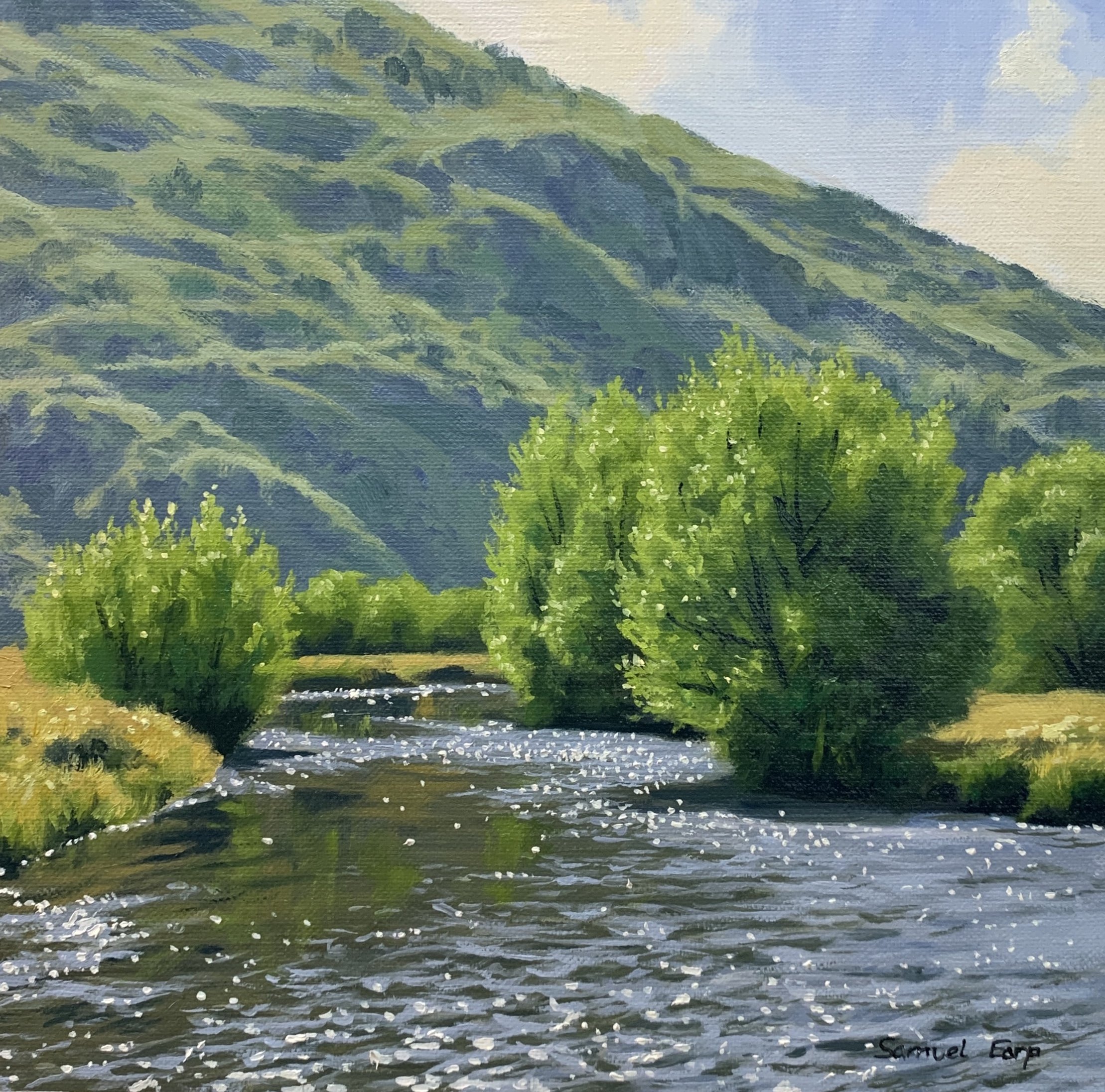
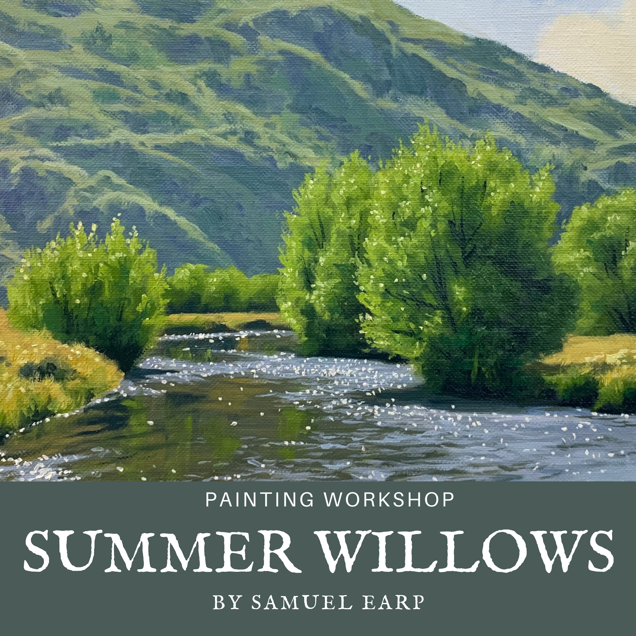
Summer Willows
By Samuel Earp
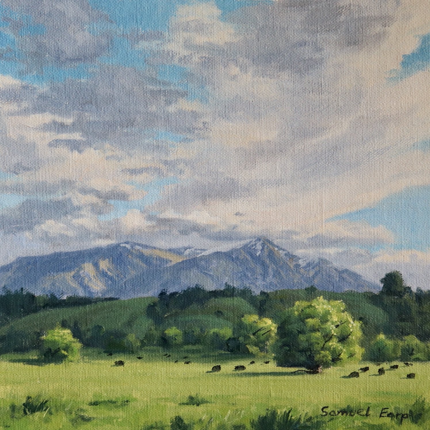
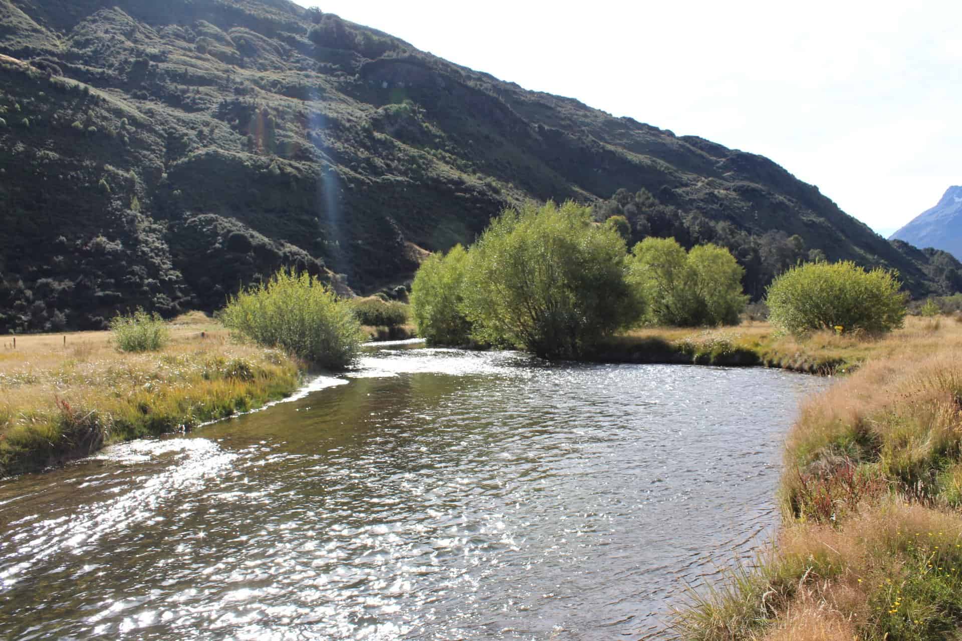
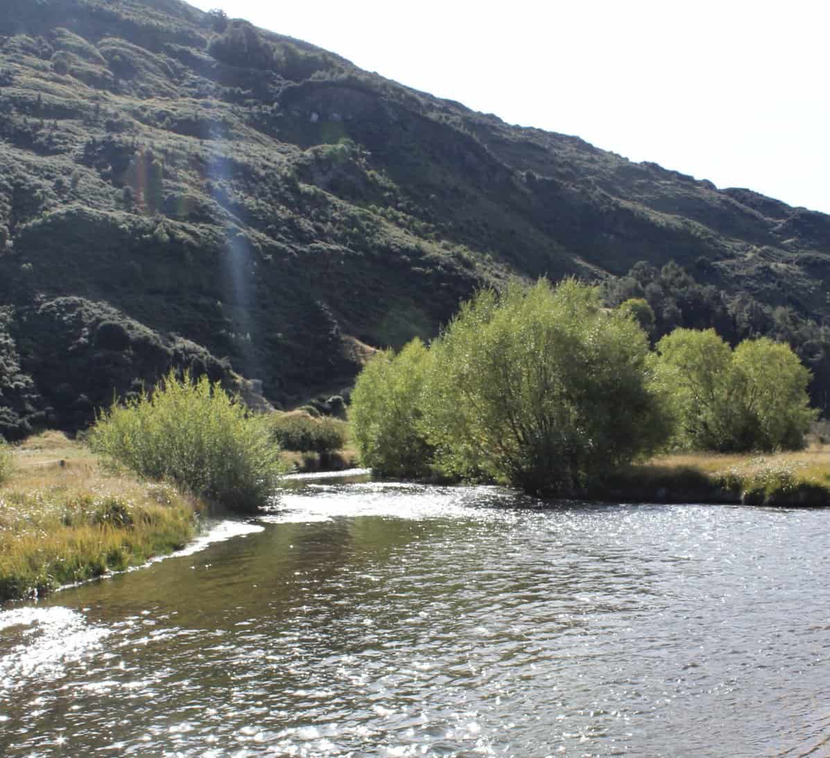
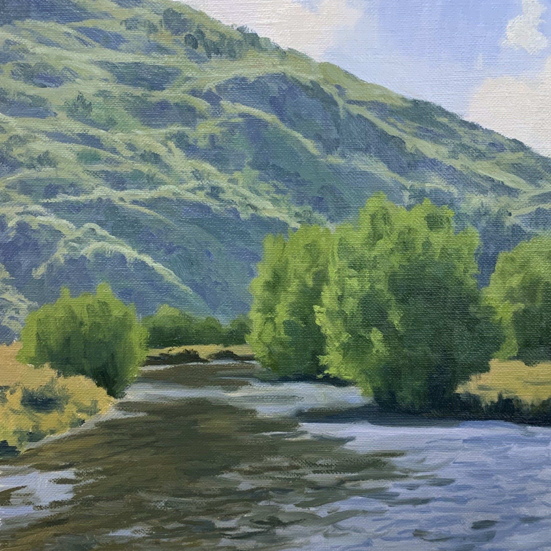
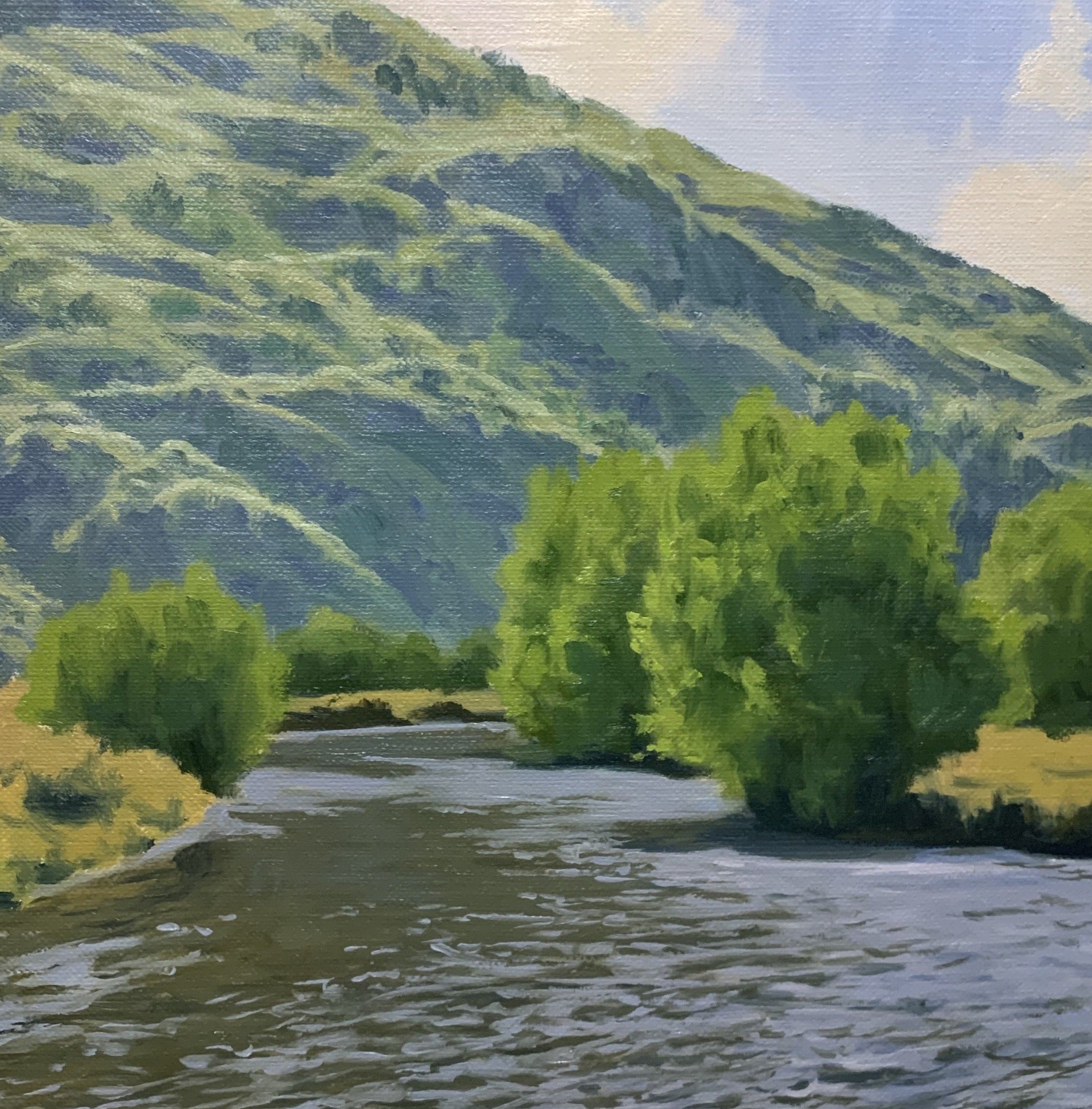
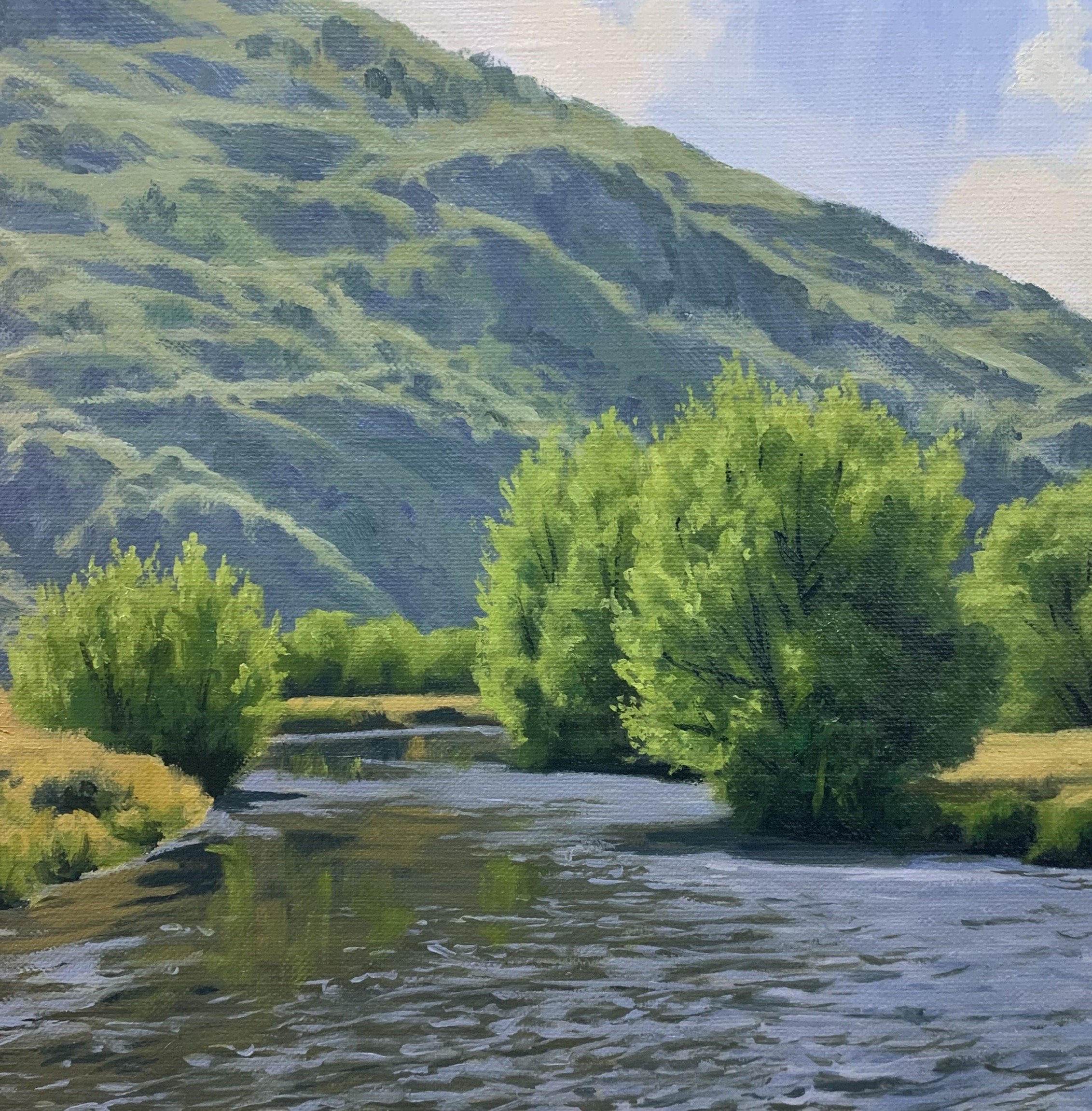
Reference Photos
Please feel free to use the reference photos provided.
Colours
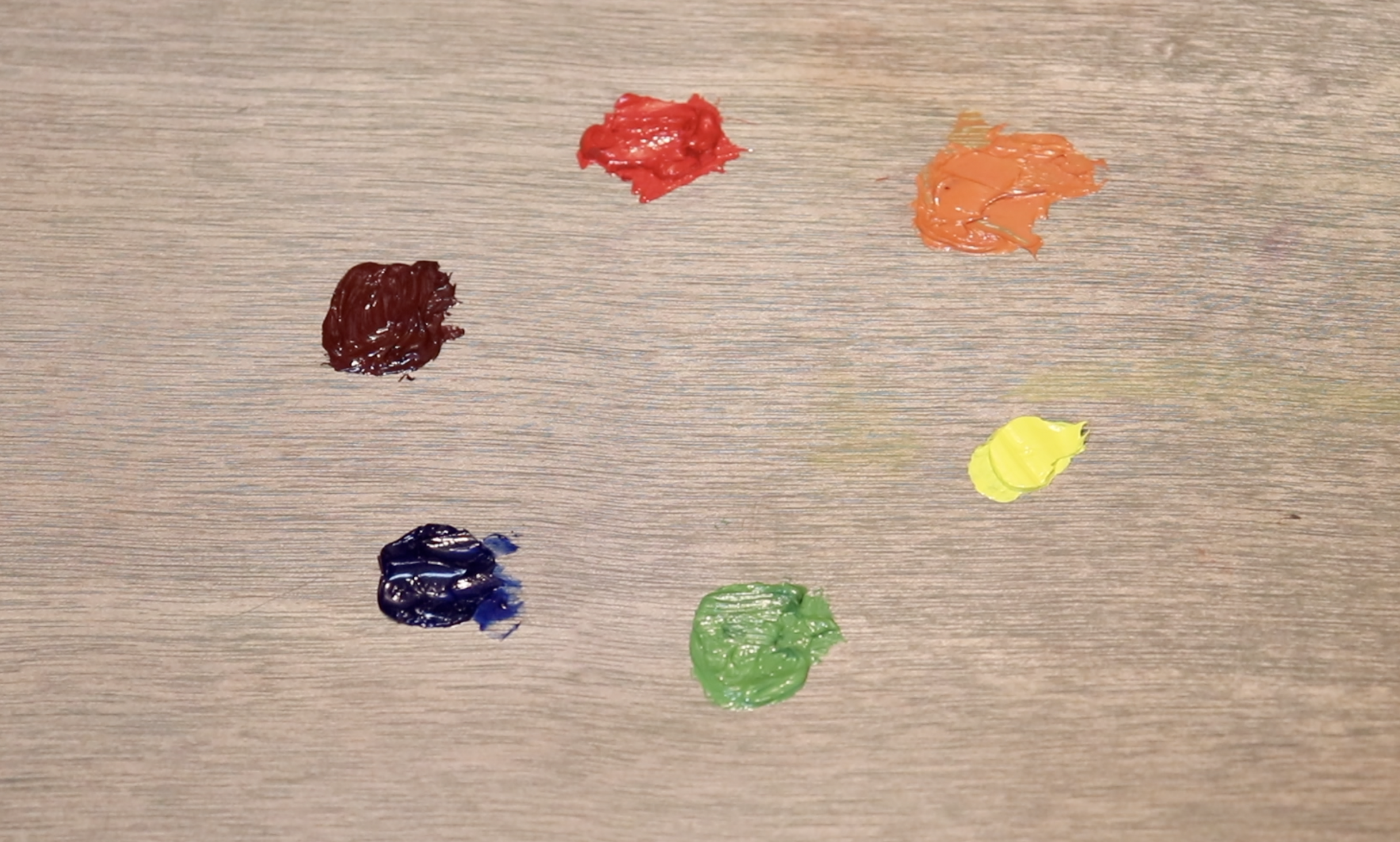
The colours I used in this painting are as follows:
-
Titanium white
-
Burnt sienna
-
Yellow ochre
-
Cadmium yellow
-
Cadmium red light
-
Alizarin crimson
-
Ultramarine blue
-
Phthalo green
Need Oil Paints?
I personally use Blue Ridge Oil Colors which are available here. If you would like to purchase Blue Ridge oil paints click the link below.
Brushes
Here is a list of the brushes I used in this painting:
-
No.5 flat
-
No.3 flat
-
No.2 flat
-
No.3 filbert
-
No.1 round
-
No.0 round
-
No.00 round
-
1/4” ivory dagger
Need Brushes?
I personally use Rosemary and Co brushes which are available here. If you would like to purchase Rosemary and Co brushes click the link below. (Note: if you purchase Rosemary and Co brushes using the link below I will receive a small commission).

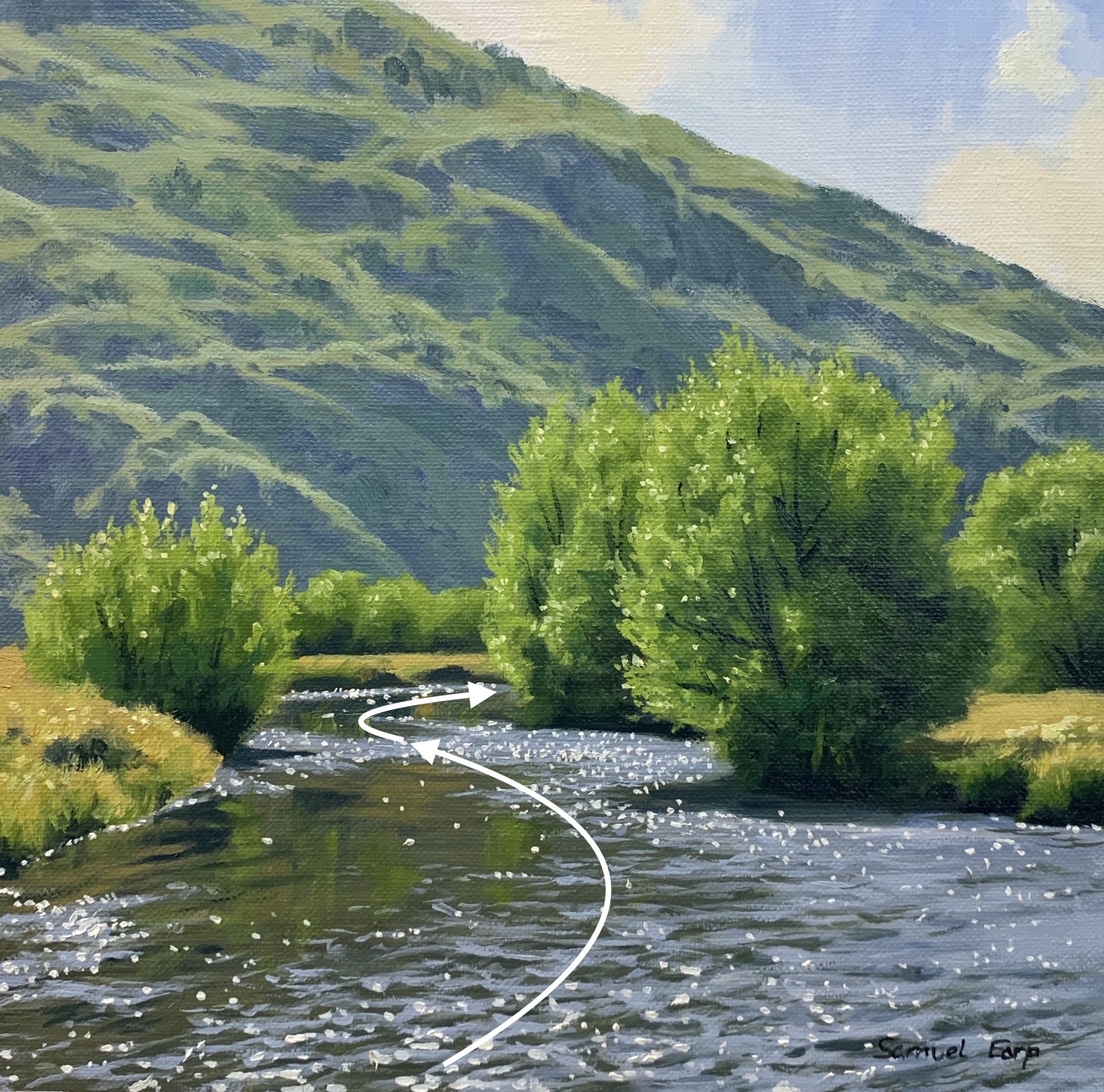
Composition
This painting implies rhythm as river forms an ‘S’ composition also known as a ‘compound curve’.
Things to be Avoided in Composition
-
Never have your focal area in the middle of the painting, avoid centred objects.
-
Never have your horizon line in the middle of the painting, either go for a lower or higher horizon.
-
Avoid repeating objects, equal masses, repeating lines and vectors and aberrations in general.
-
Avoid having too much detail that could spoil the composition.
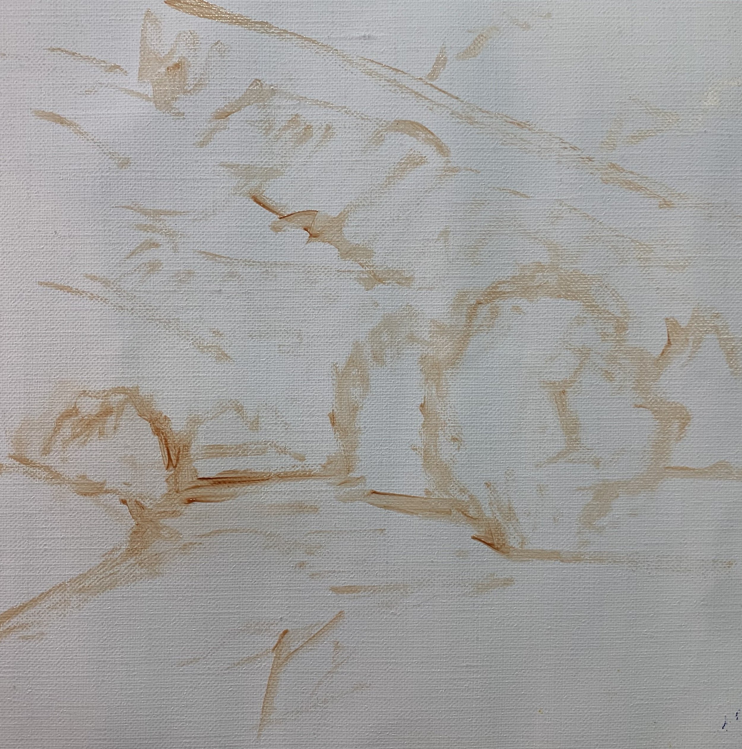
Stage 1 – Blocking in the Painting
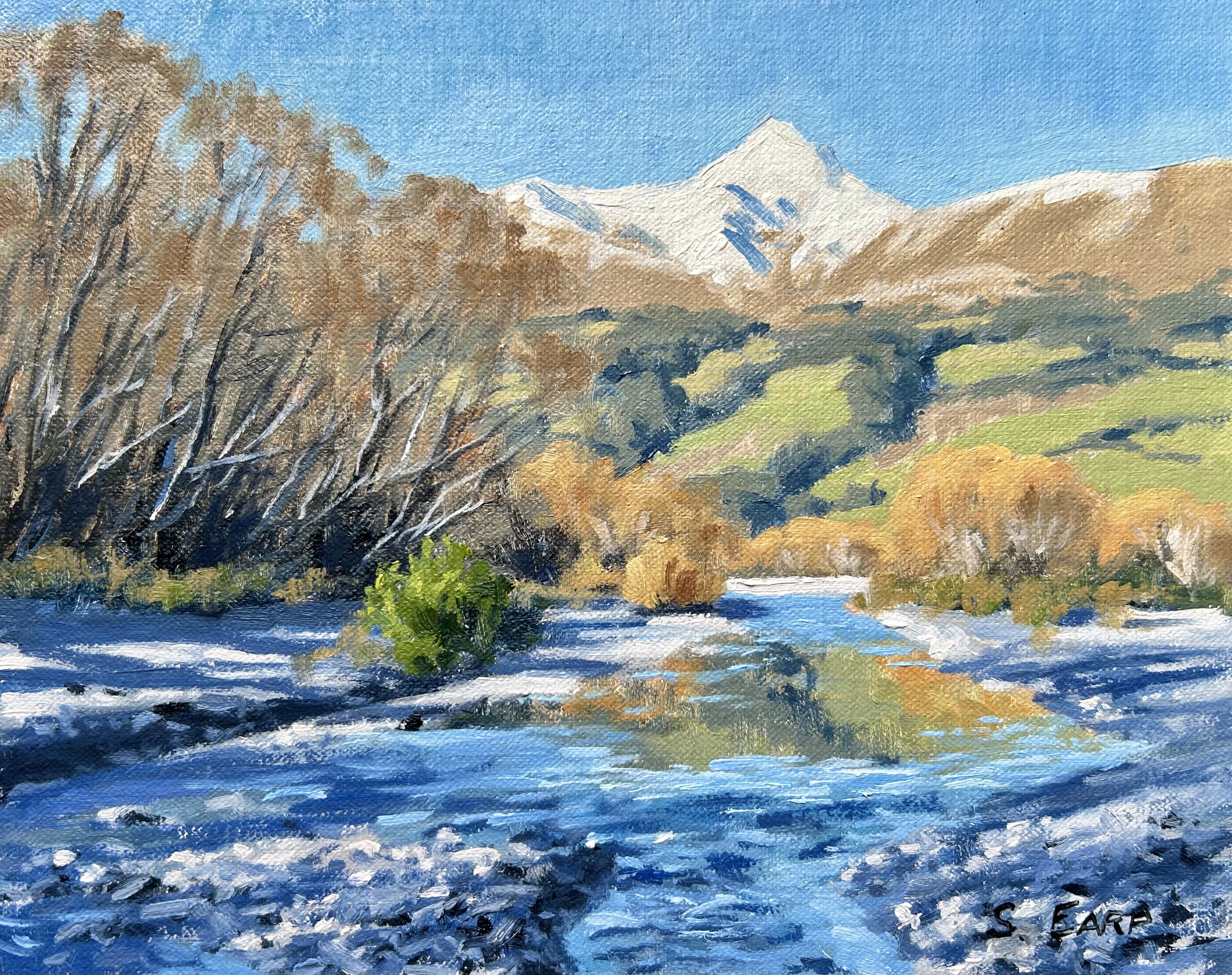
I painted this art work on oil primed, medium weave Belgian linen and the painting itself measures 12” x 12”.
I sketched the composition using a No.1 round brush with burnt sienna mixed with Liquin Original (Liquin). I am using Liquin as a medium to thin the paint and it also has the advantage of speeding up the drying time.
Paint Your Dark Values and Shadows First
Whenever I start a painting I always identify where the dark values and shadows are first in the scene I am painting. Value refers to how light or dark a subject is and by painting in the dark values first I personally find it is much easier to create atmospheric perspective my paintings. It also makes it easier to add the areas in light and to get the saturation of your colours correct once you have painted your dark values.
There are two main zones of shadows in this painting and that is within the background hills and the willow trees in the foreground. The shadows in the background are lighter in value than the shadows in the willow trees.
I mix the shadows in the background hills using ultramarine blue, yellow ochre and titanium white. I use the same colour mix for the shadows in the willow trees but with no titanium white.
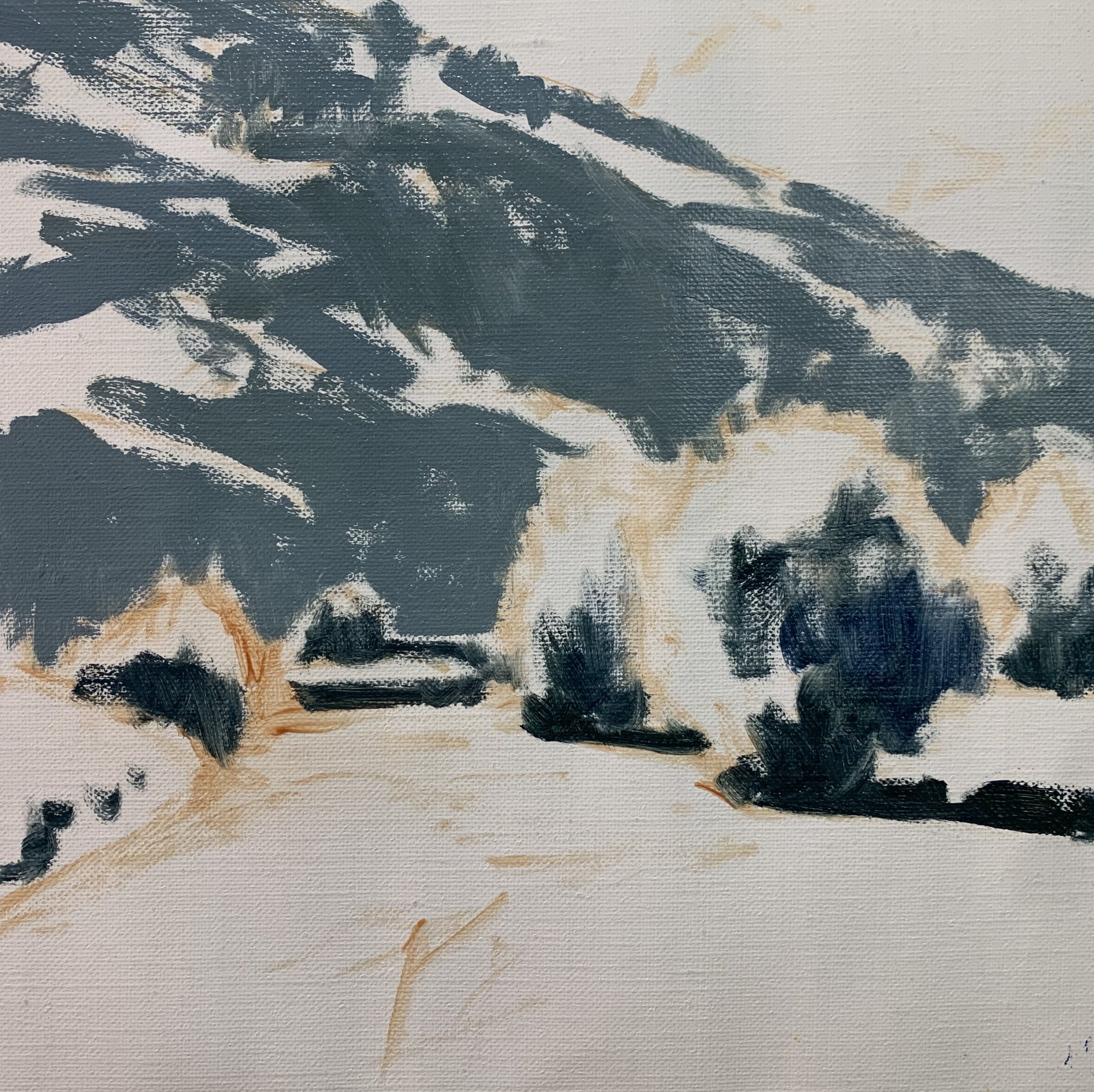
I paint the sky and clouds using titanium white and a little burnt sienna for the clouds and titanium white and ultramarine blue for the sky.
The vegetation that is in light on the background hill is a low chroma green because it is further away into the distance. For this I used a mix of ultramarine blue, yellow ochre and titanium white, the same colours I used for the shadow areas.
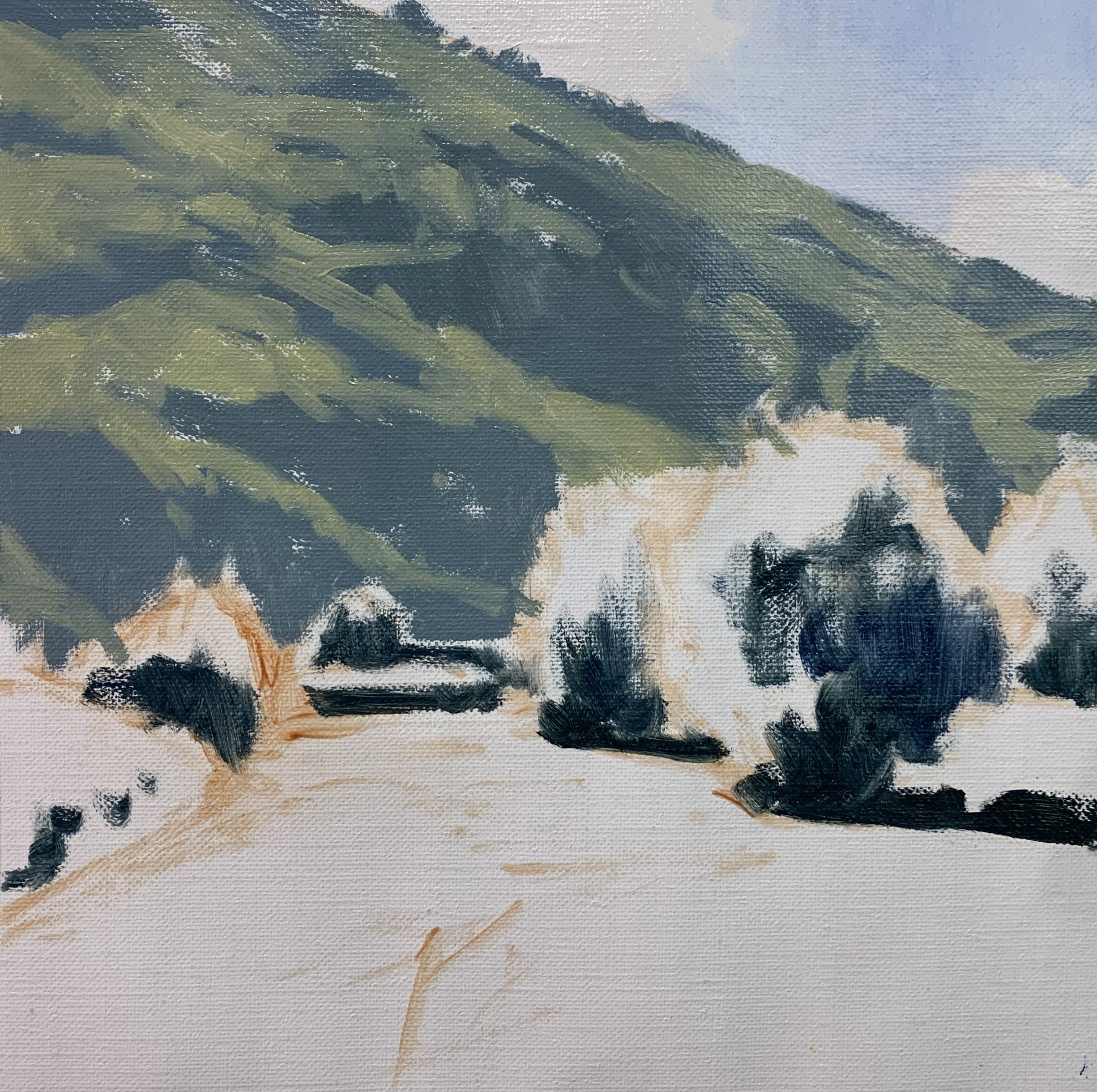
The foliage in the willow trees is much more saturated and for this I used a mix of ultramarine blue, yellow ochre and cadmium yellow for my basic green mix. I then introduced a little titanium white and alizarin crimson into the mix. To increase the saturation of the green and create some emerald tones within the tree canopies I also mixed in a little phthalo green.
The straw coloured grass is lighter in value than the trees and for this I used a mix of yellow ochre, alizarin crimson, a small amount of ultramarine blue and titanium white.
I used loose gestural brush marks for the river which is split into two areas. The more still parts of the water is reflecting the background hill and vegetation and for this I used a mix of yellow ochre, burnt sienna, ultramarine blue and titanium white.
The more rapidly moving areas of water is reflecting the sky and for this I used a mix of ultramarine blue, burnt sienna, alizarin crimson and titanium white. The ultramarine blue and titanium white are the dominant colours within the mix.
This is where I completed the block-in stage. I allowed the painting to dry so I could begin adding details to it.
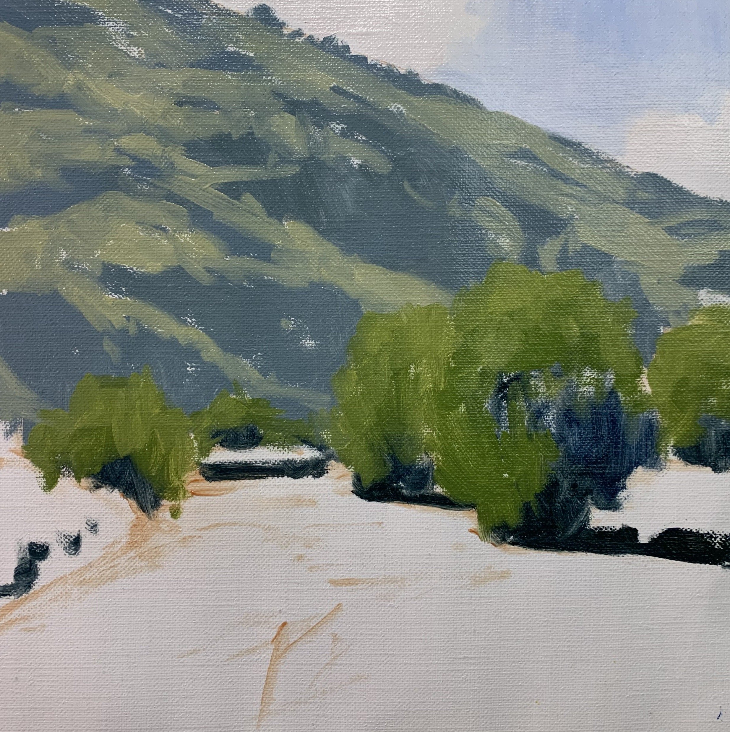
Stage 2 – Adding Details, Modelling and Refining the Painting
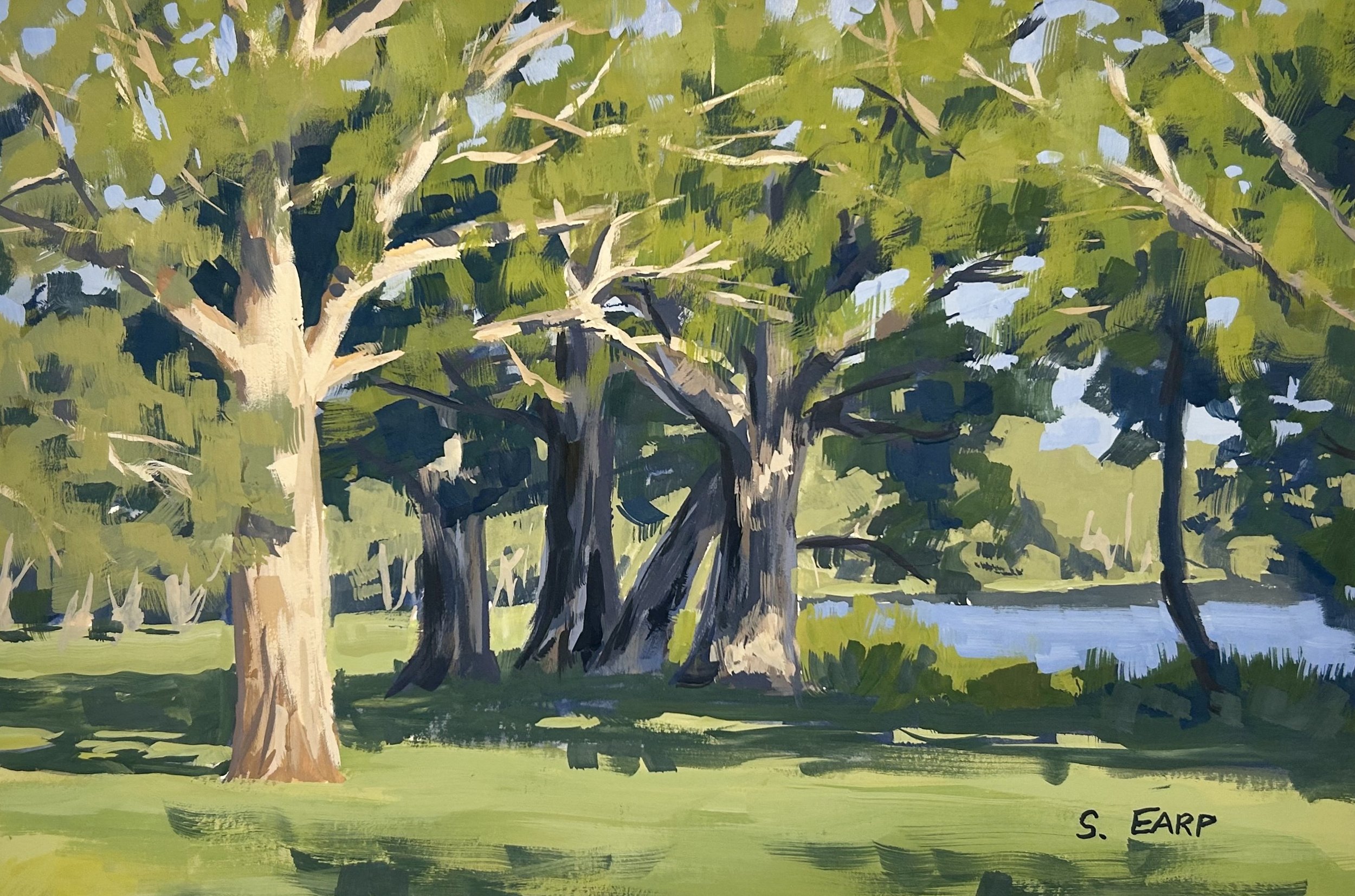
Once the painting was dry I was then able to begin the modelling stage where I added details to the painting and refined the various forms and masses.
In this stage of the painting I focussed on the sky and background hill where I added more paint layers. I have gone sparingly with the details in the background hill so it does not over complicate the composition and distract from the trees and river in the foreground.
I still used the same colours for the vegetation as I used in the block-in stage, a mix of yellow ochre, ultramarine blue and titanium white however I also added some additional colours to create a variety of greens. I still keep in mind the value of the green and I make sure that the colours are not saturated.
I added a little cadmium yellow, phthalo green and alizarin crimson to my green mix to communicate the different trees, shrubs and plants on the hill.
Next comes the modelling stage of the willow trees where I was building up the detail within the tree canopies. The main thing I was doing at this stage was creating the form of the trees and establishing the shadows, half tones and highlights within the tree canopies.
I have made a few different green mixes for the trees that are mostly centred around yellow ochre, cadmium yellow, ultramarine blue and titanium white. I have also made the greens look more natural by mixing in a small amount of colour that contains red such as alizarin crimson or cadmium red light. This helps to reduce the saturation of the greens as green is opposite to red on the colour wheel.
I start adding details to the river, painting the reflections and forming the ripples. I used the same colour mixes that I used in the block-in stage and I found using a synthetic 1/4” ivory dagger very useful for painting the ripples.
At this point in the painting I had allowed it to dry again and once dry I was able to add further details to the willow trees. I was using lighter value greens to start building up the illuminated side of the tree canopies. I used a mix of yellow ochre, cadmium yellow, ultramarine blue and titanium white. I also added a very small amount of cadmium red light and phthalo green into the mix.
I painted the suggestion of a network of stems and branches in the willow trees using a mix of ultramarine blue with a little yellow ochre.
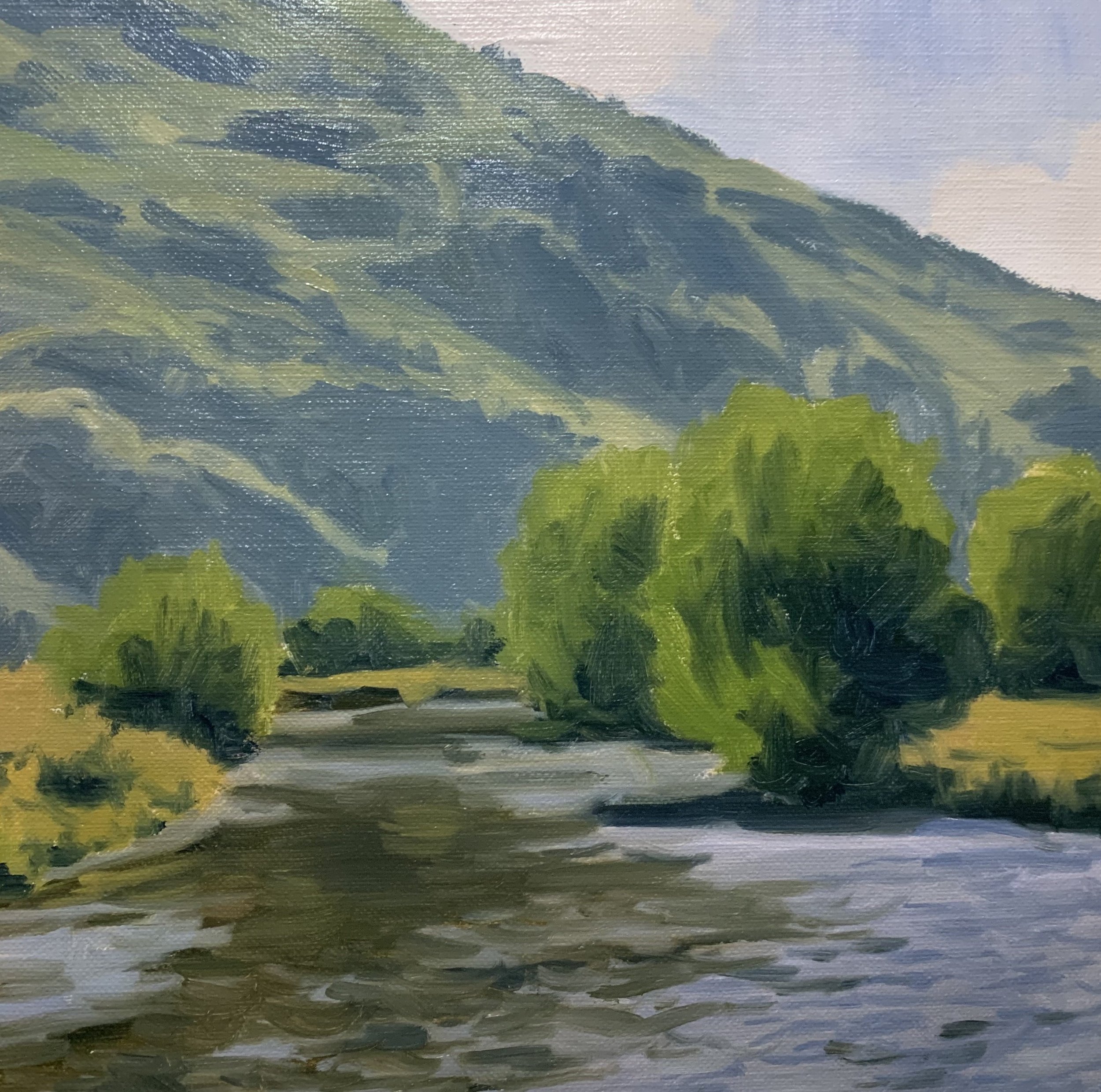
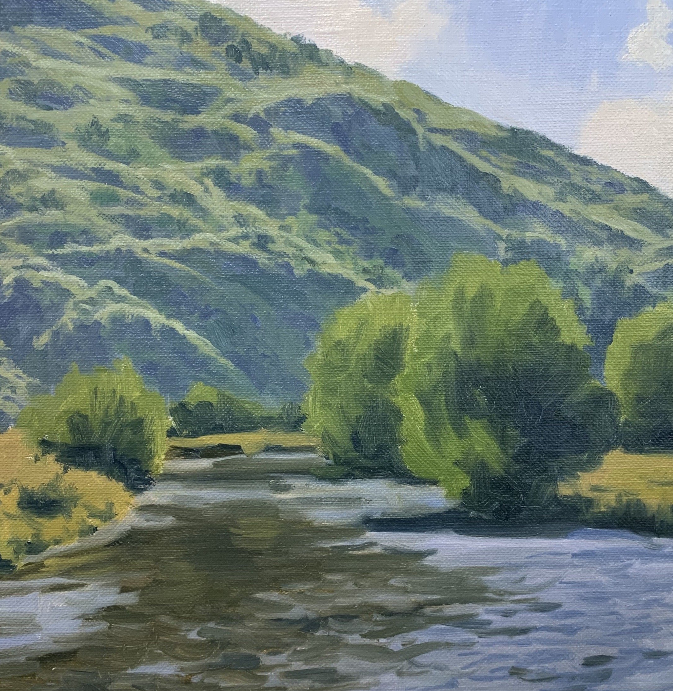
Stage 3 – Final Details
I finished this painting by adding a few highlights to the willow trees to communicate a few leaves shimmering in the sun. The leaves have glossy surfaces so they reflect the direct sunlight. To paint the shimmering leaves I used a mix of titanium white with a little cadmium yellow.
The last part of the painting was where I added the sparkles to the water using a mix of titanium white with a little yellow ochre. I applied the paint with a No.00 round brush.

Colours and Values
Throughout the video you will hear me talk about colours and values. It is important to have a basic understanding of colour theory and values when painting as it will make colour mixing easier for you. Luckily it’s easy to learn the basics and the rest is just brush mileage.
Colours Theory Terms
Below are some terms I use throughout the video and their meanings.
Hue: This refers to the main attributes of a colour and is dependent on its dominant wavelength, irrespective of how light or dark the colour is. For example, the colour is discernible as blue or a red etc.
Saturation or Chroma: This refers to the purity or intensity of a colour. You can reduce the saturation of a colour by adding a neutral grey or an opposite colour on the colour wheel.
Value: This is how light or dark a subject is. Getting your values correct is one of the keys in the success of a painting.
Tone: This is a broad term for describing a colour that is not a pure hue or black or white. It is a widely misunderstood term.
The Colour Wheel
For the benefit of people who are new to painting that are watching this video I will briefly go over the basics of the colour wheel. Knowing how the colour wheel this works can really help you with colour mixing.
Above is a simplified colour wheel. The colour wheel contains three primary colour blue, red and yellow and three secondary colours orange, green and violet.
When these colours are arranged on the colour wheel a primary colour is always opposite a secondary colour and are known as compliments or complimentary opposites. So, blue is opposite to orange, red is opposite to green and yellow is opposite to violet.
So why is this important?
If you want to desaturate a colour you can do this by mixing its complimentary opposite as the two colours will cancel each other out. In this manner you can create some neutral greys and browns especially when combined with white.
Complimentary colours also look good next to each other in a painting, for example greens often look more harmonious in a landscape if there are some reds amongst the mix or colours that contain red. If you look closely in nature, you’ll see naturally occurring complimentary opposites everywhere.
The Value Scale
Value is how light or dark a colour is and is perhaps one of the most important concepts in painting. The success of a painting rests on the relationship between the values in the painting. If they are not working and not in harmony, then the whole painting can lack any kind of depth.

Values in art work are represented on a scale with the highest value being white and the lowest value being black. The greys in between are known as mid or half tones.
In general, you will find your darkest darks and lightest lights in the foreground of a landscape. However, as landforms recede into the distance darks are not quite dark and lights are not quite light as the tonal scale narrows.
If you are unsure of where your light and dark values are in the scene you are painting, switch your reference photo to black and white and you’ll be able to clearly see where your light and dark values are.
In general, you’ll find that the sky is often one of the lightest values in the landscape. Grass is also generally lighter in value. Rocks and mountain faces are darker in value and often occupy the mid-tone range of the value scale. Trees are generally some of the darkest values in the landscape.
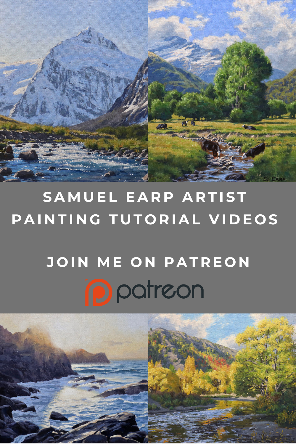
New Painting Video Every Month on Patreon
Subscribe to my Patreon channel and get instant access to all of my painting videos and get a new video every month for just $5 per month.
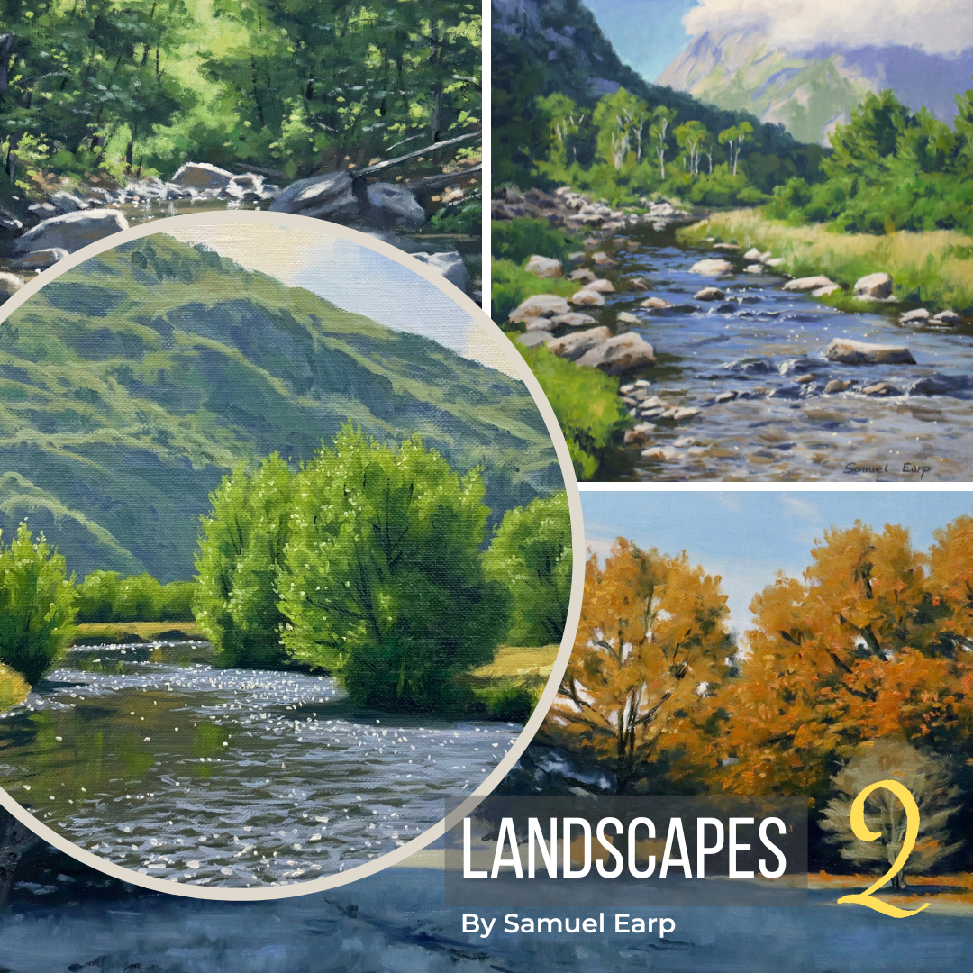
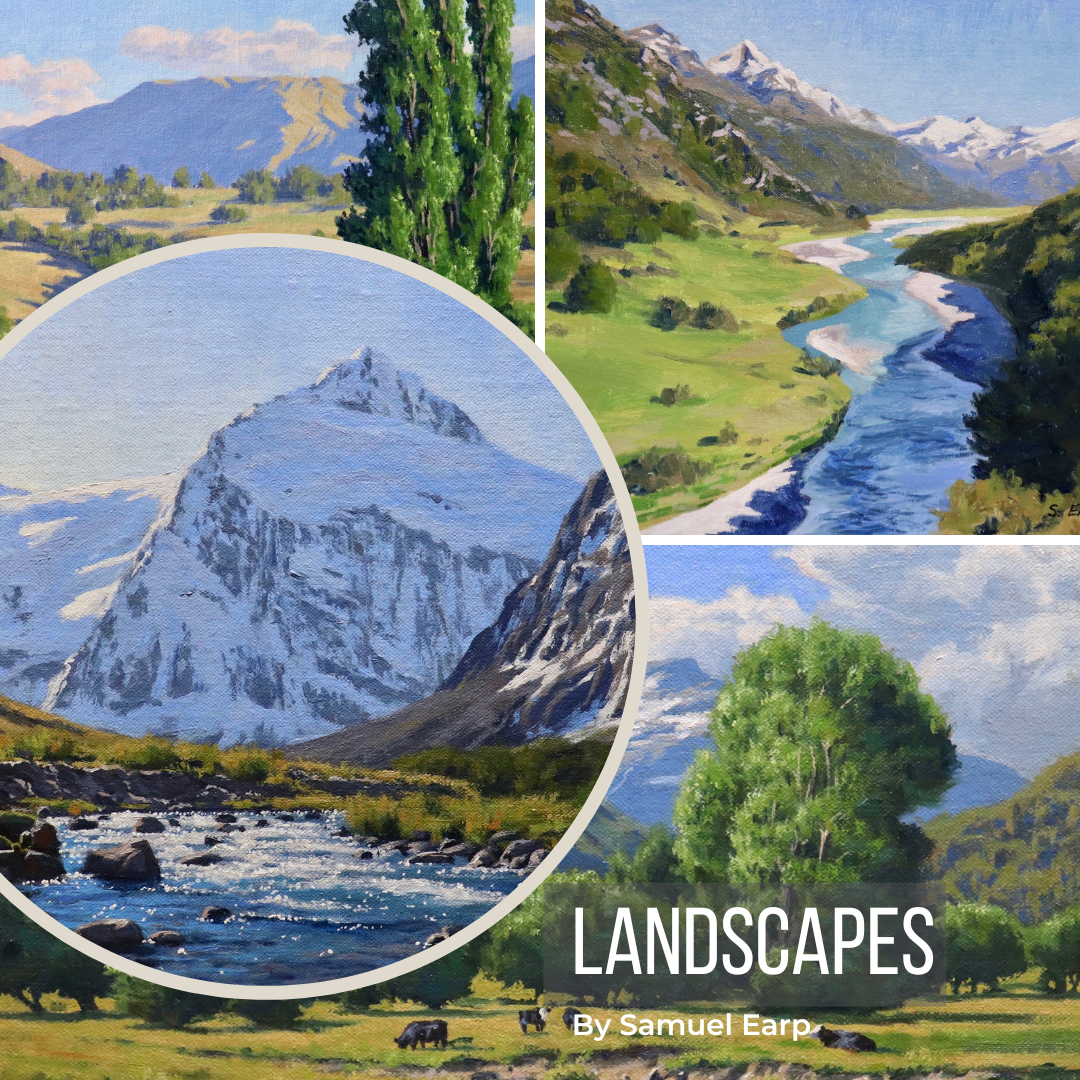
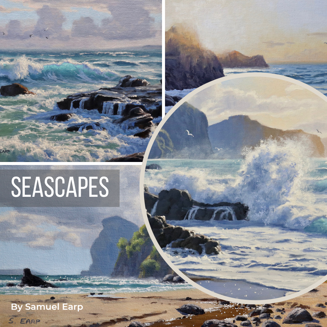
More Painting Tutorial Videos Available
Check Out My Latest Painting Blog Articles
Featured