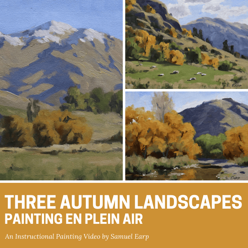
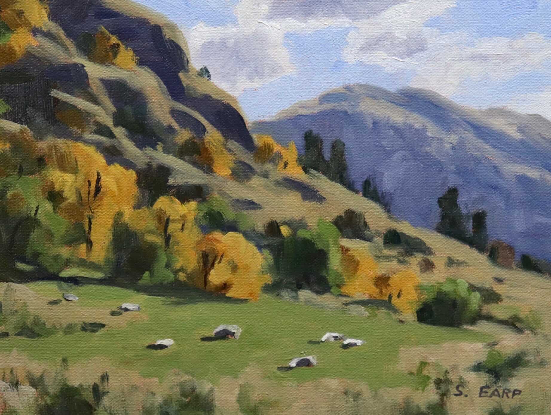
Three Autumn Landscapes
Painting En Plein Air – Lesson Notes
Painting outdoors (en plein air) is a really enjoyable activity and a wonderful way to improve your painting skills. When you paint outdoors it really makes you focus on the landscape and given the light and weather conditions are always changing, it teaches you to paint quickly.
Plein air painting will help you to loosen up your brush work and help you to improve your understanding of colours and values in the landscape. It’s also very good for the mind, body and spirit as you are getting outside, often into tranquil locations.
These lesson notes are intended to compliment the ‘Three Autumn Landscapes, Painting En Plein Air’ video. I hope they help you to gain a better understanding of landscape painting techniques, composition, colour mixing, painting tonality and how to create atmospheric depth.
Watch Trailer
This is the trailer for the painting tutorial video ‘Three Autumn Landscapes, Painting En Plein Air’ by Samuel Earp
Painting Video
Download the video that accompanies these lesson notes.
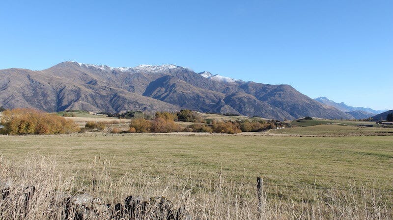
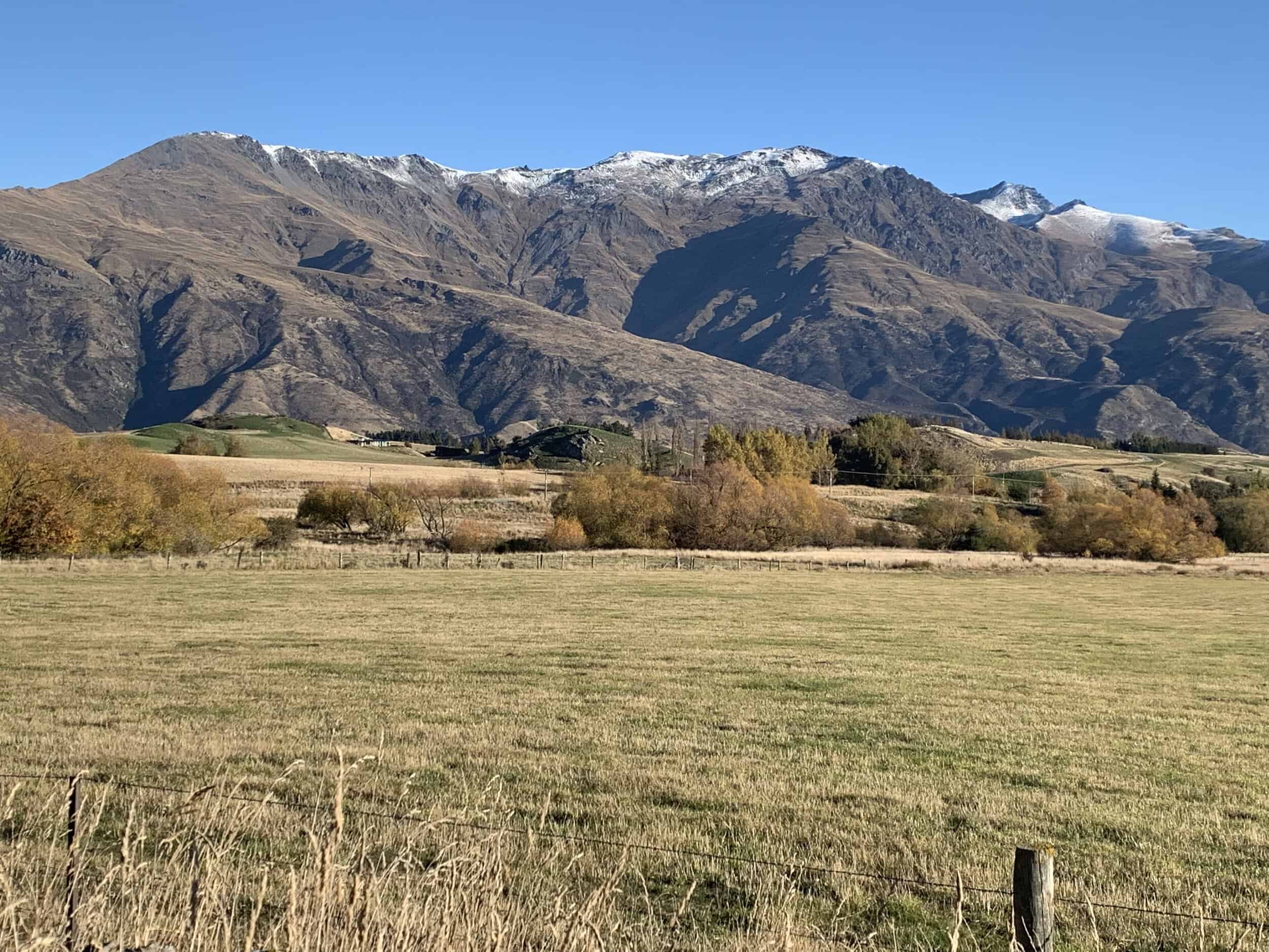
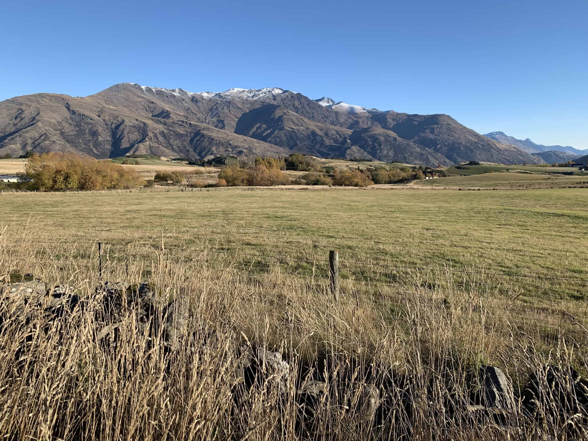
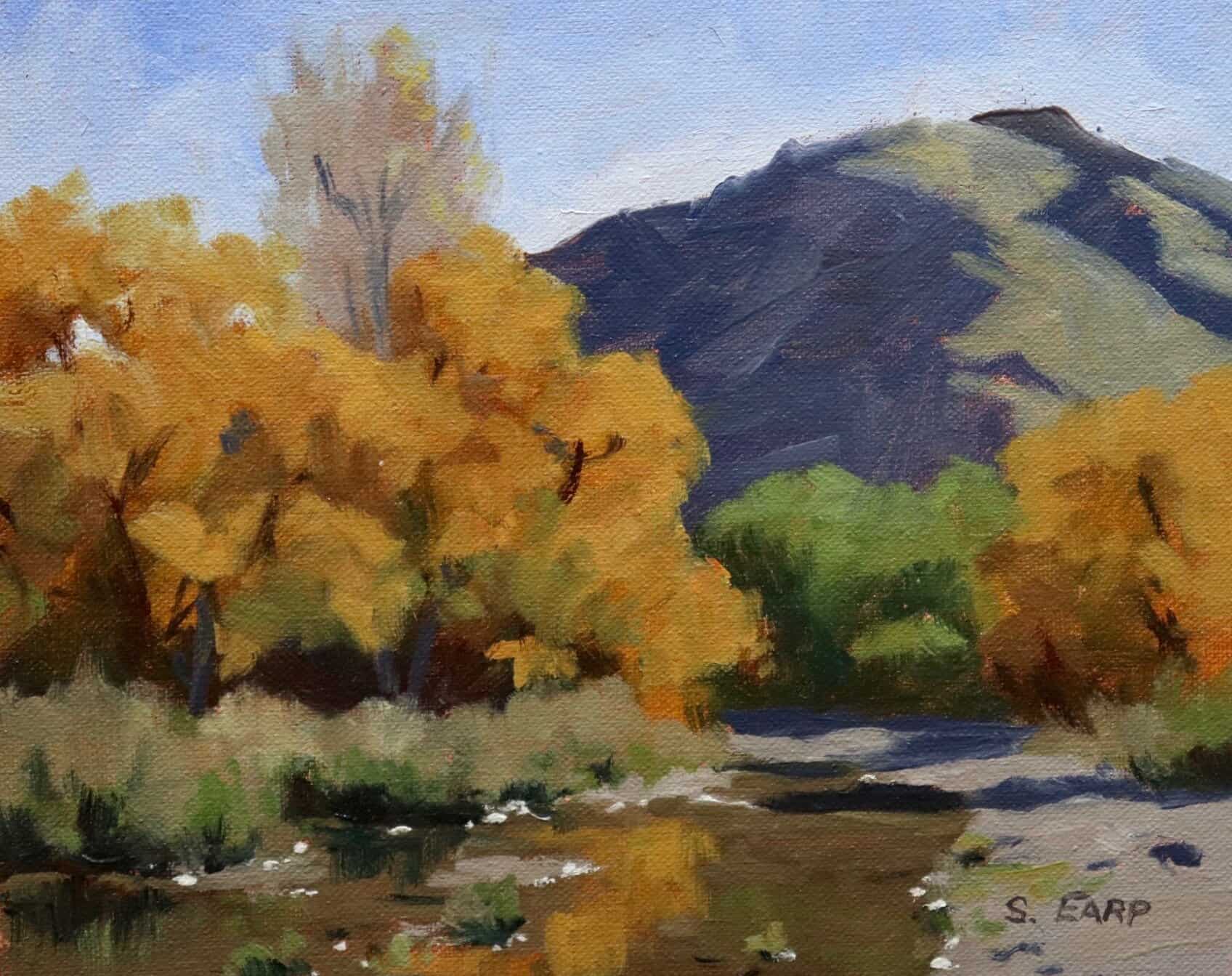
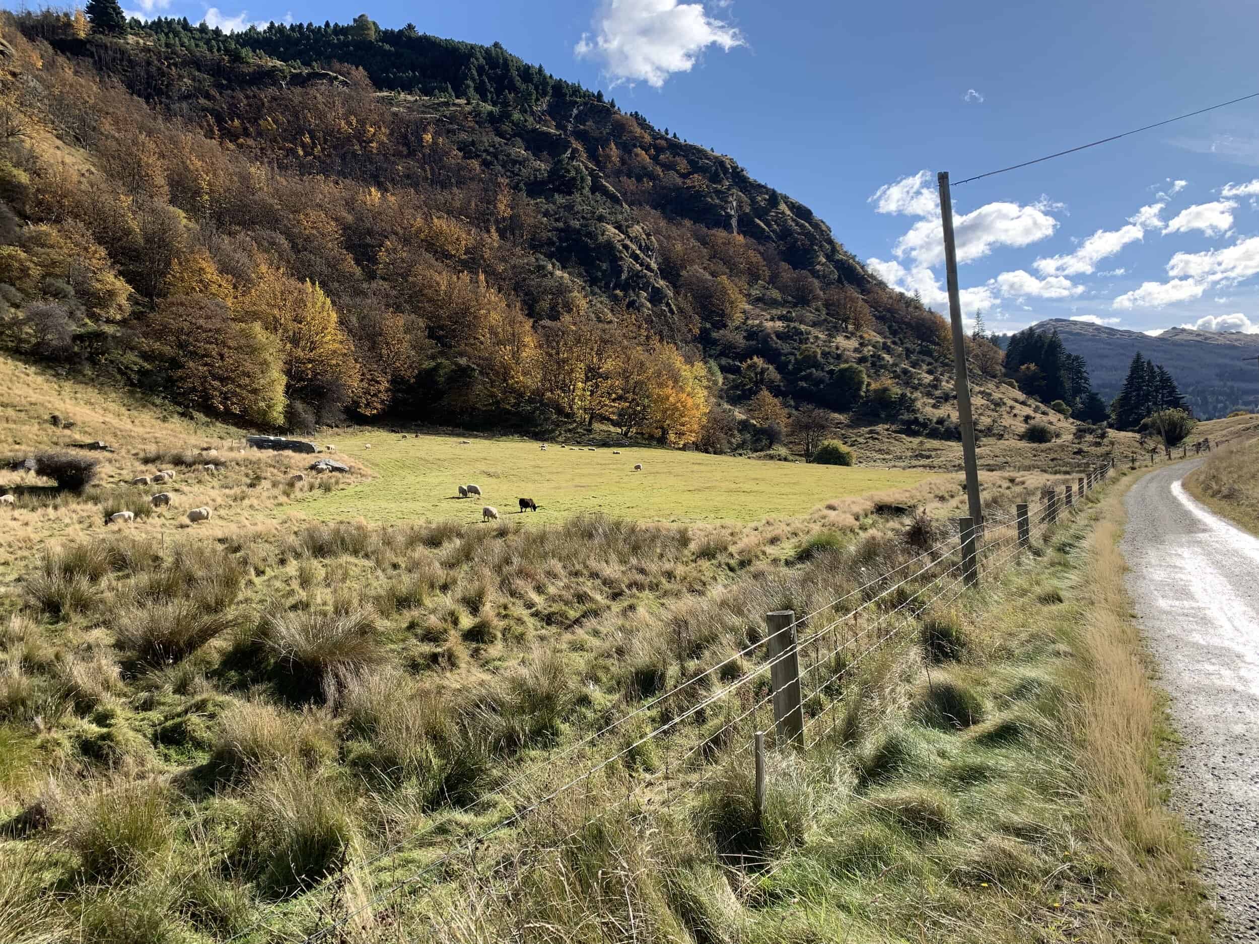
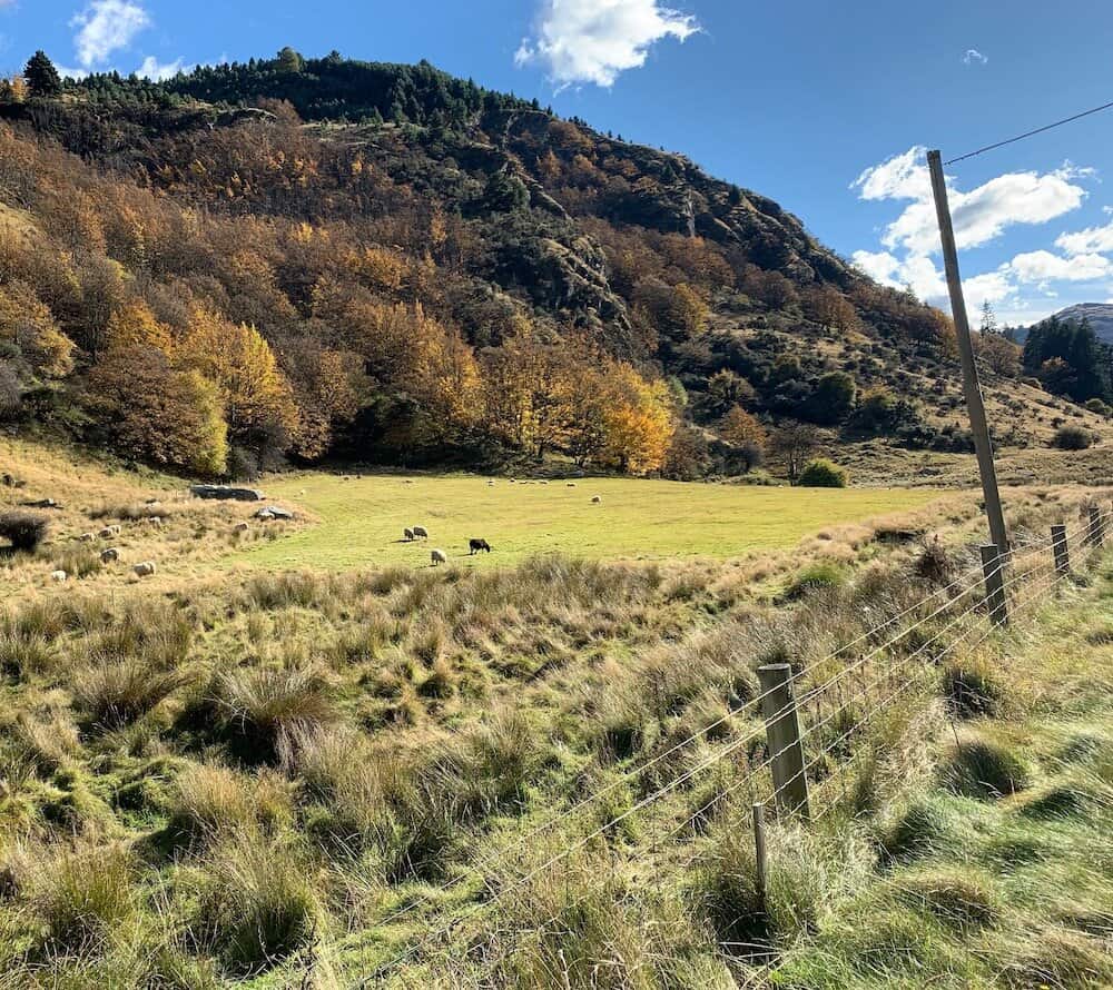
Reference Photos
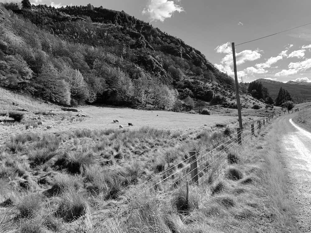
Here are the reference photos I used in painting these three art works. Feel free to copy and use them.
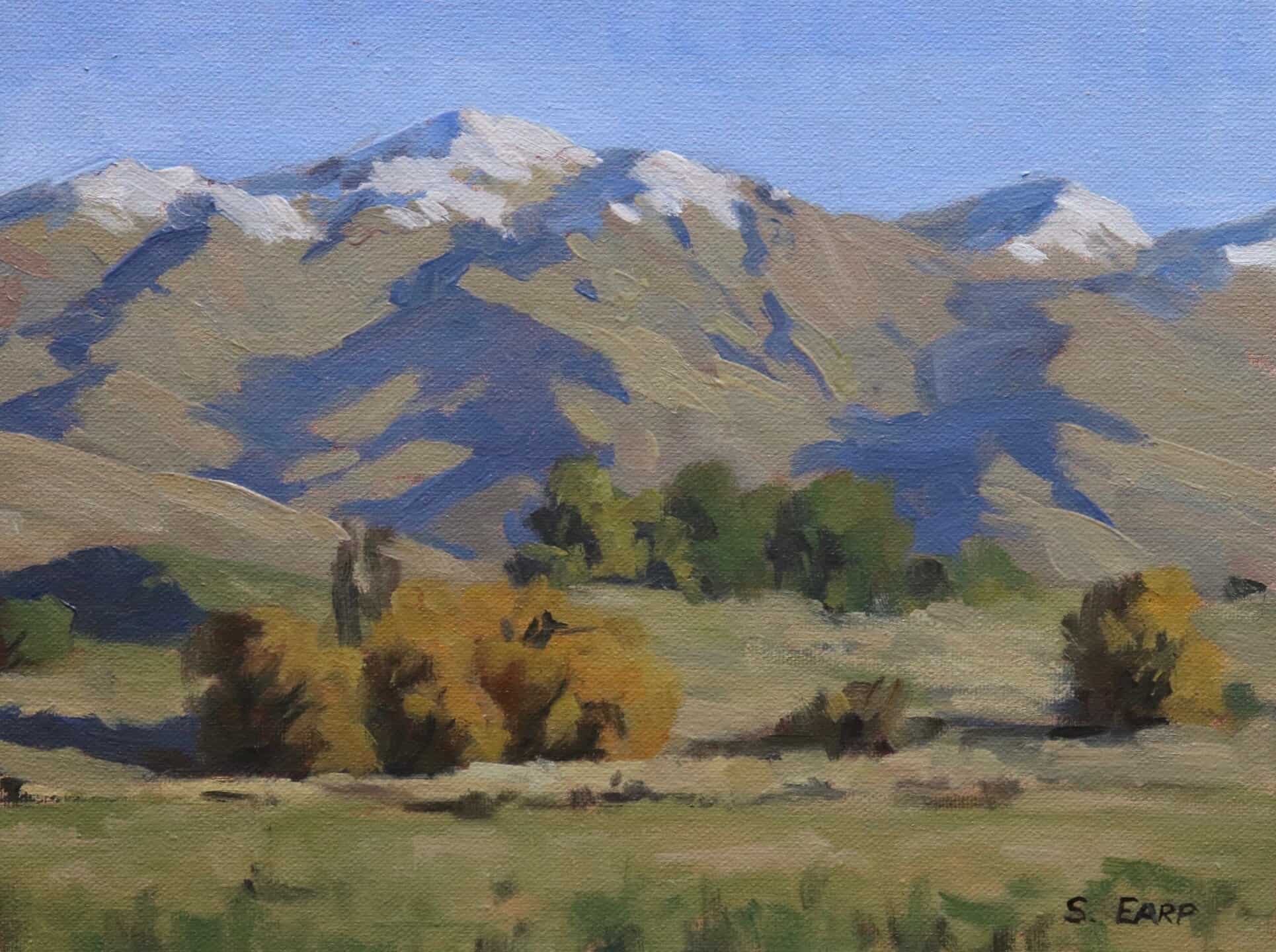
Crown Terrace
Arrowtown
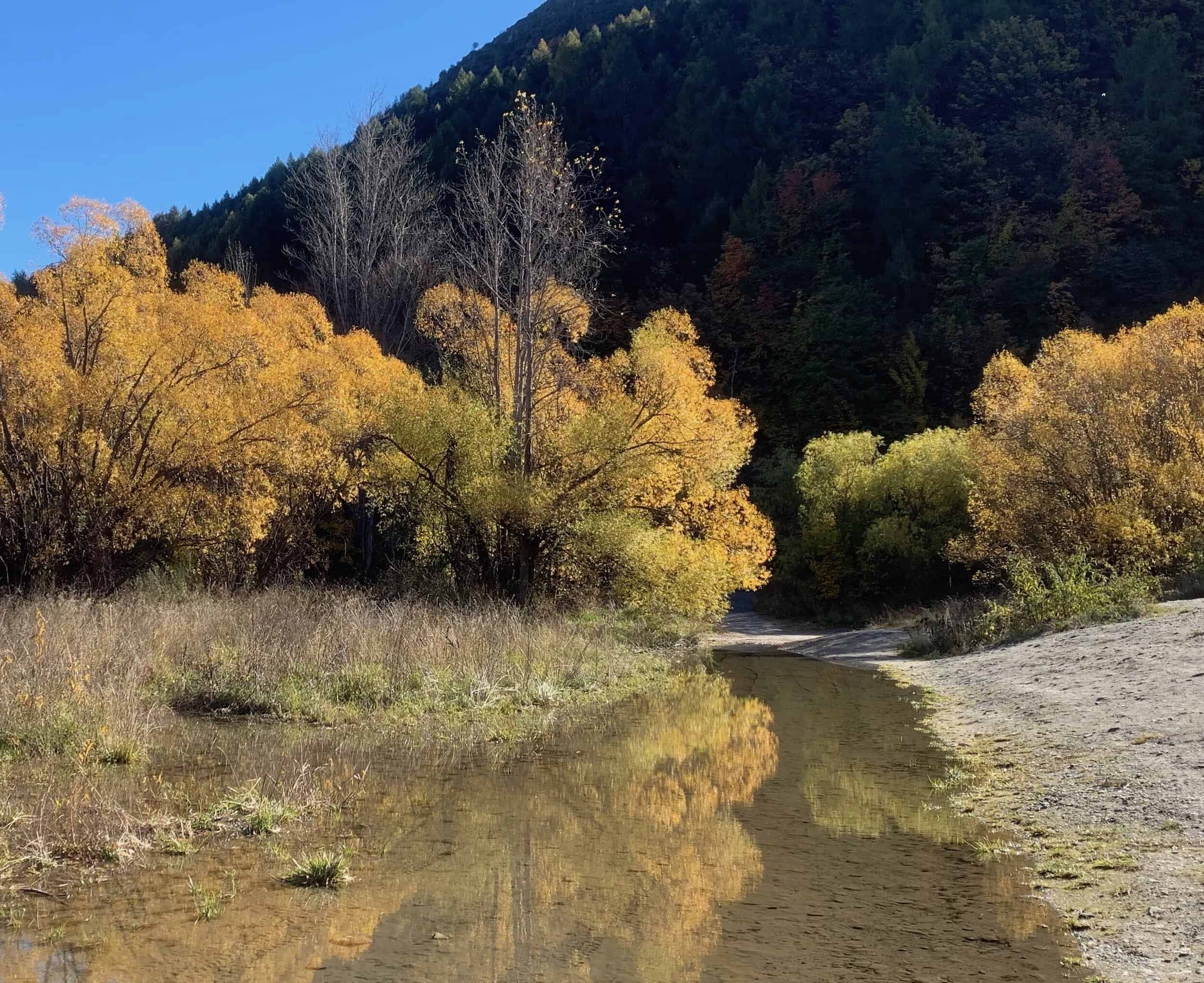
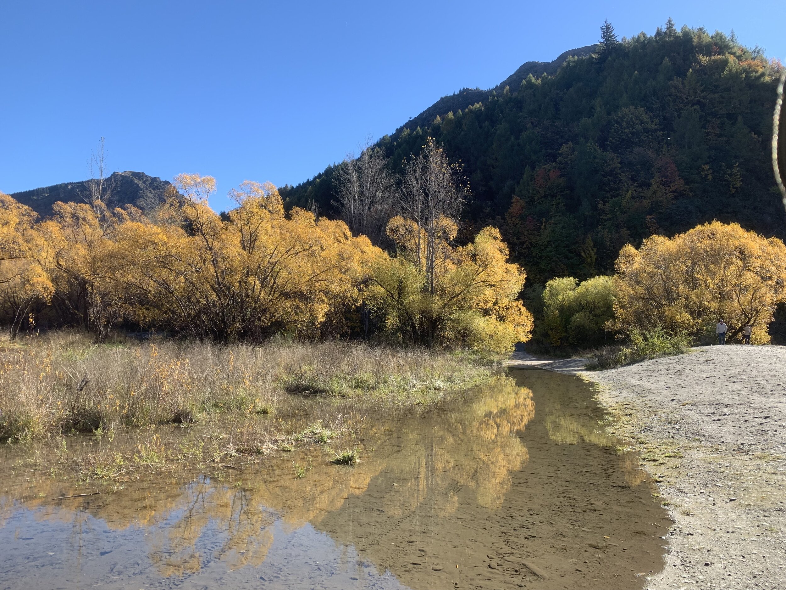
The Gorge
Composition
When painting outdoors it’s always a good idea to simplify the composition as it will make painting easier especially if you are applying loose brushwork. Very often too much information in the painting can spoil the composition.
It’s perfectly ok to move objects, elements, forms in your painting in order to create a good composition and it’s nearly always required. Remember we are artists and we are creating a painting, not a photograph
Things to Be Avoided in Composition
-
Centred Horizon: This is bad composition as it results in the painting being halved for example half sky and half land and as a result forms a displeasing static within a painting. Either choose a low horizon or a higher horizon.
-
Centred Objects: Areas of interest in the centre of your painting is a massive no no, it destroys any kind of rhythm and harmony within the composition.
-
Equal Masses and Repetitive Shapes: This is a problem in composition as often you can create repetitive shapes and forms in your painting without realising it. It again leads to disharmony within the composition.
Colours and Values
Throughout the video you will hear me talk about colours and values. It is important to have a basic understanding of colour theory and values when painting as it will actually make colour mixing easier for you and you will be able to better create atmospheric depth in your paintings. Luckily it’s easy to learn the basics and the rest is just brush mileage.
Colour Theory Terms
Below are some terms I use throughout the video and their meanings.
-
Hue: This refers to the main attributes of a colour and is dependent on its dominant wavelength, irrespective of how light or dark the colour is. For example, the colour is discernable as blue or a red etc.
-
Saturation or Chroma: This refers to the purity or intensity of a colour. You can reduce the saturation of a colour by adding a neutral grey or an opposite colour on the colour wheel.
-
Value: This is how light or dark a colour is. Getting your values correct is one of the keys in the success of a painting.
-
Tone: This is a broad term for describing a colour that is not a pure hue or black or white. It is a widely misunderstood term.
The Colour Wheel
For the benefit of people who are new to painting that are watching this video I will briefly go over the basics of the colour wheel as remembering how this works can really help you with colour mixing.
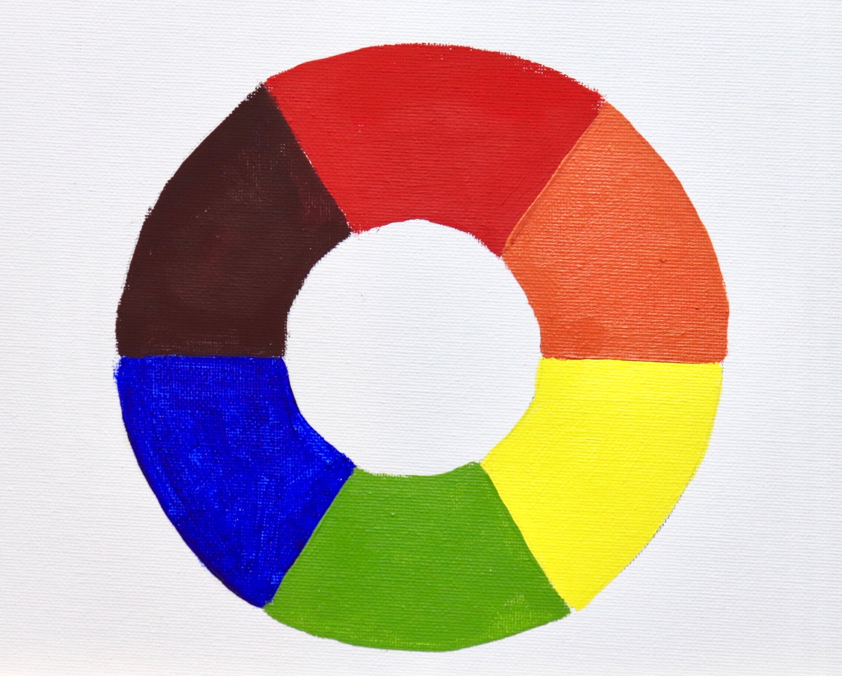
Above is a simplified colour wheel. The colour wheel contains three primary colour blue, red and yellow and three secondary colours orange, green and violet. When any two primary colours are mixed together they make a secondary colour, so red and yellow make orange, yellow and blue make green and blue and red make violet.
When these colours are arranged on the colour wheel a primary colour is always opposite a secondary colour and are known as compliments or complimentary opposites. So, blue is opposite to orange, red is opposite to green and yellow is opposite to violet.
So why is this important?
If you want to desaturate a colour you can do this by mixing its complimentary opposite as the two colours will cancel each other out. In this manner you can create some neutral greys and browns especially when combined with white.
Complimentary colours also look good next to each other in a painting, for example greens often look more harmonious in a landscape if there are some reds amongst the mix or colours that contain red. If you look closely in nature, you’ll see naturally occurring complimentary opposites everywhere.
The Value Scale
Value is how light or dark a colour is and is perhaps one of the most important concepts in painting. The success of a painting rests on the relationship between the values in the painting. If they are not working and not in harmony then the whole painting can lack any kind of depth.
Values in art work are represented on a scale with the highest value being white and the lowest value being black. The greys in between are known as mid or half tones.

In general, you will find your darkest darks and lightest lights in the foreground of a landscape. However, as landforms recede into the distance darks are not quite dark and lights are not quite light as the tonal scale narrows.
If you are unsure of where your light and dark values are in the scene you are painting, switch your reference photo to black and white and you’ll be able to clearly see where your light and dark values are.
In general, you’ll find that the sky is often one of the lightest values in the landscape. Grass is also generally lighter in value. Rocks and mountain faces are darker in value and often occupy the mid-tone range of the value scale. Trees are generally some of the darkest values in the landscape.
Colours Used
I am painting in oils but you can also use acrylics. The colours I used in this painting are as follows:
-
Titanium white
-
Burnt sienna
-
Yellow oxide (you can use yellow ochre instead)
-
Cadmium yellow
-
Cadmium red
-
Quinacridone crimson (you can use alizarin crimson instead)
-
Ultramarine blue
-
Phthalo green
Brushes
Here is a list of the brushes I generally use for plein air painting:
· No.6 flat (these are the brushes I use the most)
· No.2 flat
· No.2 filbert
· No.1 round
· No.0 round
· 3/8 dagger
· 1/4 dagger
Materials and Equipment
The equipment I use for plein air painting includes the following:
· Pochade box easel
· Camera tripod
· Paints
· Brushes
· Brush cleaner
· Liquin Original
· Paper towels
· Rags
· Disposable nitrile gloves
The first time I ever went plein air painting I brought my studio easel, I quickly found that it was cumbersome to carry around with me, although it was fine to use for the first couple of times. However, I decided to purchase some equipment that would make my plein air painting experience much easier. One of my main items of equipment I use for plein air painting is my pochade box (pictured below).
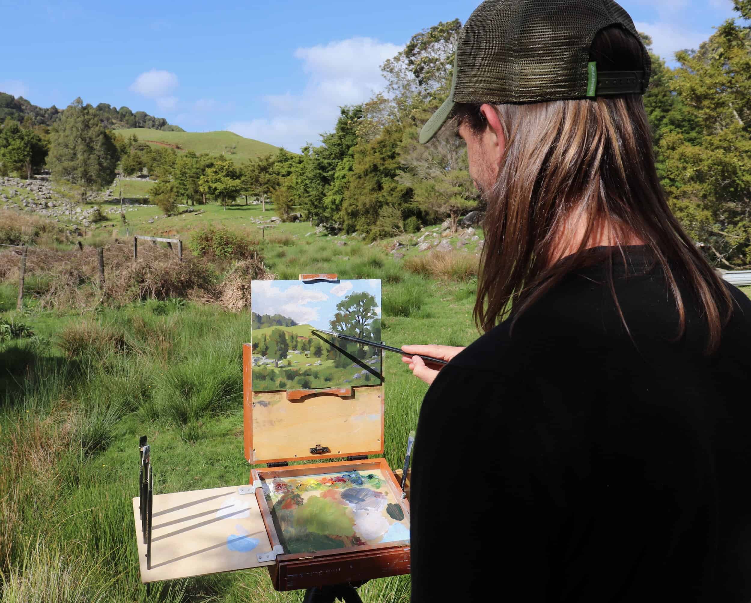
This is a portable easel that contains storage compartments for paints and finished paintings as well as a built in paint palette. My pochade box mounts on a standard camera tripod, making it sturdy for when I am painting and it is easy to carry around. There are many pochade box’s available on the market.
When plein air painting, many plein air artists paint on canvas panels or loose canvas that is adhered to a panel with masking tape. This allows the artist to paint whatever size canvas they desire and it is also a cheaper way of doing it especially when you’re learning and getting to grips with painting outside. The finished painting can then be either mounted on a board or stretcher bars. Note: if you intend to mount the painting on stretcher bars it is advisable to adjust your canvas size to standard sizes and leave at least 2cm edge so it can be mounted on stretcher bars.
Thanks for reading
Get the video, Three Autumn Landscapes, Painting En Plein Air, available in store now